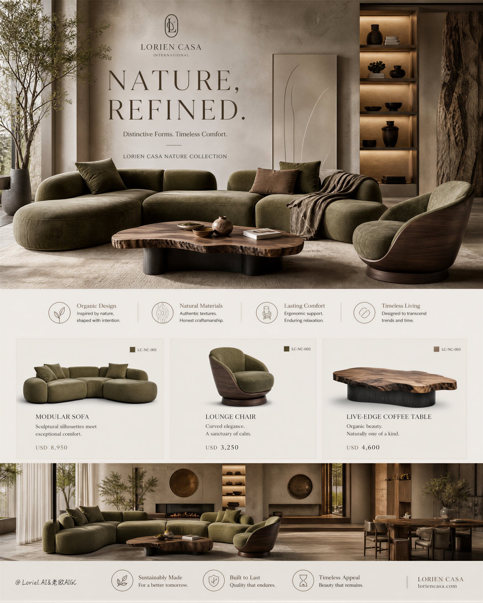
Prompt
The truly sophisticated approach to small-space furniture layouts is to ensure that users know immediately after viewing them: how to arrange the pieces, which items to buy, and what their budget will be. 小空间家具图真正高级的做法,是让用户看完就知道:怎么摆、买哪些、预算多少。 ★ Hero room: the complete composition 先用完整卧室讲清组合结果:床为中心,床头柜贴两侧,床尾凳留弹性,灯与花器向上延展。买家先看到“住进去是什么样”。 ★ Product strip: bed / tables / bench / light / vase 再把场景拆成可购买的单品。每件只保留名称、尺寸、材质与图中对应位置,灵感立刻变成清单。 ★ Anchor / paired utility / flexible accent 分类要按角色,不按品类:大件定中心,成对边几解决功能,软凳与装饰负责灵活补位。小空间照着配,不容易买错。 ★ subtle price note, never promotional 标价不要做成促销标签,而是用低调微字放在产品信息下。它传递的是“这是完整可落地的配置”,不是廉价叫卖。 一张有效的家具销售图,要同时完成三步:给出空间答案、拆成购买清单、用价格降低决策门槛。看完,用户不是只想收藏,而是知道该怎么买。 GPT- image 2 prompt Create an ultra-premium real estate interior sales poster for a self-created international luxury property developer, designed as a refined editorial bedroom presentation board that merges a dominant hyper-real master-bedroom scene with elegant planning graphics, material palette, furniture product display, and subtle pricing information. Push the overall image toward a calmer, more mature, more internationally luxurious residential identity. The final artwork must feel serene, expensive, architectural, and collectible, like a flagship master-bedroom release poster for a world-class luxury residence collection. Brand identity: Use a self-created international luxury interior brand: VELORA PRIVATE INTERIORS Project name: VELORA MASTER SUITE Main headline: QUIETLY COMPOSED. Supporting line: A Private Bedroom Collection for Elevated Living. All typography must be elegant English only, art directed, beautifully spaced, and integrated like part of a premium interior branding system. No Chinese headline. No crude bold fonts. No cheap catalog styling. Core composition: Use a tall vertical poster with a highly disciplined editorial split layout. The left side must be dominated by one large hero bedroom image occupying most of the composition. The right side must be a clean premium information column containing a minimal room plan, color palette, materials and textures, wall-art reference, and decor accents. At the bottom, add a refined product strip presenting the key bedroom pieces individually with tiny elegant labels and understated minimalist price notes. The whole poster must feel calmer, more spacious, more premium, and more like an international luxury bedroom launch cover than a retail furniture sheet. Orbit enhancement: Enlarge the hero bedroom scene and make it visually more commanding. Reduce secondary noise and keep every supporting information block sharper, quieter, and more distilled. Increase breathing room between typography, palette blocks, product items, and guide lines. The composition must read with stronger hierarchy and more luxury restraint, as if created for a global high-end residential launch campaign. International master-bedroom direction: Shift the styling toward a more stable, mature, and globally refined luxury-bedroom atmosphere. Use a sophisticated palette of warm greige, mineral beige, stone taupe, muted walnut, soft oatmeal, smoked bronze, parchment cream, and shadowed mocha. Avoid overly sweet, decorative, or casual bedroom styling. The final space must feel like a master suite in an ultra-premium show residence: quiet, tailored, architectural, and emotionally expensive. Hero bedroom scene: Show a hyper-real luxury master bedroom with an upholstered bed centered against a refined soft-plaster wall. Use a sculpted padded headboard, layered premium bedding in taupe, greige, mocha, and warm ivory, elegant walnut bedside tables, a woven bench or pouf, subtle art above the bed, and one refined pendant or ceiling light with artisanal texture. Add soft curtains, a neutral rug, restrained ceramics, and delicate botanical branches. The room must feel believable, internationally elite, and deeply calm. Lighting and styling must emphasize quiet luxury, premium comfort, and architectural harmony. Design expression: The right-side information column must include: - a minimal bedroom floor plan - a refined color palette strip - a materials and textures section - one wall-art reference block - one accents and decor block All diagrams and labels must feel extremely clean, standard, and beautiful. Add ultra-subtle design-detail elements such as faint layout guides, tiny finish codes, and thin divider lines. Everything must remain sparse, elegant, and premium. Furniture and product row: At the bottom, present isolated key pieces from the same bedroom composition on a clean background: - upholstered bed - bedside table - bedside table - woven pouf or bench - pendant light - decorative vase or floor lamp Each item should have: - elegant English product name - tiny one-line specification - extremely subtle minimalist price note The price notes must feel like luxury catalog micro-copy, never promotional, never loud. Material and color direction: Use a mature global luxury-bedroom palette: warm greige, taupe, mineral beige, soft walnut, parchment cream, muted sand, smoked bronze, and shadowed brown. Fabric must feel dense, soft, and premium. Wood must feel warm and quietly expensive. Plaster must feel velvety and architectural. Metal accents must feel satin-finished and restrained. The entire palette must communicate stability, comfort, permanence, and international sophistication. Lighting: Use extremely soft diffused natural daylight with delicate shadow transitions. The light should enter from one side through soft curtains, washing gently over bedding, wall texture, wood grain, and woven surfaces. Add very subtle warm practical light from a pendant or floor lamp if needed. The overall mood must feel luminous but restrained, calm but rich, physically believable and highly art directed. Styling realism: Render every detail with exceptional realism. Bedding must feel layered, weighty, and touchable. Curtains must feel soft and airy. Wood furniture must feel precisely crafted. The rug, pouf, ceramics, framed art, and small decor objects must feel minimal and intentional. No clutter, no cheap hotel styling, no excessive ornament. Typography and layout: Integrate: VELORA PRIVATE INTERIORS VELORA MASTER SUITE QUIETLY COMPOSED. A Private Bedroom Collection for Elevated Living. Use elegant English-only typography with strong editorial spacing and a refined global luxury aesthetic. All micro-copy, product labels, and price notes must feel like part of one unified premium brand system. Visual hierarchy: The viewer must first read the enlarged hero bedroom scene. Second, the right-side planning and palette column. Third, the bottom furniture product strip. Fourth, the subtle pricing and finish-detail system. The poster must always feel like a luxury real estate bedroom sales visual centered on spatial calm, collectible furnishings, and international residential taste. Mood: bedroom, luxurious, mature, international, serene, tailored, tactile, architectural, premium, calm, elegant, collectible, aspirational, high-end residential Rendering style: ultra-premium bedroom sales poster, flagship editorial master-suite board, enlarged hero bedroom image, clean right-side material and planning column, bottom furniture product strip, warm greige and walnut palette, soft daylight, elegant English typography, subtle luxury price display, world-class interior branding image, 8k, museum-grade realism Negative prompt: cheap furniture flyer, oversized bold fonts, discount graphics, plastic-looking materials, cluttered bedroom styling, generic hotel room look, harsh HDR lighting, oversaturated colors, low-detail bedding, messy layout, random stock-photo feeling, low-resolution textures, cute decor overloadParameters
Model
gpt-image-2
Difficulty
Beginner
Ref Images
0
Quality
-
👁 1 views📋 0 copies
Category创意图片