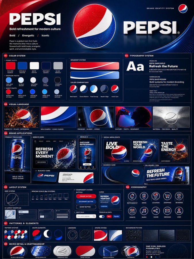
设计专业丰富品牌识别系统
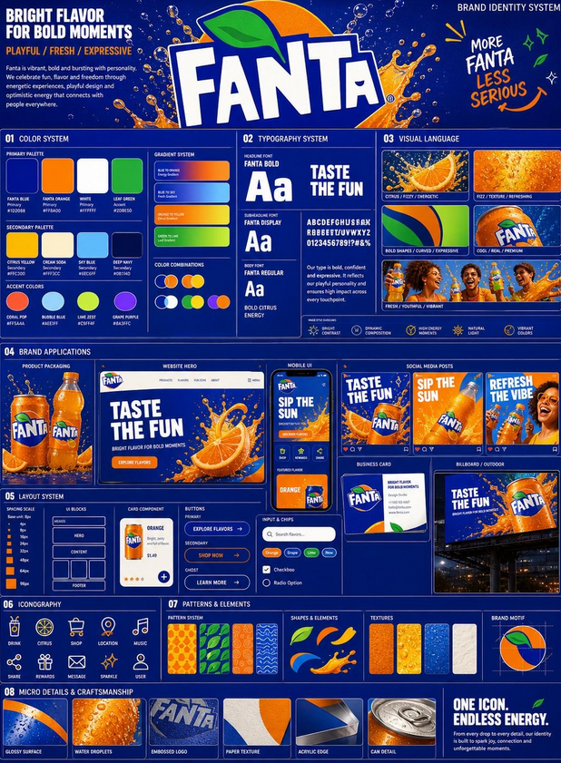
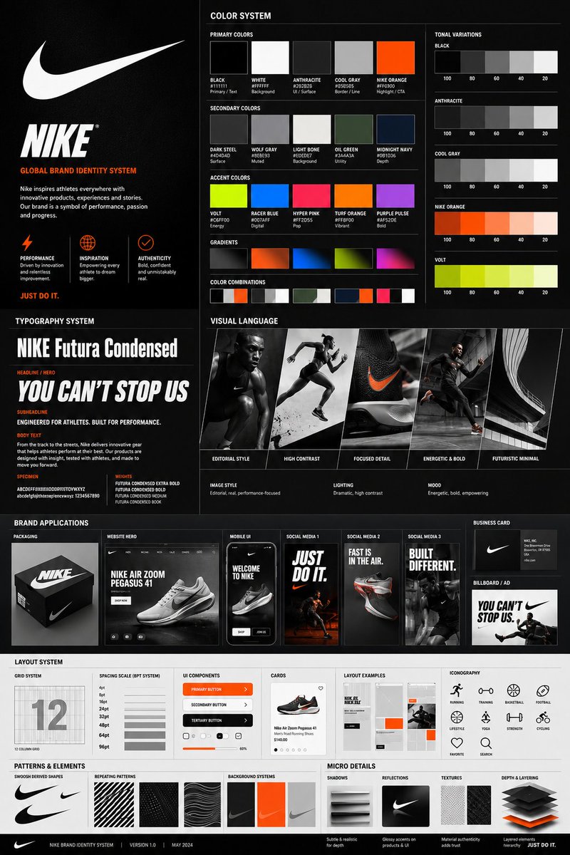
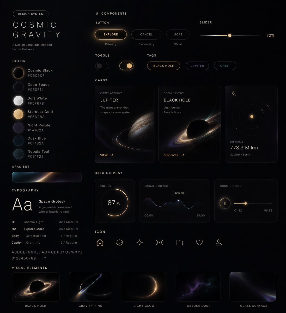
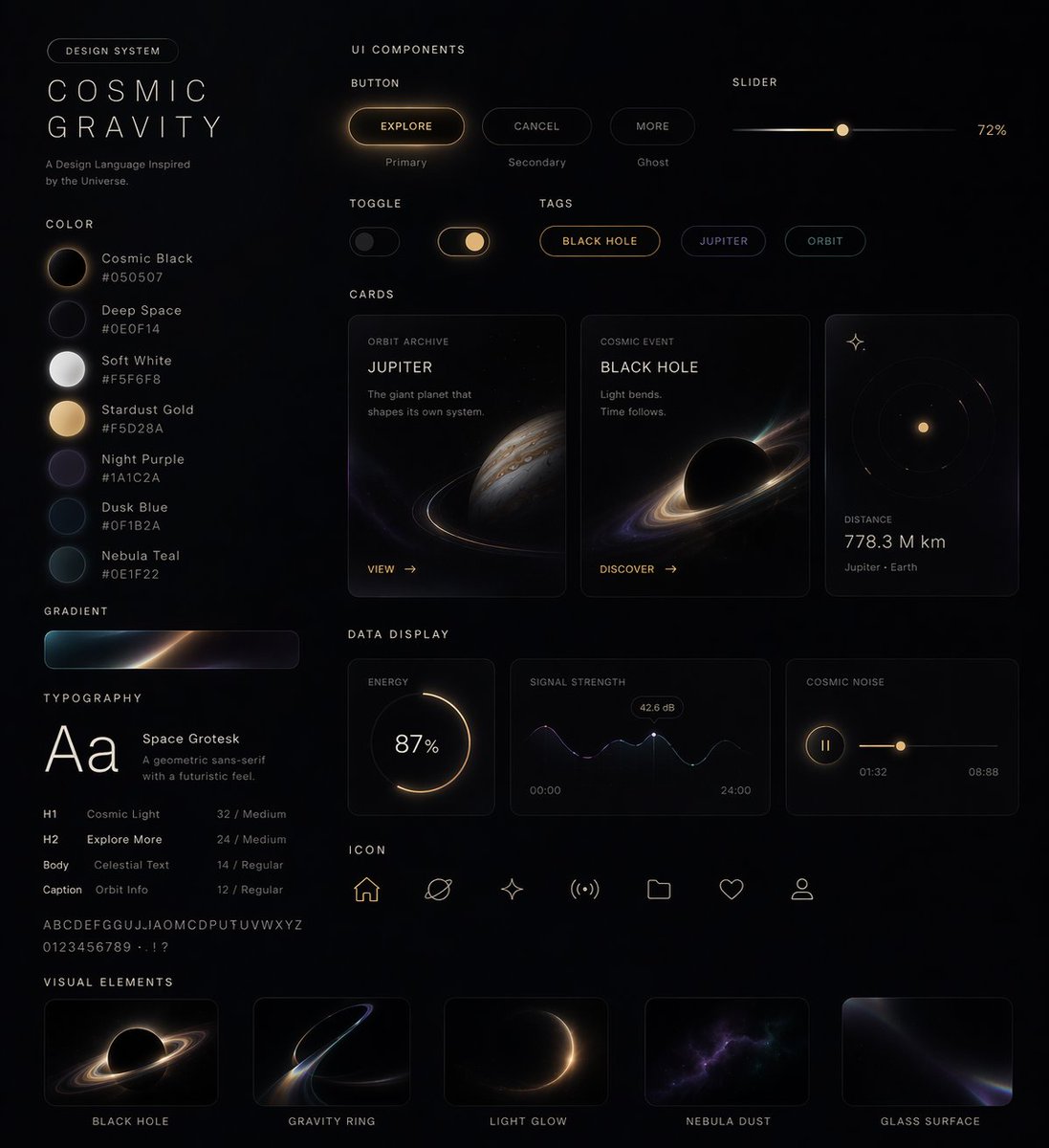
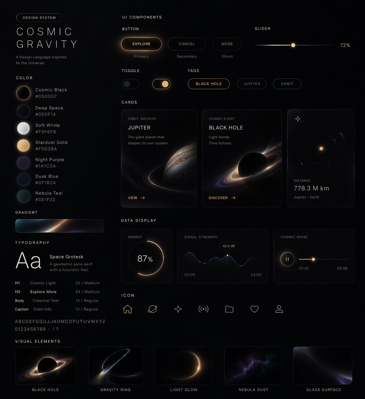
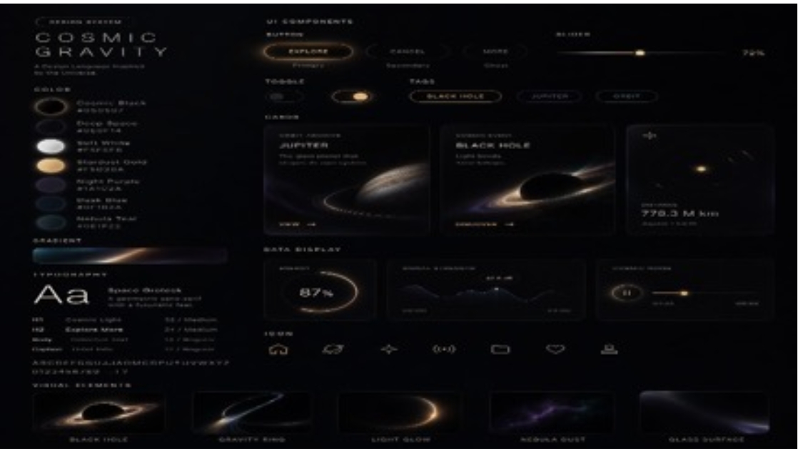
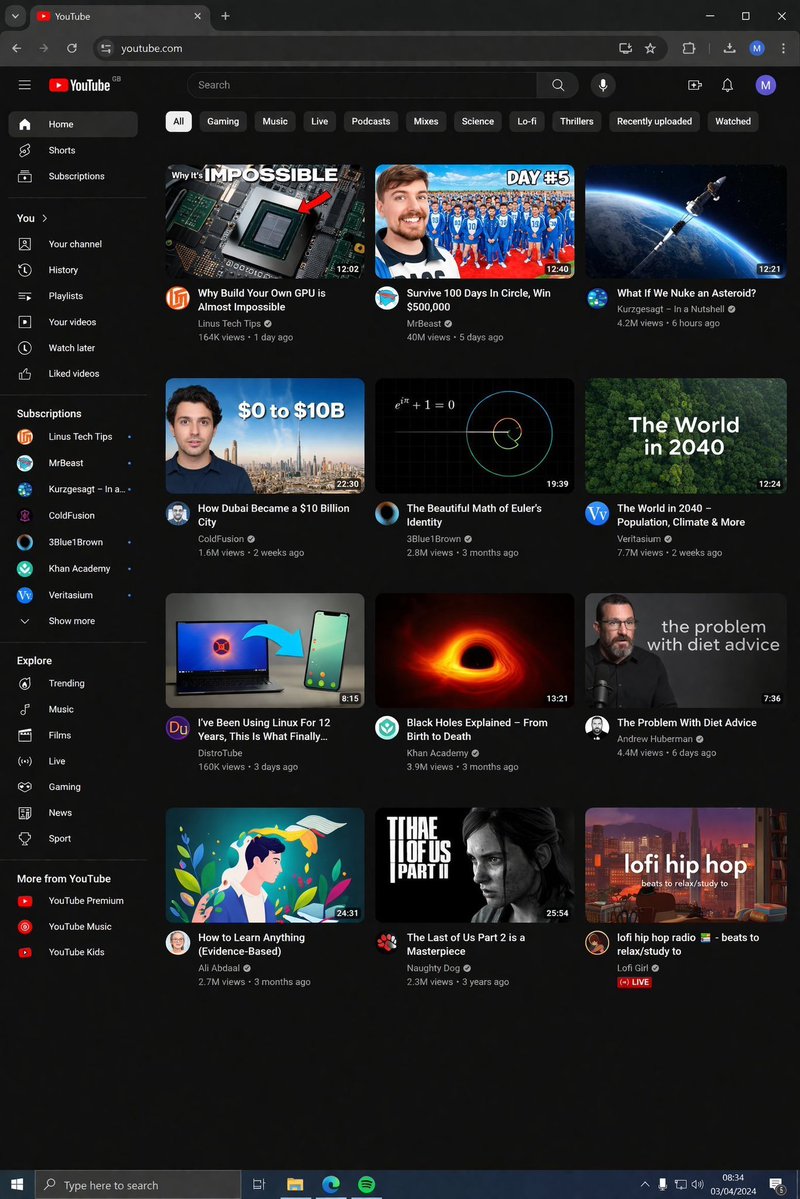
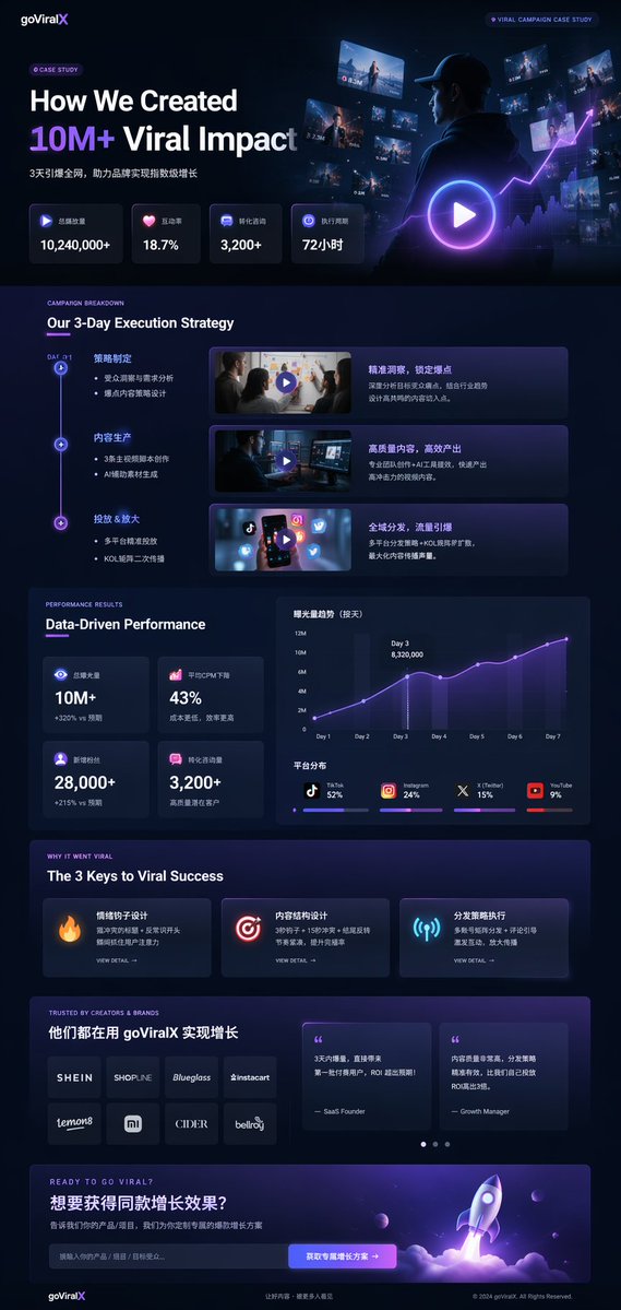
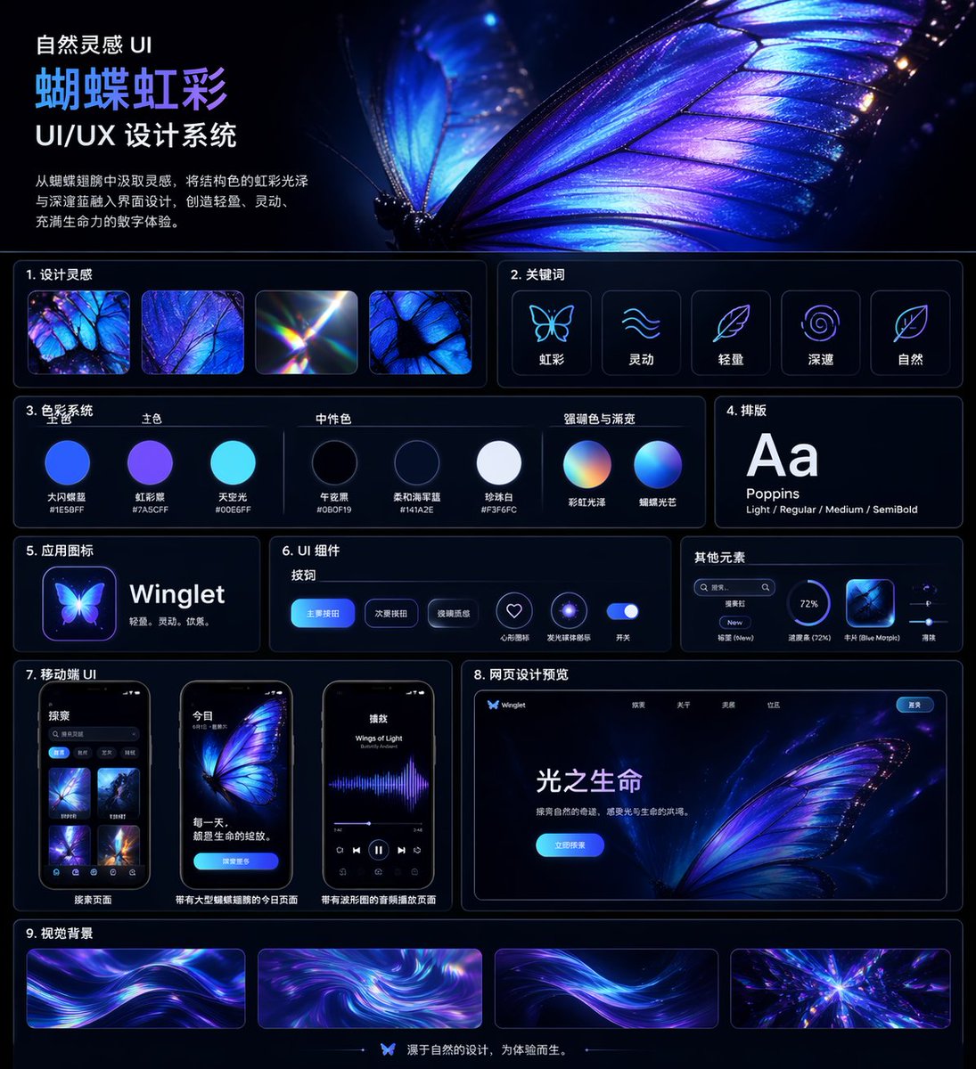
Using the uploaded logo, generate a highly detailed, premium brand identity system poster. GOAL: Create a complete, visually rich brand kit that looks like it was made by a top design agency. This must feel like a real professional brand gu
- Category
- UI & Interfaces
- Model
- ChatGPT
- Creator
- @Naiknelofar788
- Source language
- en
- Source ID
- 13964
- Published
- May 2, 2026
Full prompt
Using the uploaded logo, generate a highly detailed, premium brand identity system poster.

GOAL:
Create a complete, visually rich brand kit that looks like it was made by a top design agency.

This must feel like a real professional brand guideline board, not a simple mockup.

---

CORE RULE:

Everything must be derived from the uploaded logo:
- colors
- style
- tone
- personality

No generic outputs.

---

STRUCTURE (VERY IMPORTANT):

Vertical 4:5 poster
Multi-layered grid system
Dense but clean composition

---

TOP SECTION:

- Brand name (clean typography)
- Short brand statement (max 6 words)
- 3-word brand identity (e.g. “Modern / Bold / Minimal”)

---

COLOR SYSTEM (ADVANCED):

- Primary palette (3–5 colors)
- Secondary palette (3–5 colors)
- Accent colors

For each:
- large color blocks
- HEX codes (short)
- usage indicators (primary / highlight / background)

Add:
- gradient examples
- color combinations

---

TYPOGRAPHY SYSTEM:

- Headline font style
- Subheadline style
- Body text style

Show:
- real text examples (short phrases)
- hierarchy clearly visible

---

VISUAL LANGUAGE:

Define:
- image style (editorial, cinematic, minimal, etc.)
- lighting direction
- texture / material inspiration

Show:
- 3–5 visual tiles (image-style previews)

---

BRAND APPLICATIONS (VERY IMPORTANT):

Show multiple realistic mockups:

- product packaging
- website hero section
- mobile UI screen
- social media posts (3 variations)
- business card
- billboard or ad

Each must feel consistent with the brand.

---

LAYOUT SYSTEM:

- UI blocks
- card components
- spacing system

Show:
- buttons, cards, layout examples

---

ICONOGRAPHY:

- 6–10 icons in brand style
- consistent line / fill style

---

PATTERNS & ELEMENTS:

- background patterns
- decorative shapes
- visual motifs derived from logo

---

MICRO DETAILS (TO SHOW POWER):

- shadows
- material textures
- reflections
- depth layers

---

VISUAL STYLE (CRITICAL):

- modern editorial + tech design hybrid
- extremely clean but information-rich
- layered composition
- strong hierarchy

Typography:
- bold titles
- clean supporting text

---

DEPTH:

- 30–50 visual elements total
- mix of large + small components
- dense but organized

---

IMPORTANT RULES:

- no empty space
- no generic placeholders
- everything must feel intentional
- all elements must visually connect

---

FINAL FEEL:

Like:
- a Behance top project
- a real agency brand guideline board
- something clients would pay for

NOT:
- basic
- minimal
- template-like
Translations
设计专业丰富品牌识别系统
enUsing the uploaded logo, generate a highly detailed, premium brand identity system poster. GOAL: Create a complete, visually rich brand kit that looks like it was made by a top design agency. This must feel like a real professional brand guideline board, not a simple mockup. --- CORE RULE: Everything must be derived from the uploaded logo: - colors - style - tone - personality No generic outputs. --- STRUCTURE (VERY IMPORTANT): Vertical 4:5 poster Multi-layered grid system Dense but clean composition --- TOP SECTION: - Brand name (clean typography) - Short brand statement (max 6 words) - 3-word brand identity (e.g. “Modern / Bold / Minimal”) --- COLOR SYSTEM (ADVANCED): - Primary palette (3–5 colors) - Secondary palette (3–5 colors) - Accent colors For each: - large color blocks - HEX codes (short) - usage indicators (primary / highlight / background) Add: - gradient examples - color combinations --- TYPOGRAPHY SYSTEM: - Headline font style - Subheadline style - Body text style Show: - real text examples (short phrases) - hierarchy clearly visible --- VISUAL LANGUAGE: Define: - image style (editorial, cinematic, minimal, etc.) - lighting direction - texture / material inspiration Show: - 3–5 visual tiles (image-style previews) --- BRAND APPLICATIONS (VERY IMPORTANT): Show multiple realistic mockups: - product packaging - website hero section - mobile UI screen - social media posts (3 variations) - business card - billboard or ad Each must feel consistent with the brand. --- LAYOUT SYSTEM: - UI blocks - card components - spacing system Show: - buttons, cards, layout examples --- ICONOGRAPHY: - 6–10 icons in brand style - consistent line / fill style --- PATTERNS & ELEMENTS: - background patterns - decorative shapes - visual motifs derived from logo --- MICRO DETAILS (TO SHOW POWER): - shadows - material textures - reflections - depth layers --- VISUAL STYLE (CRITICAL): - modern editorial + tech design hybrid - extremely clean but information-rich - layered composition - strong hierarchy Typography: - bold titles - clean supporting text --- DEPTH: - 30–50 visual elements total - mix of large + small components - dense but organized --- IMPORTANT RULES: - no empty space - no generic placeholders - everything must feel intentional - all elements must visually connect --- FINAL FEEL: Like: - a Behance top project - a real agency brand guideline board - something clients would pay for NOT: - basic - minimal - template-like