Back to prompts
刘亦菲像素刺绣杂志感拼贴

Example images

刘亦菲像素刺绣杂志感拼贴 1刘亦菲像素刺绣杂志感拼贴 2
Charts & InfographicsOpenNanaChatGPT图片charts-infographics
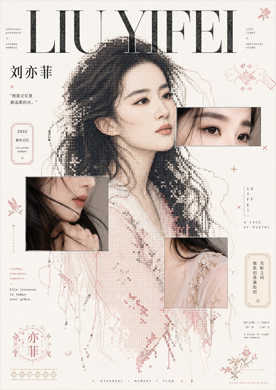
刘亦菲像素刺绣杂志感拼贴

围绕具体主题内容生成一张编辑杂志式拼贴图像:画面以大片明亮留白承托内容,最强视觉重量来自一个被放大的主题主物轮廓,轮廓用粗颗粒网点、像素十字绣和断裂针脚混合塑形,边缘保留未完成的织线感与少量脱落点,让实物主题转译成介于印刷网屏和手工刺绣之间的图形。主物上叠放两三处细线描边的局部影像窗口,只截取主题最有触感和识别度的细节,窗口与像素轮廓发生遮挡,形成真实影像和点阵图案互相校准的层次。文字作为核心构成:使用一个超大高反差衬线标题压住上方视觉层级,辅以窄字距的像素手写短句、小号说明

Category
Charts & Infographics
Model
ChatGPT
Creator
@xiaoxiaodong01
Source language
zh-CN
Source ID
15496
Published
Jun 8, 2026
Use in StudioOpen source

Full prompt

Generate an editorial magazine-style collage image based on a specific theme: the composition uses large areas of bright white space to support the content. The strongest visual weight comes from an enlarged silhouette of the main subject. The silhouette is shaped using a mixture of coarse halftone dots, pixel cross-stitch, and broken stitches. The edges retain an unfinished thread feel and a few loose points, translating the physical subject into a graphic that exists between a printing screen and hand embroidery. Two or three partial image windows with thin line outlines are overlaid on the main subject, capturing only the most tactile and recognizable details of the theme. The windows overlap with the pixel silhouette, creating layers where real images and dot patterns calibrate with each other. Typography serves as the core composition: a massive high-contrast serif title anchors the upper visual hierarchy, supplemented by narrow-letter-spaced pixel handwritten phrases, small captions, and scattered micro-annotations. The layout maintains the calmness, emptiness, and rhythmic reading pace of French editorial design. The background retains clean paper grain and slight scanning noise, with surrounding scattered folk art patterns derived from the theme, symbolic stamps, broken borders, and dot-matrix decorations, like graphic marks torn from old fabrics, receipts, and childhood memories. Colors are extracted from the theme's own materials, emotions, and cultural signals: high-brightness clear base colors are used in large areas, structural information uses clear dark colors to establish the center of gravity, and a small amount of theme-derived accent colors are used only for sub-titles, thin frames, and decorative symbols, maintaining a bright, clean mood with a touch of childhood ritual; all color boundaries are clear, saturation is restrained but not muddy, the texture is an airy paper feel and printing grain, without any aged or dirty treatment. Theme: Liu Yifei

Translations

刘亦菲像素刺绣杂志感拼贴

en

Generate an editorial magazine-style collage image based on a specific theme: the composition uses large areas of bright white space to support the content. The strongest visual weight comes from an enlarged silhouette of the main subject. The silhouette is shaped using a mixture of coarse halftone dots, pixel cross-stitch, and broken stitches. The edges retain an unfinished thread feel and a few loose points, translating the physical subject into a graphic that exists between a printing screen and hand embroidery. Two or three partial image windows with thin line outlines are overlaid on the main subject, capturing only the most tactile and recognizable details of the theme. The windows overlap with the pixel silhouette, creating layers where real images and dot patterns calibrate with each other. Typography serves as the core composition: a massive high-contrast serif title anchors the upper visual hierarchy, supplemented by narrow-letter-spaced pixel handwritten phrases, small captions, and scattered micro-annotations. The layout maintains the calmness, emptiness, and rhythmic reading pace of French editorial design. The background retains clean paper grain and slight scanning noise, with surrounding scattered folk art patterns derived from the theme, symbolic stamps, broken borders, and dot-matrix decorations, like graphic marks torn from old fabrics, receipts, and childhood memories. Colors are extracted from the theme's own materials, emotions, and cultural signals: high-brightness clear base colors are used in large areas, structural information uses clear dark colors to establish the center of gravity, and a small amount of theme-derived accent colors are used only for sub-titles, thin frames, and decorative symbols, maintaining a bright, clean mood with a touch of childhood ritual; all color boundaries are clear, saturation is restrained but not muddy, the texture is an airy paper feel and printing grain, without any aged or dirty treatment. Theme: Liu Yifei

刘亦菲像素刺绣杂志感拼贴

zh-CN

围绕具体主题内容生成一张编辑杂志式拼贴图像:画面以大片明亮留白承托内容,最强视觉重量来自一个被放大的主题主物轮廓,轮廓用粗颗粒网点、像素十字绣和断裂针脚混合塑形,边缘保留未完成的织线感与少量脱落点,让实物主题转译成介于印刷网屏和手工刺绣之间的图形。主物上叠放两三处细线描边的局部影像窗口,只截取主题最有触感和识别度的细节,窗口与像素轮廓发生遮挡,形成真实影像和点阵图案互相校准的层次。文字作为核心构成:使用一个超大高反差衬线标题压住上方视觉层级,辅以窄字距的像素手写短句、小号说明文字和分散的微型注释,排版保持法式编辑感的冷静、空旷和跳跃阅读节奏。背景保留干净纸面颗粒与轻微扫描噪点,周围散布主题派生的民艺纹样、符号小章、破碎边框和点阵装饰,像从旧织物、票据与童年记忆里拆出的图形标记。色彩从主题自身材质、情绪和文化信号中提取:大面积使用高明度清透底色,结构信息用清晰深色建立重心,少量主题派生强调色只用于标题副层、细框和装饰符号,保持明亮、洁净、带一点童年仪式感的情绪;所有颜色边界清楚,饱和度克制但不灰脏,纹理是通风的纸感和印刷颗粒,不做陈旧污浊处理。 主题:刘亦菲

Related prompts