![[BRAND NAME] Act as a Streetwear Creative Director and Graphic Designer creating](https://whqgdndlpxjbwosvipip.supabase.co/storage/v1/render/image/public/prompt-source-media/promptsref/work-7089/image-1-487b043aa498858c.png?width=800&quality=75)
[BRAND NAME] Act as a Streetwear Creative Director and Graphic Designer creating
Prompt
[BRAND NAME]

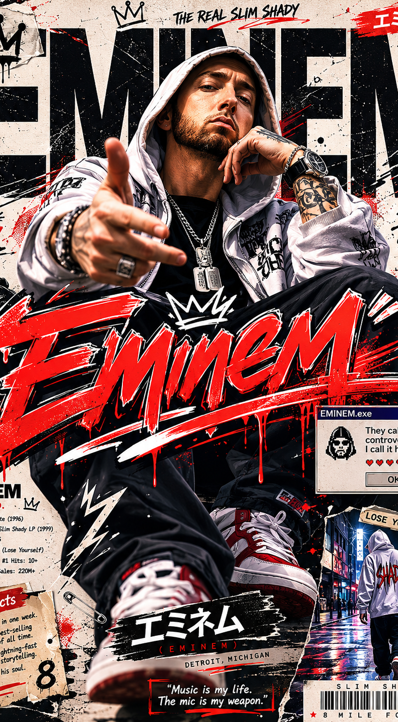
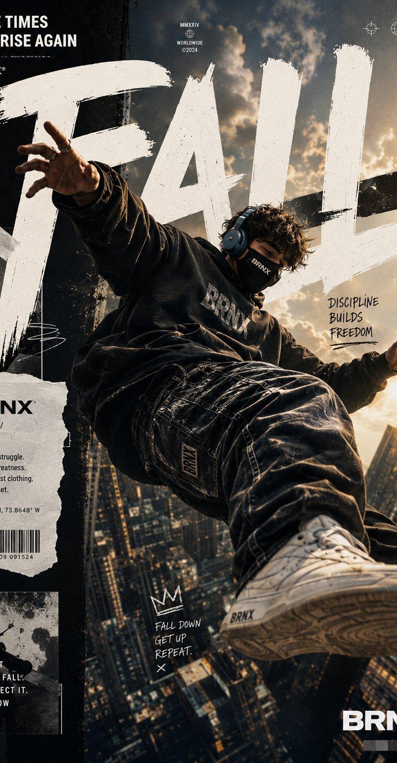
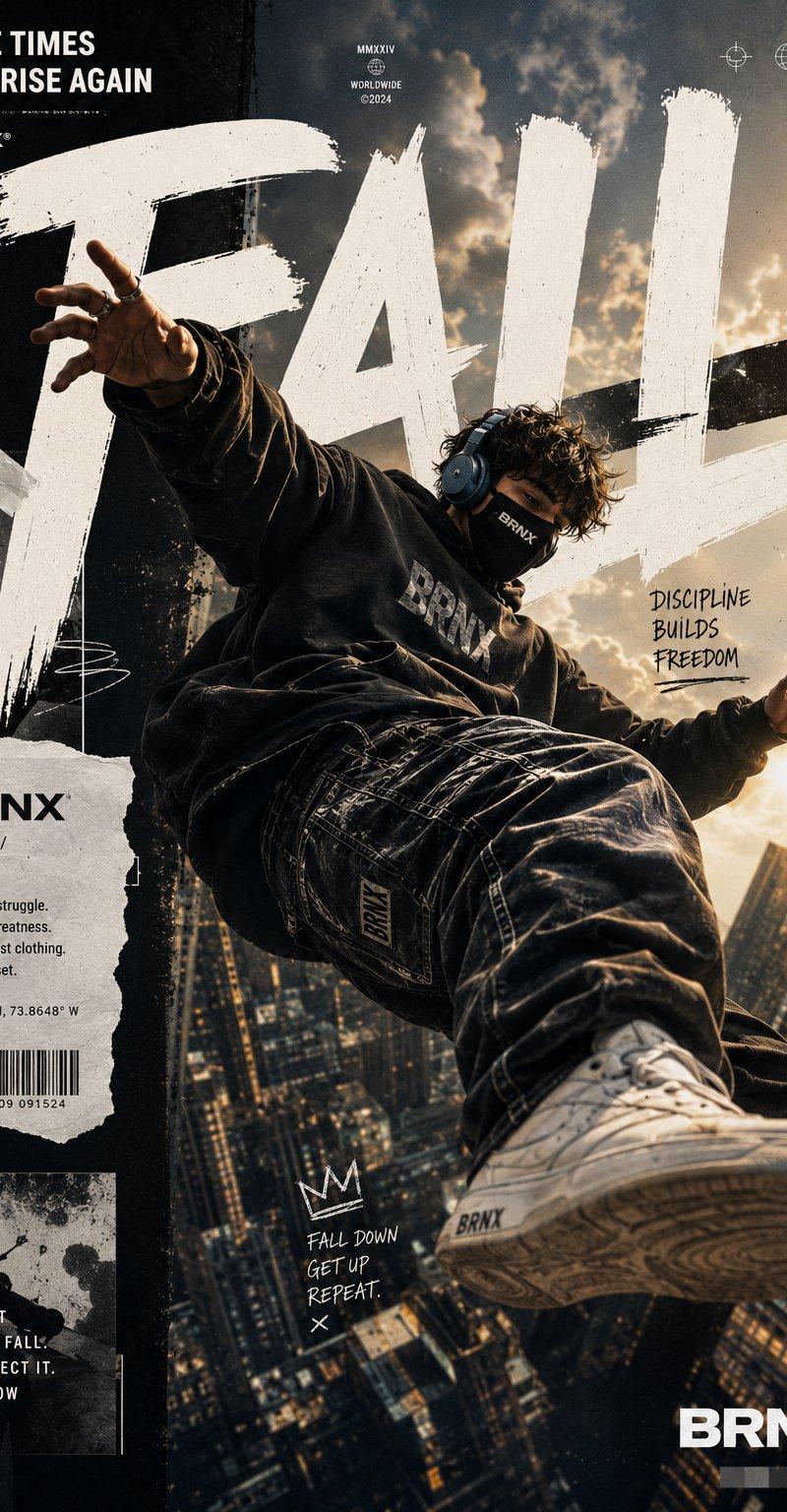
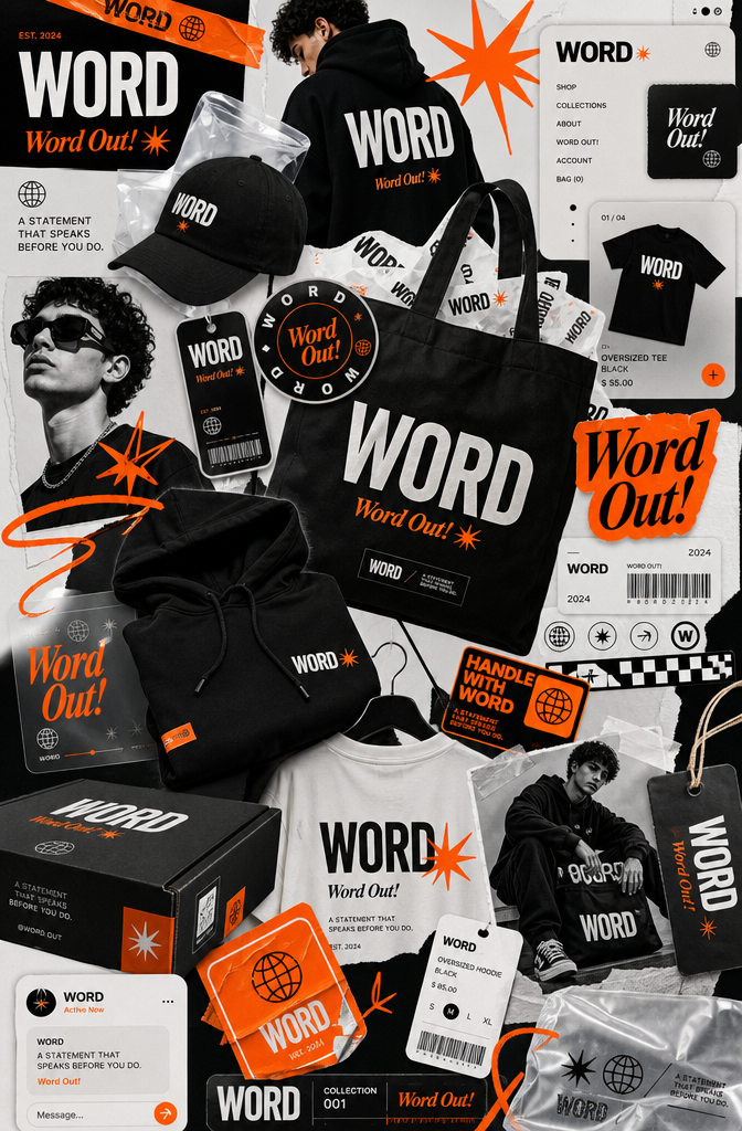
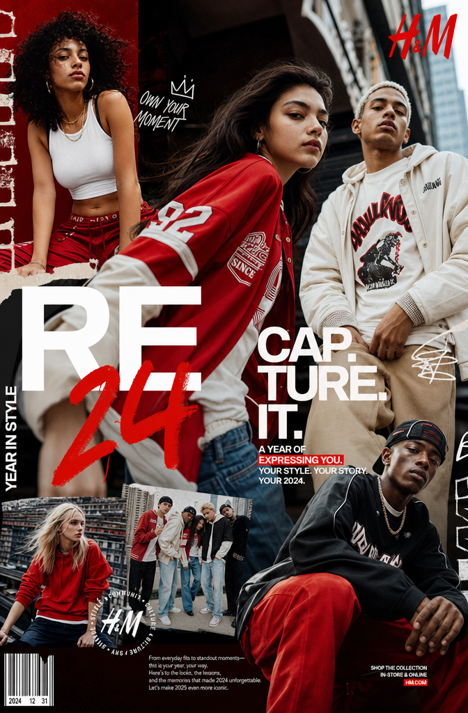
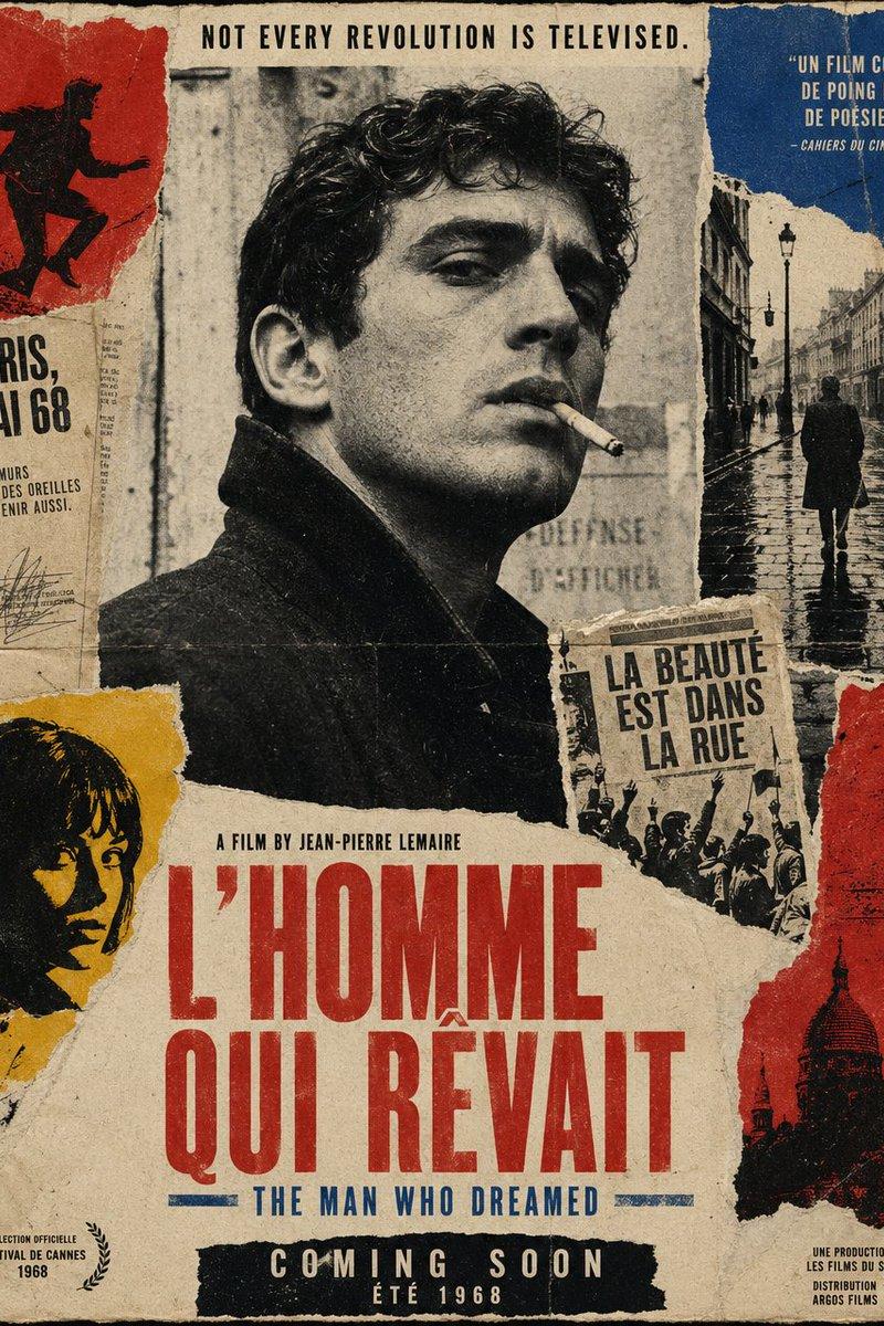
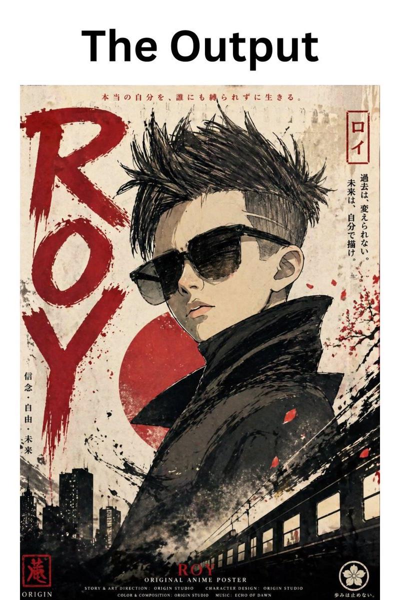
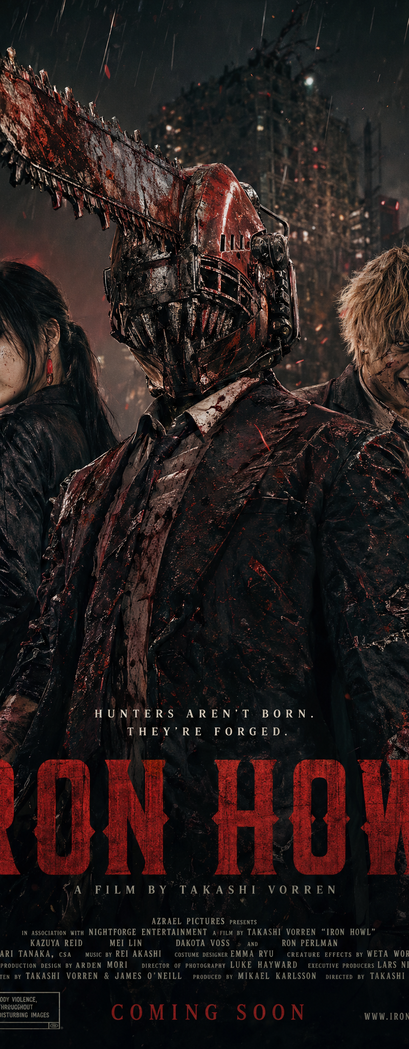
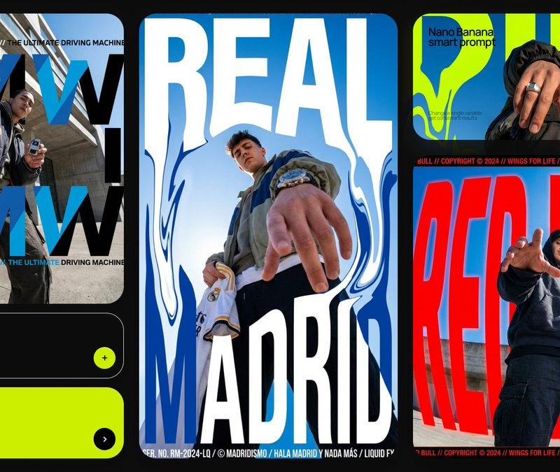
Act as a Streetwear Creative Director and Graphic Designer creating a triptych of three distinct campaign images unified by subculture aesthetics — analog grain, collage layering, hand-drawn elements, and raw urban energy. The three panels are presented side by side as a single wide-format image. Each panel has a completely different visual treatment but they belong to the same campaign universe. The entire system is driven by [BRAND NAME]'s real brand identity, real products, real cultural positioning. References: hip-hop album artwork, streetwear zine culture, skate photography, graffiti editorial, risograph print aesthetics.

---

PHASE 0: BRAND INTELLIGENCE — AUTONOMOUS EXTRACTION

Perform a complete brand decode of [BRAND NAME] from training data before generating anything.

COLOR SYSTEM: identify [BRAND NAME]'s primary brand color — this becomes the dominant background color across all three panels. Each panel uses a variation of this color: Panel 1 uses the most saturated vivid version. Panel 2 uses a slightly darker or more complex version. Panel 3 uses a slightly desaturated or shifted version. Secondary accent color: identify [BRAND NAME]'s accent color — used for hand-drawn elements, graffiti tags, and accent marks across all three panels.

BRAND WORLD: identify [BRAND NAME]'s cultural positioning — music, skate, street, outdoor, sport, or other. All photographic content, environments, and cultural references across all three panels must authentically belong to this world.

HERO PRODUCT: identify [BRAND NAME]'s most iconic current product — footwear, apparel, or accessory. This product appears prominently in Panel 3 as the subject of close-up photography.

BRAND TYPOGRAPHY: identify [BRAND NAME]'s official wordmark style and the typeface character used in their campaigns. Apply to Panel 2's logo lockup.

CULTURAL LANGUAGE: identify real slogans, real product names, real cultural phrases associated with [BRAND NAME]'s community. These appear as handwritten text, editorial copy, and background writing across all three panels.

---

PHASE 1: TRIPTYCH STRUCTURE

Single wide-format image — aspect ratio approximately 3:1 landscape or three 1:1 squares side by side. The three panels are placed edge to edge with zero gap — they bleed directly into each other. Each panel is equal width. Together they form one unified campaign image read left to right. The three panels share: the brand color family, the analog grain treatment, the hand-drawn mark-making aesthetic, and the subculture visual language. They differ in: photographic treatment, typographic approach, and compositional structure.

---

PHASE 2: PANEL 1 — RISOGRAPH PORTRAIT (LEFT)

Visual language: album cover / risograph print / screenprint aesthetic. Two-color duotone treatment — [BRAND NAME]'s primary brand color as the background, black and off-white/cream for the photographic subject. The photograph is processed to look like a two-color risograph or screenprint: high contrast, visible halftone grain, ink texture, slightly misregistered color layers creating a subtle offset effect.

Photographic subject: a close-up portrait of a person relevant to [BRAND NAME]'s cultural world — a musician, skater, or street figure. The portrait is tightly cropped, the face filling 60 to 70% of the panel. The subject wears [BRAND NAME] products visibly.

Collage micro-elements layered over the portrait: two small human figures — tiny scale, approximately 3 to 5% of panel height — placed on a horizontal surface within the portrait (a hat brim, a shoulder) as if they are tiny people standing on the subject. A small cut-out photograph embedded within the portrait (on the chest or collar area) showing a lifestyle scene relevant to [BRAND NAME]'s world — this cutout has slightly torn or rough edges.

Hand-drawn elements scattered across the panel: a loose cursive script text — a real [BRAND NAME] phrase or cultural word — written in white brush pen style over the upper-center of the portrait. Small doodle marks: tiny stars, hearts, directional lines, quick sketches — scattered asymmetrically across the panel, drawn in thin black or white ink. These marks are casual and quick — like someone drew on the artwork with a ballpoint pen.

Bottom right corner: a small rectangular label element — brand name in small mono type, and a barcode graphic beneath it.

---

PHASE 3: PANEL 2 — STREETWEAR EDITORIAL (CENTER)

Visual language: streetwear magazine spread / brand editorial. A real photograph — not duotone — of a person wearing [BRAND NAME] products in an urban environment. Shot with a fisheye or ultra-wide lens from a low angle looking up — the subject is in the lower-center of the frame, the environment (buildings, sky, street) fills the upper portion in dramatic wide-angle perspective. The photograph retains its natural color but has a slight film grain overlay and a color grade consistent with [BRAND NAME]'s brand world.

Brand logo lockup: [BRAND NAME]'s official wordmark and logo symbol rendered large in white — positioned in the upper portion of the panel, over the sky/architectural zone of the photograph. The logo occupies approximately 40 to 50% of the panel width. The wordmark is in [BRAND NAME]'s correct official typography.

Graffiti tag overlay: a large aggressive wildstyle graffiti tag written in [BRAND NAME]'s accent color — bright, energetic, spanning approximately 60 to 70% of the panel width. Positioned in the middle zone of the panel, partially overlapping the figure and the logo. The tag style is authentic to street graffiti — fluid, confident, marker-thick strokes with sharp wild extensions. The tag spells a real [BRAND NAME] word, product name, or brand-relevant phrase.

Lower left editorial text block: a small structured text block with a bold headline in white — a real [BRAND NAME] campaign or cultural phrase as the title, followed by 2 to 3 lines of smaller body text describing the brand's cultural positioning or product. Set in a mix of bold and regular weight — some words in bold, some in regular, creating typographic rhythm. This text block mimics a magazine article header.

Lower right corner: care label / garment icons — a row of 4 to 5 small washing/care instruction icons in white, as found on clothing labels. Next to them: [BRAND NAME]'s logo in small form with a tagline. This references the brand's product language.

Corner micro-elements: top left — current year with ® symbol. Top center — a small descriptor ("Brand Meets Subculture" equivalent for [BRAND NAME]'s world). Top right — a social media handle or brand identifier in small type.

Bottom disclaimer strip: a small M-rating style box with small text — "This content is a creative concept" — positioned lower left. Lower right: "Never stop [brand-relevant verb]" + small [BRAND NAME] logo.

---

PHASE 4: PANEL 3 — ZINE COLLAGE (RIGHT)

Visual language: skate zine / analog collage / film photography. A flat-color or slightly textured background in [BRAND NAME]'s primary color — the background has visible film grain or paper texture, slightly desaturated, analog feel.

Multiple photographic layers: 3 to 4 photographs of different sizes placed across the panel at varying angles — some tilted 5 to 15° clockwise or counter-clockwise, some slightly overlapping. Each photograph looks like a real printed photo — slightly glossy, with a very thin white border like a developed photograph. Some photos have a transparent tape element or a colored paper backing visible at the corners — physical analog mounting effect. Photo subjects: close-up shots of [BRAND NAME]'s hero product — different angles, different colorways, shot in real environments (skate spot, street, nature). One photo includes a partial figure — a person sitting or standing in a real environment wearing [BRAND NAME] products.

Handwritten text scattered across the panel: multiple instances of handwritten text in different scales and styles — some large and gestural (song lyrics, personal thoughts, brand phrases relevant to [BRAND NAME]'s world), some small and intimate (diary-like notes, dates, place names). The text is written in thin ballpoint or marker style — white, black, or the brand accent color. The text content is authentic to [BRAND NAME]'s cultural community.

Quick sketch doodles: small hand-drawn illustrations scattered between the photos — gesture drawings of figures, objects relevant to the brand, abstract marks. These are quick and rough — 10 to 20 seconds per sketch quality.

Numerical identifier: a large painted or stenciled number on one of the environmental elements in the main photograph — a real-feeling street number, code, or reference number. Rendered as if spray-painted or stenciled.

---

PHASE 5: UNIFIED ANALOG TREATMENT

All three panels share these visual properties that unify them as one campaign: film grain — a consistent fine grain overlay across all three panels at 20 to 30% opacity. Color family — all three panels are dominated by variations of [BRAND NAME]'s primary brand color. Hand-drawn marks — all three panels contain freehand pen, marker, or brush marks of varying density. Layer depth — all three panels have multiple overlapping visual layers creating physical depth. Cultural authenticity — all three panels reference [BRAND NAME]'s real subculture world.

---

PHASE 6: TECH SPECS

Single wide-format image — three panels side by side, zero gap between them. Each panel: 1:1 square or 4:5 portrait — three equal widths. Film grain: real noise texture overlay on all panels — ISO 1600 to 3200 equivalent grain density. Risograph treatment on Panel 1: genuine two-color halftone simulation — not a filter, a real duotone with visible dot pattern at close inspection. Photography: editorial quality across all three panels — natural moments, not overly staged. Hand-drawn elements: authentic imperfect mark-making — not computer-generated perfect lines. Color palette: exclusively [BRAND NAME]'s documented brand colors across all three panels. Output feel: this triptych is published as a zine spread, pinned in a streetwear designer's studio, or posted as a campaign carousel on [BRAND NAME]'s Instagram.- Category
- Posters & Typography
- Model
- GPT Image 2
- Creator
- xie underwood
- Source language
- en
- Source ID
- 7089
- Published
- May 19, 2026
Views166