5-Grid Product Lineup5宫格产品序列 GPT- image 2 prompt Create an ultra-premium...
Saved from X post by @ou_zhen599. 5-Grid Product Lineup5宫格产品序列 GPT- image 2 prompt Create an ultra-premium five-panel vertical advertising campaign board for Nippon Paint, designed as a saturated color-engineering
- Category
- 创意图片
- Model
- GPT Image 2
- Creator
- @ou_zhen599
- Source language
- zh-CN
- Source ID
- 2078546700827083009
- Published
- Jul 19, 2026
Full prompt
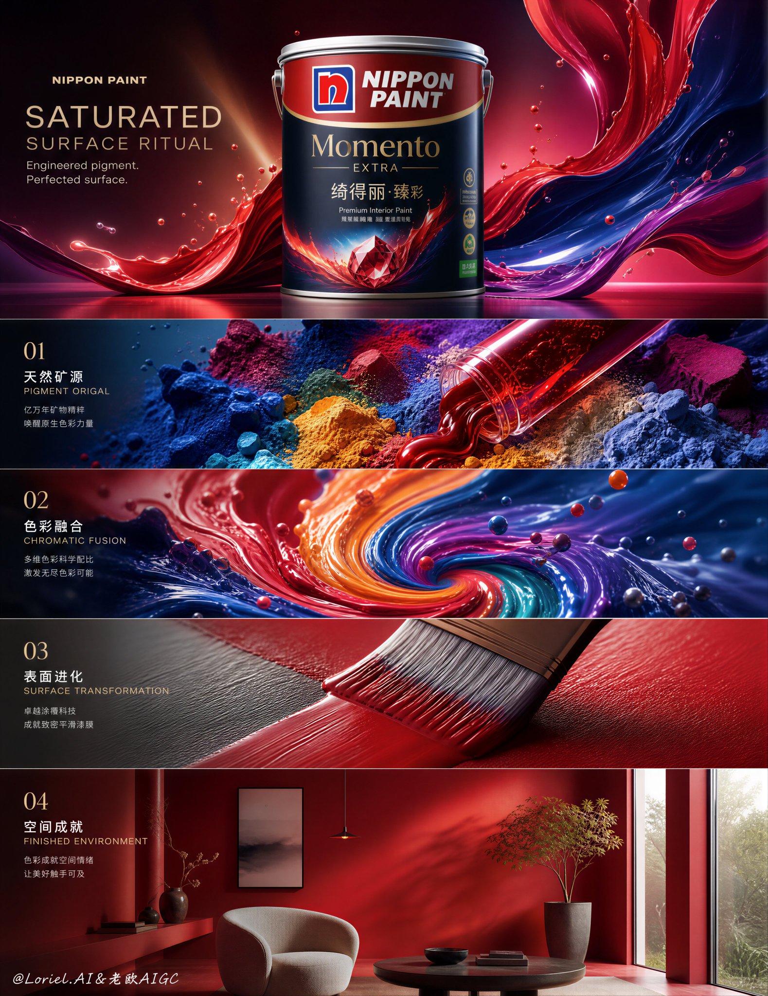
5-Grid Product Lineup5宫格产品序列 GPT- image 2 prompt Create an ultra-premium five-panel vertical advertising campaign board for Nippon Paint, designed as a saturated color-engineering ritual where the top panel presents the front-facing hero product with absolute dominance, and the four lower panels unfold like a refined industrial narrative of pigment birth, chromatic fusion, surface transformation, and completed architectural finish. The overall image must feel hyper-real, highly controlled, luxurious, and technologically poetic, like a flagship global paint campaign elevated into contemporary visual art. Preserve the structural discipline of a premium process board while pushing the entire palette into richer, more saturated, more luminous color territory. Core concept: The campaign should present Nippon Paint not simply as a paint brand, but as a master of color alchemy, where raw pigment, liquid flow, material chemistry, and finished living surfaces become one continuous visual ritual. The product must remain unmistakably central and commercially dominant, while every lower panel acts as an extension of the paint's inner world. The entire board should feel like color is being engineered, awakened, refined, and finally released into architecture and lifestyle. 5-panel structure: Use a clean vertical 5-panel board with strong premium hierarchy. Panel 1 at the top: one large hero panel for the main product. Panels 2 to 5 below: four smaller narrative panels in a refined stacked sequence, each showing a different stage of saturated color transformation. All five panels must feel visually unified through shared lighting discipline, premium material fidelity, elegant negative space, and a continuous vertical chromatic energy flow running through the entire composition. Panel 1, hero product: Show a hyper-real Nippon Paint can or premium paint bucket in a front-facing hero angle, perfectly upright, centered or slightly elevated in the composition, with strong product dominance and clean brand readability. The packaging must feel physically real, premium, precise, and beautifully lit. Surround the product with restrained but powerful color-energy cues: liquid pigment ribbons, suspended micro-droplets, fine mist, translucent paint membranes, soft reflective vapor, and layered chromatic gradients that suggest high-performance coating technology. The hero panel must feel rich, saturated, sharp, and iconic, like the master image of an international flagship campaign. Panel 2, pigment source: Visualize the birth of color as raw pigment matter in a hyper-detailed macro industrial-poetic scene. Show crushed mineral pigment, luminous powder clouds, glossy liquid concentrate, and saturated color particles gathering into controlled streams. The scene should feel tactile and scientific, but also elegant and cinematic. Color must feel dense, alive, and premium, not messy. Think of premium industrial beauty where pigment behaves like precious material. Panel 3, chromatic fusion: Show the color mixing stage as a powerful visual reaction chamber where multiple saturated paint tones spiral, fold, blend, and collide in a refined fluid choreography. Use hyper-real liquid dynamics, smooth vortex motion, glossy ribbons, suspended droplets, soft foam traces, and delicate micro-particles. The image should communicate formula intelligence and controlled intensity, as if the brand is engineering emotional color with exact precision. The result must feel luxurious, vivid, and technically mesmerizing. Panel 4, surface transformation: Show the paint becoming a perfected coating system. Present ultra-close material behavior: a brushstroke, roller pass, or smooth sheet-like paint membrane settling onto a premium wall or architectural surface. Emphasize coverage quality, density, edge clarity, surface tension, reflectivity control, and the transformation from wet liquid to flawless premium finish. The panel should feel calm, technical, and deeply satisfying, revealing the paint's material intelligence and superior performance. Panel 5, finished environment: Show the final architectural or interior result created by the paint, using a refined, aspirational, high-design space. This can be an elegant living room wall, a modern gallery-like corridor, a premium residential facade, or a sophisticated interior corner where the final coated surface becomes the emotional payoff of the entire campaign. The environment should feel minimal but elevated, allowing the saturated color to become the central atmosphere. The paint finish must feel rich, smooth, luxurious, and real, with subtle natural light revealing texture and depth. Product realism: Render the Nippon Paint product with absolute realism and commercial precision: front-facing hero angle, accurate packaging proportions, clean lid geometry, realistic metal or plastic material response, correct label placement, crisp printed branding, high-end packaging reflections, premium studio-light behavior, and world-class FMCG product photography quality. The product must never feel generic or approximate. Color direction: Push the campaign into a more saturated and premium chromatic world. Use a refined palette built from lacquer red, electric coral, deep cobalt, vivid ultramarine, rich saffron yellow, mineral teal, vivid vermilion, and dense magenta accents, balanced by clean neutrals, polished whites, graphite shadows, and soft silver-gray highlights. The color should feel intentional, expensive, and controlled, never cheap or noisy. Saturation must communicate power, confidence, and technological mastery. Typography: Use a premium typography system integrated into the board with elegant spacing and strong brand hierarchy. Because this is a Chinese market-facing product, use: Main Chinese title: “色彩成膜仪式” English secondary title: “SATURATED SURFACE RITUAL” Supporting English copy: “Engineered pigment. Perfected surface.” Typography should feel modern, refined, and architectural, with clean premium layout discipline. Use minimal official-style brand coding, not oversized or crude lettering. Brand coding: Preserve Nippon Paint identity through: product-led composition, high-fidelity packaging realism, advanced coating technology atmosphere, color-science storytelling, clean commercial hierarchy, premium architectural finishing, and elegant Asian-market campaign sophistication. The result must feel unmistakably like a top-tier Nippon Paint flagship visual. Lighting: Use extremely refined soft-commercial lighting with precise specular control. The hero panel should have premium studio lighting with sculpted highlights and rich shadow transitions. The process panels should feel more cinematic and tactile, revealing fluid behavior, particle depth, and surface texture. The final environment panel should use calm architectural light that makes the finished paint feel breathable, expensive, and emotionally resonant. Mood: saturated, premium, refined, engineered, vivid, tactile, architectural, luminous, controlled, technologically poetic, emotionally elevated, globally aspirational Rendering style: ultra-premium paint campaign board, front-facing hero product photography, saturated industrial color process storytelling, hyper-real fluid dynamics, luxury architectural finish, five-panel vertical layout, exquisite material realism, elegant Chinese and English typography system, 8k, world-class commercial image quality Negative prompt: cheap hardware-store ad, flat generic packaging, weak product dominance, dull colors, muddy paint, messy composition, low-detail liquid, cartoon coating effect, sloppy typography, noisy industrial clutter, amateur collage, oversaturated chaos, low-end retail poster
Translations
5-Grid Product Lineup5宫格产品序列 GPT- image 2 prompt Create an ultra-premium...
zh-CN5-Grid Product Lineup5宫格产品序列 GPT- image 2 prompt Create an ultra-premium five-panel vertical advertising campaign board for Nippon Paint, designed as a saturated color-engineering ritual where the top panel presents the front-facing hero product with absolute dominance, and the four lower panels unfold like a refined industrial narrative of pigment birth, chromatic fusion, surface transformation, and completed architectural finish. The overall image must feel hyper-real, highly controlled, luxurious, and technologically poetic, like a flagship global paint campaign elevated into contemporary visual art. Preserve the structural discipline of a premium process board while pushing the entire palette into richer, more saturated, more luminous color territory. Core concept: The campaign should present Nippon Paint not simply as a paint brand, but as a master of color alchemy, where raw pigment, liquid flow, material chemistry, and finished living surfaces become one continuous visual ritual. The product must remain unmistakably central and commercially dominant, while every lower panel acts as an extension of the paint's inner world. The entire board should feel like color is being engineered, awakened, refined, and finally released into architecture and lifestyle. 5-panel structure: Use a clean vertical 5-panel board with strong premium hierarchy. Panel 1 at the top: one large hero panel for the main product. Panels 2 to 5 below: four smaller narrative panels in a refined stacked sequence, each showing a different stage of saturated color transformation. All five panels must feel visually unified through shared lighting discipline, premium material fidelity, elegant negative space, and a continuous vertical chromatic energy flow running through the entire composition. Panel 1, hero product: Show a hyper-real Nippon Paint can or premium paint bucket in a front-facing hero angle, perfectly upright, centered or slightly elevated in the composition, with strong product dominance and clean brand readability. The packaging must feel physically real, premium, precise, and beautifully lit. Surround the product with restrained but powerful color-energy cues: liquid pigment ribbons, suspended micro-droplets, fine mist, translucent paint membranes, soft reflective vapor, and layered chromatic gradients that suggest high-performance coating technology. The hero panel must feel rich, saturated, sharp, and iconic, like the master image of an international flagship campaign. Panel 2, pigment source: Visualize the birth of color as raw pigment matter in a hyper-detailed macro industrial-poetic scene. Show crushed mineral pigment, luminous powder clouds, glossy liquid concentrate, and saturated color particles gathering into controlled streams. The scene should feel tactile and scientific, but also elegant and cinematic. Color must feel dense, alive, and premium, not messy. Think of premium industrial beauty where pigment behaves like precious material. Panel 3, chromatic fusion: Show the color mixing stage as a powerful visual reaction chamber where multiple saturated paint tones spiral, fold, blend, and collide in a refined fluid choreography. Use hyper-real liquid dynamics, smooth vortex motion, glossy ribbons, suspended droplets, soft foam traces, and delicate micro-particles. The image should communicate formula intelligence and controlled intensity, as if the brand is engineering emotional color with exact precision. The result must feel luxurious, vivid, and technically mesmerizing. Panel 4, surface transformation: Show the paint becoming a perfected coating system. Present ultra-close material behavior: a brushstroke, roller pass, or smooth sheet-like paint membrane settling onto a premium wall or architectural surface. Emphasize coverage quality, density, edge clarity, surface tension, reflectivity control, and the transformation from wet liquid to flawless premium finish. The panel should feel calm, technical, and deeply satisfying, revealing the paint's material intelligence and superior performance. Panel 5, finished environment: Show the final architectural or interior result created by the paint, using a refined, aspirational, high-design space. This can be an elegant living room wall, a modern gallery-like corridor, a premium residential facade, or a sophisticated interior corner where the final coated surface becomes the emotional payoff of the entire campaign. The environment should feel minimal but elevated, allowing the saturated color to become the central atmosphere. The paint finish must feel rich, smooth, luxurious, and real, with subtle natural light revealing texture and depth. Product realism: Render the Nippon Paint product with absolute realism and commercial precision: front-facing hero angle, accurate packaging proportions, clean lid geometry, realistic metal or plastic material response, correct label placement, crisp printed branding, high-end packaging reflections, premium studio-light behavior, and world-class FMCG product photography quality. The product must never feel generic or approximate. Color direction: Push the campaign into a more saturated and premium chromatic world. Use a refined palette built from lacquer red, electric coral, deep cobalt, vivid ultramarine, rich saffron yellow, mineral teal, vivid vermilion, and dense magenta accents, balanced by clean neutrals, polished whites, graphite shadows, and soft silver-gray highlights. The color should feel intentional, expensive, and controlled, never cheap or noisy. Saturation must communicate power, confidence, and technological mastery. Typography: Use a premium typography system integrated into the board with elegant spacing and strong brand hierarchy. Because this is a Chinese market-facing product, use: Main Chinese title: “色彩成膜仪式” English secondary title: “SATURATED SURFACE RITUAL” Supporting English copy: “Engineered pigment. Perfected surface.” Typography should feel modern, refined, and architectural, with clean premium layout discipline. Use minimal official-style brand coding, not oversized or crude lettering. Brand coding: Preserve Nippon Paint identity through: product-led composition, high-fidelity packaging realism, advanced coating technology atmosphere, color-science storytelling, clean commercial hierarchy, premium architectural finishing, and elegant Asian-market campaign sophistication. The result must feel unmistakably like a top-tier Nippon Paint flagship visual. Lighting: Use extremely refined soft-commercial lighting with precise specular control. The hero panel should have premium studio lighting with sculpted highlights and rich shadow transitions. The process panels should feel more cinematic and tactile, revealing fluid behavior, particle depth, and surface texture. The final environment panel should use calm architectural light that makes the finished paint feel breathable, expensive, and emotionally resonant. Mood: saturated, premium, refined, engineered, vivid, tactile, architectural, luminous, controlled, technologically poetic, emotionally elevated, globally aspirational Rendering style: ultra-premium paint campaign board, front-facing hero product photography, saturated industrial color process storytelling, hyper-real fluid dynamics, luxury architectural finish, five-panel vertical layout, exquisite material realism, elegant Chinese and English typography system, 8k, world-class commercial image quality Negative prompt: cheap hardware-store ad, flat generic packaging, weak product dominance, dull colors, muddy paint, messy composition, low-detail liquid, cartoon coating effect, sloppy typography, noisy industrial clutter, amateur collage, oversaturated chaos, low-end retail poster