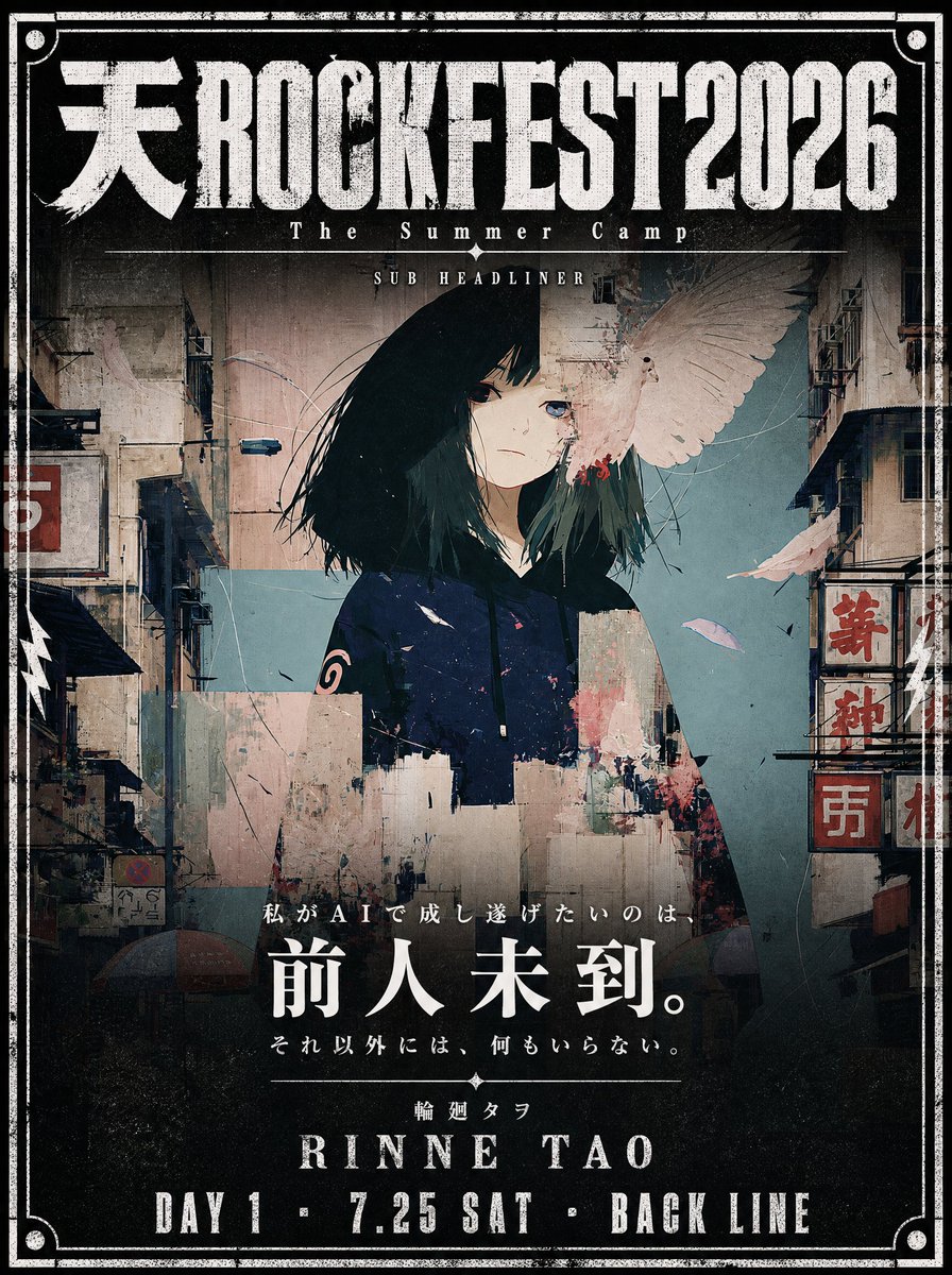
电影感音乐节海报设计
一个用于根据现有角色插画创作电影感音乐节海报的精细化提示词,包含做旧字体效果和特定的布局区域要求。
- Category
- Posters & Typography
- Model
- GPT Image 2
- Creator
- 輪廻タヲ ☯ AI Artist
- Source language
- en
- Source ID
- 21089
- Published
- May 17, 2026
Full prompt
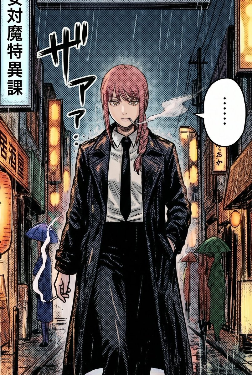
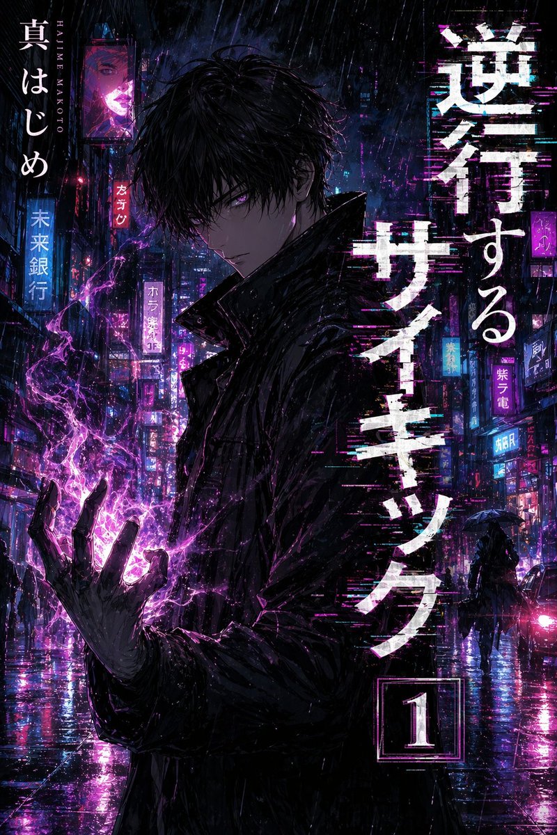
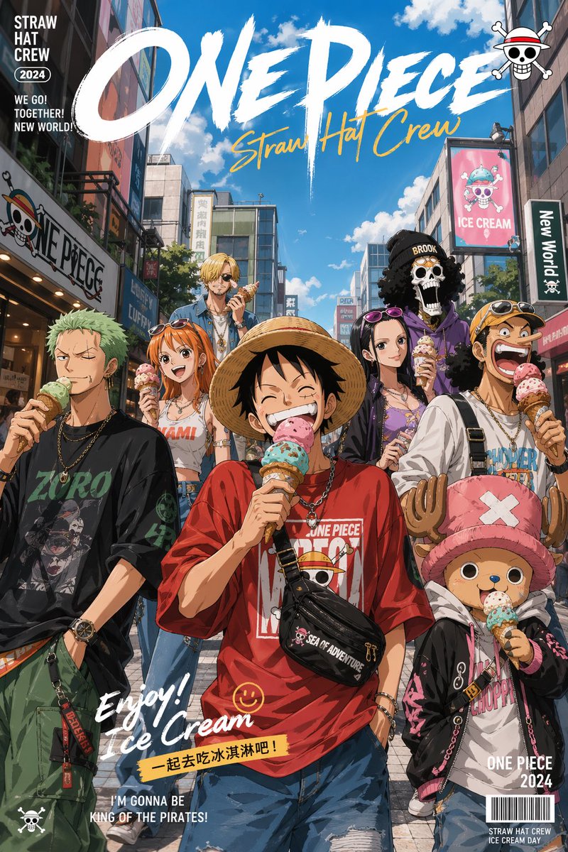
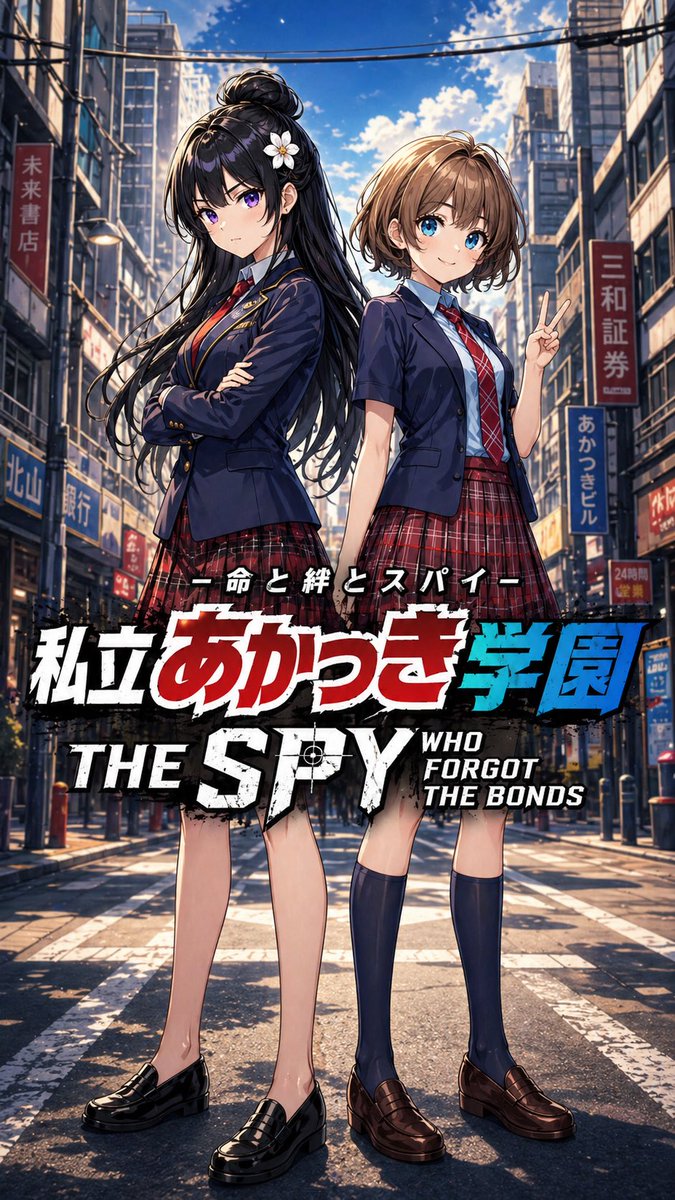
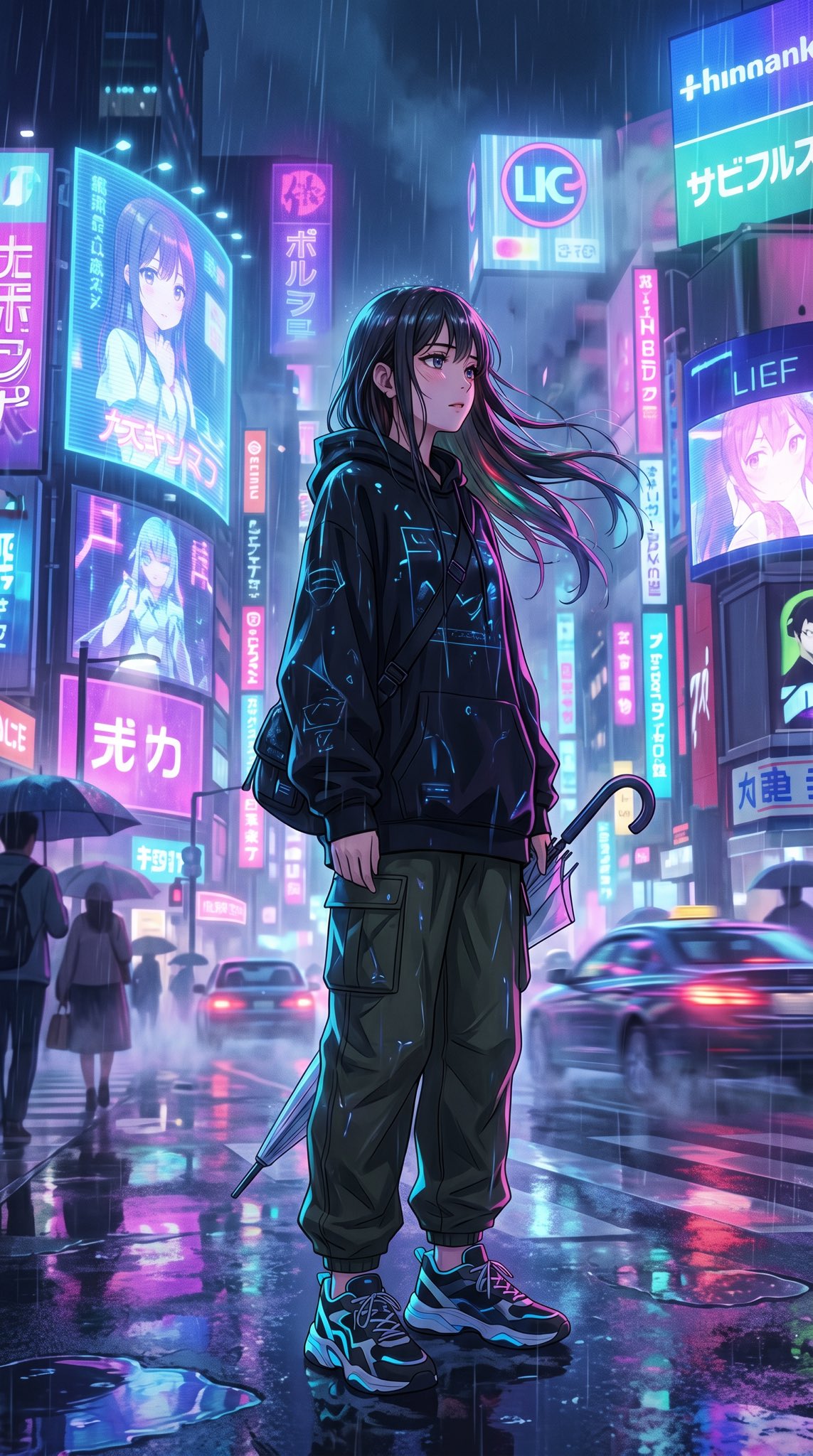
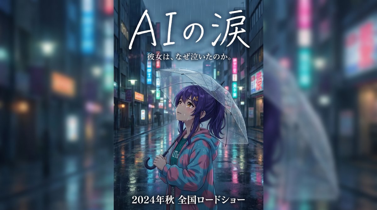
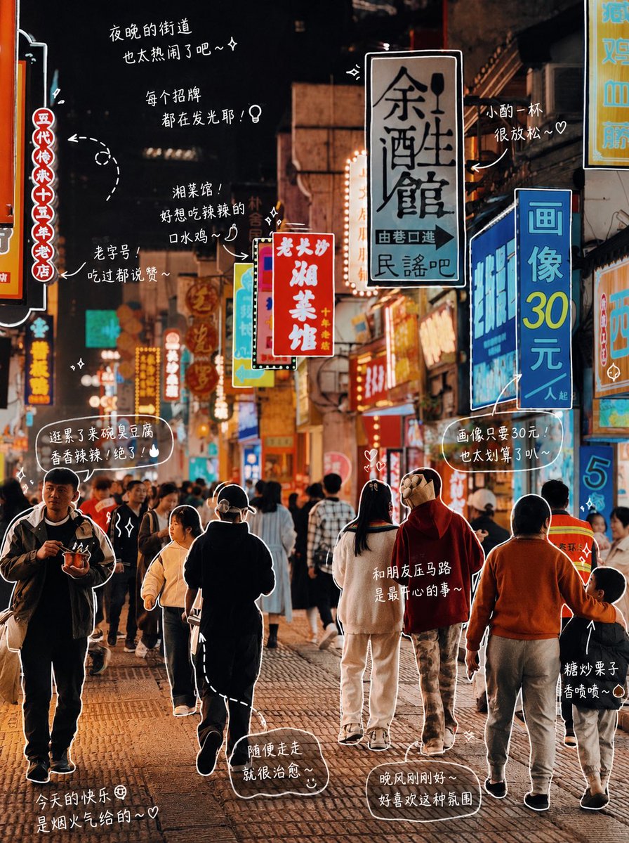
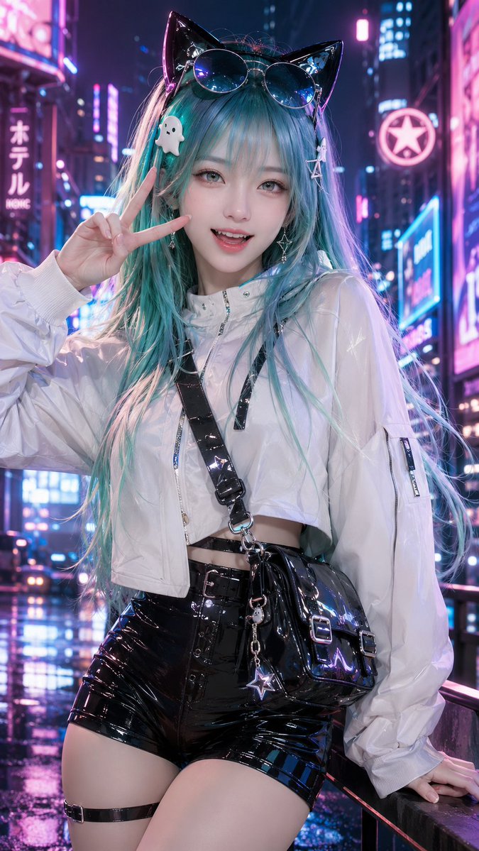
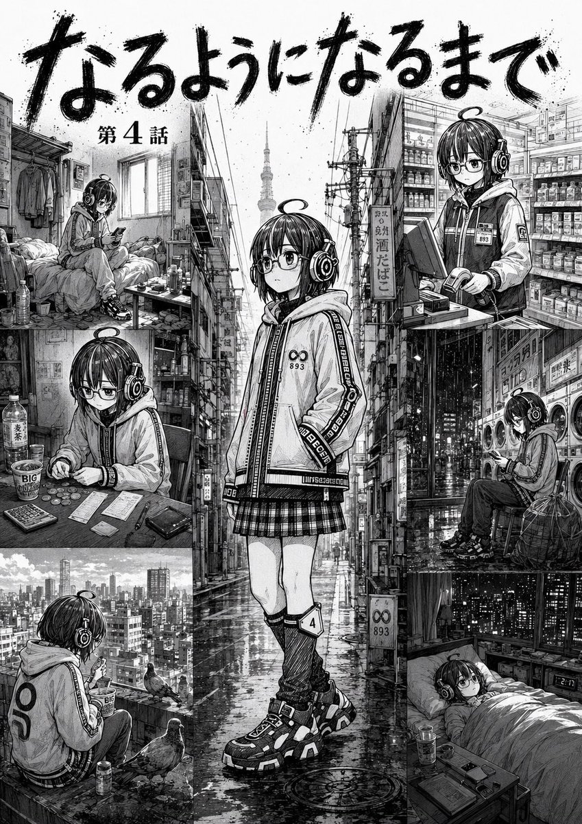
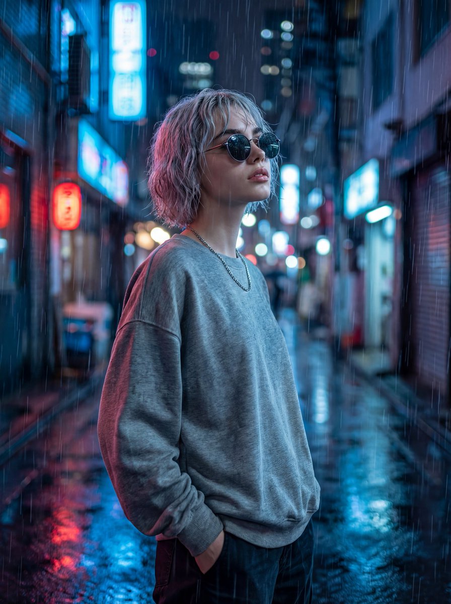
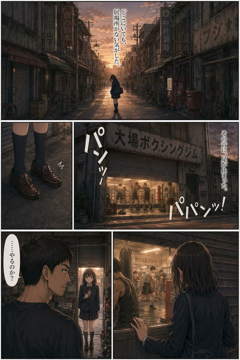
Use the attached illustration as the main visual. Do not alter the character, face, or art style in any way.

Create a vertical music festival poster (portrait, 2:3 ratio) with a dark, cinematic atmosphere.

---

LAYOUT:

- The illustration fills the full poster as background
- The character's face must be clearly visible — keep the center of the image free from heavy overlays
- Dark gradient overlay at the very top (behind title text only) and at the bottom (behind artist info only)
- The middle zone where the face appears should remain mostly unobscured
- The illustration should occupy as much of the poster as possible — minimize the text footprint
- The illustration must bleed into the catchcopy zone — the image should remain visible and partially unobscured all the way down through {argument name="catchcopy end" default="[ここにキャッチコピー最終行]"} — only the very bottom (artist name and date line) needs a solid dark background
- The bottom text block must be kept as small and tight as possible — prioritize illustration space over text size
- All text in white

---

TOP AREA:

Title logotype — "天ROCKFEST2026":
Ultra-bold slab or condensed gothic hybrid font, heavily distressed with uneven ink coverage, stamp-pressed texture, roughened edges as if screen-printed on a worn surface — think overinked woodblock print meets industrial stencil. Characters should feel physically heavy and slightly irregular, NOT clean digital type. The kanji "天" and Latin "ROCKFEST2026" must read as one unified logotype with consistent damage texture throughout. Color: solid white with ink-dropout gaps revealing the dark background beneath.

Below the title logotype:
  Small spaced text (clean, thin): The Summer Camp
  Thin horizontal rule with small star or diamond ornaments at center
  Very small all-caps text: SUB HEADLINER

---

BOTTOM AREA:

The entire bottom text block must occupy no more than 18% of the total poster height — keep every text element as compact and tight as possible.
The dark gradient at the bottom should begin only below {argument name="catchcopy line" default="[ここにキャッチコピー最終行]"} — the catchcopy lines sit directly over the illustration with only a very subtle dark veil, not a solid overlay. The solid dark background applies only to the artist name and date line at the very bottom.

Line 1 — very small size, wide letter-spacing, distressed display font — worn ink texture and rough edges, consistent with the title logotype:
  {argument name="first catchcopy" default="[ここにキャッチコピー1行目]"}

Line 2 — small Japanese mincho/serif, heavy weight, clean (no distress):
  {argument name="main catchcopy" default="[ここにキャッチコピーのメインフレーズ(最も印象的な一文)]"}

[Generous vertical margin between Line 2 and Line 3]

Line 3 — small size, wide letter-spacing, thin weight, clean:
  {argument name="final catchcopy" default="[ここにキャッチコピー最終行]"}

Thin horizontal rule with small diamond ornament at center

Line 4 — very small, wide letter-spacing:
  {argument name="artist name" default="[ここにアーティスト名(日本語)]"}

Line 5 — very large display font, elegant tracking, distressed weight
Translations
电影感音乐节海报设计
enUse the attached illustration as the main visual. Do not alter the character, face, or art style in any way. Create a vertical music festival poster (portrait, 2:3 ratio) with a dark, cinematic atmosphere. --- LAYOUT: - The illustration fills the full poster as background - The character's face must be clearly visible — keep the center of the image free from heavy overlays - Dark gradient overlay at the very top (behind title text only) and at the bottom (behind artist info only) - The middle zone where the face appears should remain mostly unobscured - The illustration should occupy as much of the poster as possible — minimize the text footprint - The illustration must bleed into the catchcopy zone — the image should remain visible and partially unobscured all the way down through {argument name="catchcopy end" default="[ここにキャッチコピー最終行]"} — only the very bottom (artist name and date line) needs a solid dark background - The bottom text block must be kept as small and tight as possible — prioritize illustration space over text size - All text in white --- TOP AREA: Title logotype — "天ROCKFEST2026": Ultra-bold slab or condensed gothic hybrid font, heavily distressed with uneven ink coverage, stamp-pressed texture, roughened edges as if screen-printed on a worn surface — think overinked woodblock print meets industrial stencil. Characters should feel physically heavy and slightly irregular, NOT clean digital type. The kanji "天" and Latin "ROCKFEST2026" must read as one unified logotype with consistent damage texture throughout. Color: solid white with ink-dropout gaps revealing the dark background beneath. Below the title logotype: Small spaced text (clean, thin): The Summer Camp Thin horizontal rule with small star or diamond ornaments at center Very small all-caps text: SUB HEADLINER --- BOTTOM AREA: The entire bottom text block must occupy no more than 18% of the total poster height — keep every text element as compact and tight as possible. The dark gradient at the bottom should begin only below {argument name="catchcopy line" default="[ここにキャッチコピー最終行]"} — the catchcopy lines sit directly over the illustration with only a very subtle dark veil, not a solid overlay. The solid dark background applies only to the artist name and date line at the very bottom. Line 1 — very small size, wide letter-spacing, distressed display font — worn ink texture and rough edges, consistent with the title logotype: {argument name="first catchcopy" default="[ここにキャッチコピー1行目]"} Line 2 — small Japanese mincho/serif, heavy weight, clean (no distress): {argument name="main catchcopy" default="[ここにキャッチコピーのメインフレーズ(最も印象的な一文)]"} [Generous vertical margin between Line 2 and Line 3] Line 3 — small size, wide letter-spacing, thin weight, clean: {argument name="final catchcopy" default="[ここにキャッチコピー最終行]"} Thin horizontal rule with small diamond ornament at center Line 4 — very small, wide letter-spacing: {argument name="artist name" default="[ここにアーティスト名(日本語)]"} Line 5 — very large display font, elegant tracking, distressed weight
电影感音乐节海报设计
zh-CN请使用随附的插画作为主视觉。严禁以任何方式更改角色、面部或艺术风格。 创作一张竖版音乐节海报(纵向,2:3 比例),营造黑暗、电影感的氛围。 --- 布局: - 插画作为背景铺满整个海报 - 必须清晰展现角色面部 —— 保持图像中心区域无厚重遮盖 - 仅在顶部(标题文字后方)和底部(艺术家信息后方)添加深色渐变遮罩 - 面部所在的中间区域应保持基本无遮挡 - 插画应尽可能占据海报的大部分空间 —— 尽量缩小文字占用的面积 - 插画必须延伸至宣传语区域 —— 图像应保持可见并部分无遮挡,一直贯穿至 [此处插入最后一行宣传语] —— 仅最底部(艺术家姓名和日期行)需要纯色深色背景 - 底部文字块必须尽可能保持小巧紧凑 —— 优先考虑插画空间,而非文字大小 - 所有文字均为白色 --- 顶部区域: 标题 Logo —— "{argument name="festival title" default="TEN-ROCKFEST2026"}": 超粗板式字体或压缩哥特混合字体,带有明显的做旧效果,如油墨覆盖不均、印章质感、边缘粗糙,仿佛在磨损的表面上丝网印刷而成 —— 类似于过度上墨的木刻版画与工业模板的结合。字符应具有物理重量感且略显不规则,而非干净的数字字体。汉字“天”与拉丁字母“ROCKFEST2026”必须作为一个统一的 Logo 阅读,并保持一致的破损纹理。颜色:纯白色,带有油墨脱落的缝隙,露出下方的深色背景。 标题 Logo 下方: 小号间距文字(干净、纤细):The Summer Camp 纤细水平线,中心带有小星星或菱形装饰 极小号全大写文字:SUB HEADLINER --- 底部区域: 整个底部文字块占用的高度不得超过海报总高度的 18% —— 保持每个文字元素尽可能紧凑。 底部的深色渐变应仅从 [此处插入最后一行宣传语] 下方开始 —— 宣传语行直接置于插画之上,仅覆盖极淡的深色面纱,而非实心遮罩。实心深色背景仅应用于最底部的艺术家姓名和日期行。 第 1 行 —— 极小字号,宽字间距,做旧展示字体 —— 磨损的油墨质感和粗糙边缘,与标题 Logo 风格一致: [此处插入第一行宣传语] 第 2 行 —— 小号日文明朝体/衬线体,加粗,干净(无做旧): {argument name="main catchcopy" default="[此处插入宣传语主句]"} [第 2 行与第 3 行之间留出充裕的垂直间距] 第 3 行 —— 小号字号,宽字间距,纤细字重,干净: [此处插入最后一行宣传语] 纤细水平线,中心带有小菱形装饰 第 4 行 —— 极小字号,宽字间距: {argument name="artist name" default="[此处插入日文艺术家姓名]"} 第 5 行 —— 超大号展示字体,优雅的字间距,做旧字重