Charts & InfographicsYouMindcharts-infographics图表信息图en
日本 AI 咨询 OGP 横幅
为生成式 AI 落地实施及职场应用支持服务,制作一张简洁的日式企业级 OGP 横幅。
- Category
- Charts & Infographics
- Model
- GPT Image 2
- Creator
- はな🌸"あなたの色"で輝くお手伝い
- Source language
- en
- Source ID
- 24198
- Published
- Jun 4, 2026
Full prompt
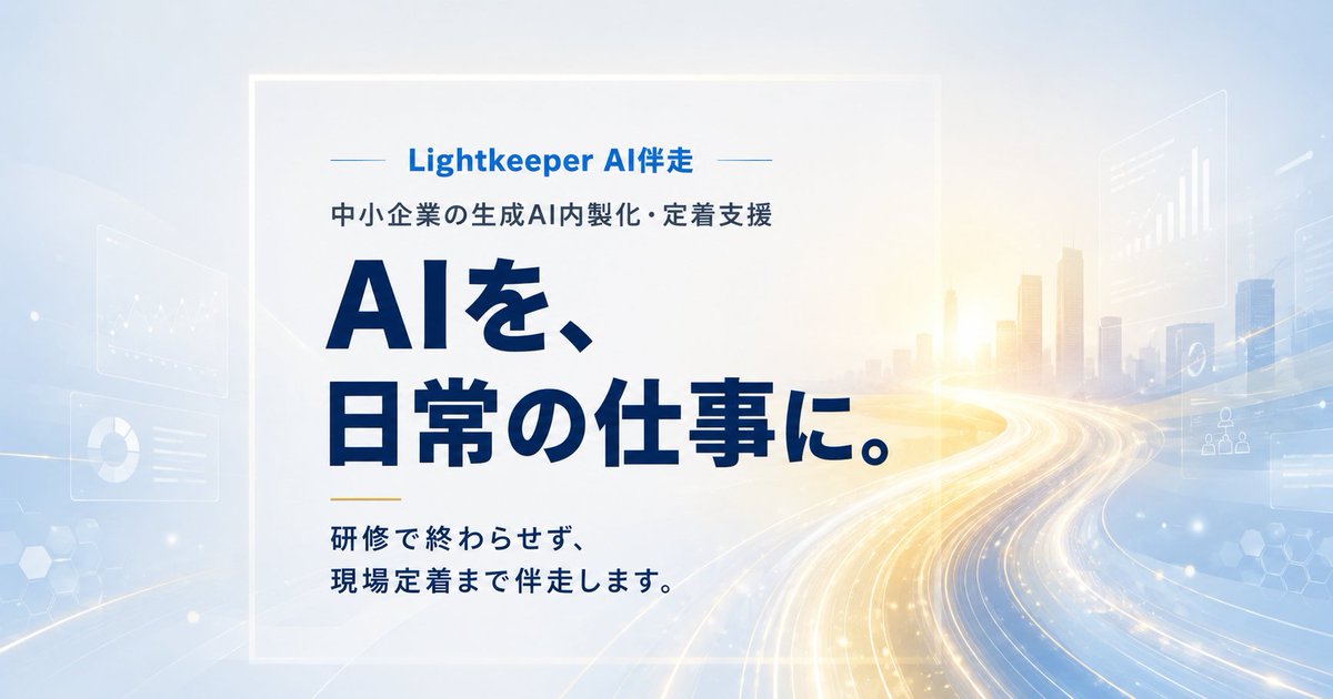
Goal: Create a polished Japanese OGP/social media banner for a B2B generative AI implementation support service, emphasizing AI becoming part of daily work.

Canvas: Wide horizontal 1200×630 px banner, clean corporate technology style, bright and trustworthy. Use a pale sky-blue to white gradient background with a soft sunrise glow on the right.

Layout: Place a semi-transparent frosted white rectangular panel slightly left of center, occupying about 55% of the width and 82% of the height, with a subtle white border and soft shadow. All main text sits inside this panel, left aligned. The right half shows a futuristic city skyline fading into the background, with sweeping highway-like light trails curving from the lower right toward the center.

Text content: At the top of the panel, add a small blue brand line with thin horizontal decorative lines on both sides: {argument name="brand text" default="Lightkeeper AI伴走"}. Beneath it, add a smaller dark navy subtitle: {argument name="subtitle text" default="中小企業の生成AI内製化・定着支援"}. The main headline is very large, bold, dark navy Japanese type on two lines: {argument name="headline text" default="AIを、\n日常の仕事に。"}. Near the bottom left, add a short gold horizontal accent line, then a smaller bold navy supporting message on two lines: {argument name="supporting text" default="研修で終わらせず、\n現場定着まで伴走します。"}.

Visual style: Use modern Japanese sans-serif typography, heavy weight for the headline, crisp spacing, high contrast navy text. Color palette: deep navy, medium corporate blue, soft white, pale cyan, and warm gold highlights. Add translucent floating UI panels in the background: exactly 5 faint panels, including 1 line chart card on the left, 1 donut chart card on the lower left, 1 bar chart card upper right, 1 organization/network icon card mid-right, and 1 small abstract data card far right. Add subtle hexagon patterns and small glowing particles, but keep the design uncluttered.

Constraints: Preserve the Japanese text exactly as written in the default values. No people, no logo icon, no watermark, no mockup frame, no extra text. Ensure the final banner feels like a professional landing-page hero or OGP image for an AI consulting service.