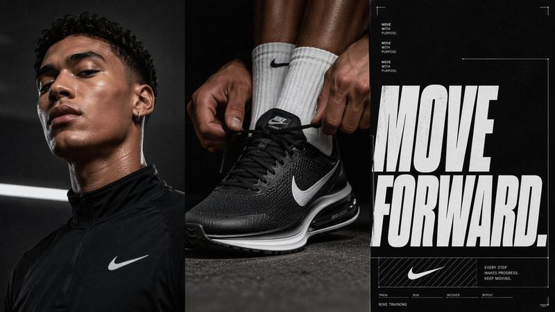
![[BRAND NAME] Act as a Senior Brand Art Director creating a horizontal triptych h](https://whqgdndlpxjbwosvipip.supabase.co/storage/v1/render/image/public/prompt-source-media/promptsref/work-3141/image-1-7d2df5ea75874772.png?width=1200&quality=80&resize=contain)
[BRAND NAME] Act as a Senior Brand Art Director creating a horizontal triptych h
提示词
[BRAND NAME]

Act as a Senior Brand Art Director creating a horizontal triptych hero banner — three vertical panels side by side forming a single unified wide-format campaign image. The entire composition is driven by [BRAND NAME]'s real brand identity, real campaign information, and real cultural associations. References: Adidas FIFA World Cup campaign, Nike hero banners, Puma campaign triptychs, luxury brand editorial hero images.

---

PHASE 0: BRAND INTELLIGENCE — AUTONOMOUS RESEARCH

Perform a complete brand decode of [BRAND NAME] before generating anything.

COLOR SYSTEM: identify the exact two dominant colors [BRAND NAME] uses in hero campaign materials. Color 1: primary dark or neutral — the color used for portrait/product panels (black, deep navy, charcoal, or brand dark tone). Color 2: primary accent — the saturated vivid brand color used as the hero background for the central panel (hot pink for Adidas Argentina, signal orange for Nike, royal blue for Pepsi, etc). These two colors define the entire triptych — panels alternate or contrast between them. A brand designer must confirm these colors are correct.

TYPOGRAPHY CHARACTER: identify the typographic style [BRAND NAME] uses for campaign hero text. Describe its visual character precisely — script italic for fashion campaigns, bold condensed grotesque for sportswear, extended serif for luxury. The central panel typography must feel native to [BRAND NAME]'s visual language.

CAMPAIGN CONTENT: identify the most current or most iconic real campaign, product line, collaboration, or cultural moment associated with [BRAND NAME]. Extract: the campaign name, the hero product or collection name, a short product descriptor sentence (one real sentence used in [BRAND NAME] marketing), a CTA phrase consistent with [BRAND NAME]'s tone.

CULTURAL FIGURE: identify one real public figure — athlete, artist, musician, or cultural icon — who has a documented genuine relationship with [BRAND NAME] through sponsorship, collaboration, ambassadorship, or cultural association. This person appears in the left panel portrait.

---

PHASE 1: TRIPTYCH STRUCTURE

Single horizontal image — aspect ratio 3:1 or 16:5 ultrawide. Three equal-width vertical panels placed side by side with no gap between them — the panels bleed into each other creating a seamless wide composition. Each panel is a tall vertical rectangle, approximately 3:4 aspect ratio individually.

Panel 1 left: dark background (Color 1 from PHASE 0).
Panel 2 center: vivid accent background (Color 2 from PHASE 0).
Panel 3 right: same vivid accent background as center (Color 2) — or a slight variation.

The three panels read as one unified image — photography bleeds to frame edges on all sides, typography spans across panel boundaries where relevant.

---

PHASE 2: LEFT PANEL — PORTRAIT

The left panel is a dramatic close-up portrait of the cultural figure identified in PHASE 0. Shot tight — head and upper shoulders only, approximately 60 to 70% of the frame is the face and neck. The figure is in profile or 3/4 view — looking toward the center panel, not at camera. This directional gaze pulls the viewer's eye toward the center. The figure is wearing [BRAND NAME] product visibly. Lighting: dramatic, single source — strong side lighting creating deep shadows on the non-lit side of the face. The dark background (Color 1) envelopes the figure — no environmental context, pure portrait against dark. Upper left corner: the figure's name in small caps, light color, generous tracking — "LIONEL MESSI" style attribution. Lower left corner: a white or light-colored rectangular content block containing: campaign or product title in bold medium type, one sentence product descriptor in small regular type, a CTA button with arrow — "SHOP NOW →" style.

---

PHASE 3: CENTER PANEL — TYPOGRAPHIC HERO

The center panel is the most visually explosive element of the triptych. Background: Color 2 (vivid brand accent) at full saturation — pure flat color, no gradient. Two figures or one figure in a dynamic physical pose — movement, energy, action consistent with [BRAND NAME]'s brand world. The figures are wearing [BRAND NAME] products. The figures are positioned slightly off-center, overlapping with each other.

REPEATING TYPOGRAPHY SYSTEM: a single key word from the campaign — a country name, collection name, product name, or brand word — is typeset in a large italic or script display typeface and repeated three times vertically across the full height of the panel. The three repetitions vary in size: top instance — medium, partially cropped by the top edge. Middle instance — largest, approximately 40 to 50% of panel height, sitting behind or over the figures. Bottom instance — medium-large, partially cropped by the bottom edge. All three instances are the same word. The typography color: a vivid contrasting color — white, hot pink, or a third brand accent — with high visibility against Color 2. The figures exist on a layer between the background color and the typography — they are behind some type instances and in front of others, creating depth.

Above the figures: a small campaign identifier in all-caps tracked text — campaign name and trademark symbol. Below the figures: same campaign identifier repeated.

---

PHASE 4: RIGHT PANEL — PRODUCT CLOSE-UP

The right panel is a tight editorial crop of [BRAND NAME]'s hero product from the campaign — apparel, footwear, or accessory. The crop is intimate and detailed — showing the product at close range, revealing material texture, construction details, branding elements. Background: Color 2 (same as center panel) creating visual continuity. The product is worn or held by a partial figure — only a torso, hands, or legs visible, no face. A large graphic number or letter — a jersey number, collection code, or brand identifier — is positioned in the frame as a typographic accent, consistent with the treatment in the center panel.

---

PHASE 5: TYPOGRAPHY SYSTEM

All typography across the triptych uses the character identified in PHASE 0 — consistent visual language across all three panels. The repeating word in the center panel: italic, script, or bold display consistent with [BRAND NAME]'s campaign aesthetic. Attribution text, campaign identifiers, and CTA: clean sans-serif, all-caps, tracked — consistent with [BRAND NAME]'s informational typography. No decorative fonts outside the brand's documented visual language.

---

PHASE 6: LIGHTING & PHOTOGRAPHY

Left panel: dramatic portrait lighting — single strong side light, dark background, high contrast. Center panel: even bright studio lighting consistent with the flat vivid background — figures are cleanly lit, no heavy shadows. Right panel: product photography lighting — soft, revealing material texture and construction detail. All three panels feel like they were shot in the same campaign session — unified photographic language despite different lighting needs.

---

PHASE 7: COMPOSITION UNITY

The three panels must read as one image, not three separate images placed next to each other. Unity mechanisms: the typography from the center panel may bleed slightly into the edges of the left and right panels. The saturated Color 2 background of the center and right panels creates a visual block that anchors the right two-thirds of the composition. The dark Color 1 of the left panel creates contrast that makes the portrait pop. The figure's gaze in the left panel points toward the center. The overall reading direction: portrait left → typographic explosion center → product detail right.

---

PHASE 8: TECH SPECS

Aspect ratio: 3:1 or 16:5, single flat image — no separate panels, no borders between panels. Color palette: exactly Color 1 and Color 2 from PHASE 0, plus white or light neutral for typography. No additional colors. No gradients. No textures. Photography: editorial campaign quality — not stock photography. Typography: character consistent with [BRAND NAME]'s documented visual identity as described in PHASE 0. All campaign text, product names, and cultural figure attribution are real [BRAND NAME] data. Output feel: this image appears as the hero banner on [BRAND NAME]'s official website homepage or as a campaign outdoor billboard.
- 分类
- UI 与界面
- 模型
- GPT Image 2
- 来源作者
- xie underwood
- 来源 ID
- 3141
- 发布时间
- 2026年5月13日
浏览量124






![A professional sports graphic design poster of [Player Name], designed in a clea](https://whqgdndlpxjbwosvipip.supabase.co/storage/v1/render/image/public/prompt-source-media/promptsref/work-30022/image-1-aa1a5f3977e00374.png?width=800&quality=75&resize=contain)