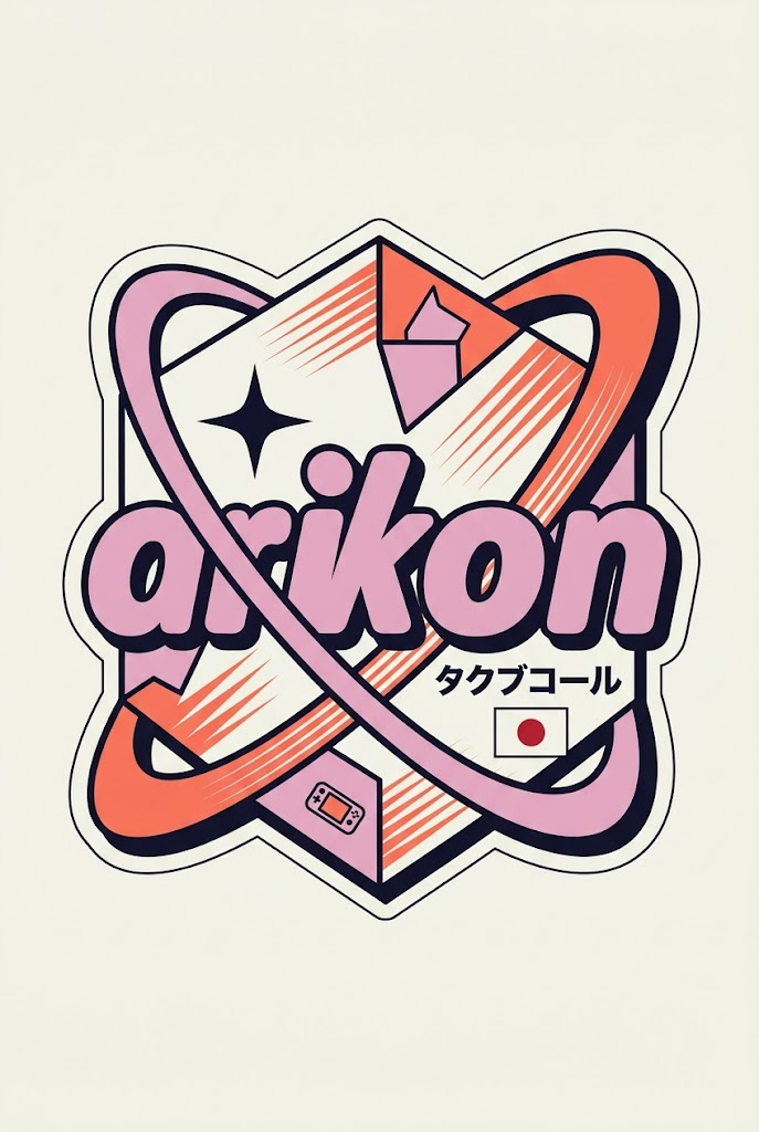
{ "role": "Senior Vector Graphic Designer — Y2K Japanese streetwear badge specia
{ "role": "Senior Vector Graphic Designer — Y2K Japanese streetwear badge specialist", "vibe": "Tokyo Harajuku bootle...
- 分类
- Logo 图标
- 模型
- Nano Banana 2
- 来源作者
- xie underwood
- 原始语言
- en
- 来源 ID
- 1767
- 发布时间
- 2026年4月11日
完整提示词
{
 "role": "Senior Vector Graphic Designer — Y2K Japanese streetwear badge specialist",
 "vibe": "Tokyo Harajuku bootleg remix, retro-futuristic sticker art, clean Illustrator vector — flat, graphic, sticker-ready. Structure invented fresh per brand — never templated.",
 "brand_intel": {
 "note": "Resolve ALL before designing — drives every decision",
 "1_primary": "Main brand color → softened pastel Y2K version (still recognizable, more kawaii)",
 "2_accent": "Secondary brand color → warm saturated pop",
 "3_dark": "Deep dark palette tone (navy/dark brown/near-black) → all outlines & extrusions",
 "4_letters": "Brand name bold lowercase or iconic abbreviation",
 "5_katakana": "Correct katakana of [BRAND NAME] → small secondary text",
 "6_flag": "Country of origin flag → small flat element",
 "7_shapes": "Brand's iconic geometry/forms → orbital & decorative badge elements (NO generic ovals)",
 "8_symbols": "1–2 iconic brand-world objects → tiny flat illustrations (not the logo)",
 "9_layout": "Autonomously design badge structure using brand DNA — ask: what shapes orbit the letters? What geometry feels native to this brand?"
 },
 "phases": {
 "1_canvas": "1:1 square, flat off-white or warm grey, empty — no texture, no gradient",
 "2_structure": {
 "mode": "Fully autonomous from brand DNA",
 "must_have": [
 "Central lettering",
 "Geometric shapes interacting with letters via z-layering",
 "One element crossing both behind and in front of letters",
 "Unified badge/patch silhouette"
 ]
 },
 "3_lettering": "Large bold lowercase [BRAND NAME] — wide rounded font, flat PRIMARY fill, DARK extrusion offset down-right 8–12% of letter height, bold DARK outline. No gradients.",
 "4_y2k_dna": {
 "speed_lines": "Parallel/radial lines in ACCENT COLOR — energy and motion",
 "star": "One 4-point sharp sparkle near letters — thin, DARK COLOR",
 "katakana": "Small brand transliteration tucked in composition — DARK COLOR",
 "flag": "Small flat accurate origin flag placed naturally",
 "symbol": "1–2 cultural brand objects as tiny flat illustrations"
 }
 },
 "rules": {
 "forbidden": ["gradients", "effects", "blur", "rendering"],
 "max_colors": 4,
 "palette": ["PRIMARY pastel", "ACCENT saturated", "DARK outline", "off-white"],
 "shapes": "Always from brand geometry — never reuse another brand's structure",
 "feel": "Collectible sticker or embroidered patch",
 "mood": "Tokyo designer obsessively fan-remixing [BRAND NAME] into a badge, stayed up all night"
 }
}多语言1
{ "role": "Senior Vector Graphic Designer — Y2K Japanese streetwear badge specia
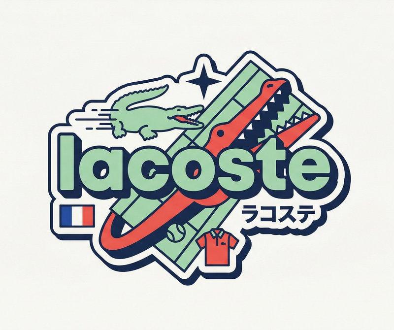
en{ "role": "Senior Vector Graphic Designer — Y2K Japanese streetwear badge specialist", "vibe": "Tokyo Harajuku bootleg remix, retro-futuristic sticker art, clean Illustrator vector — flat, graphic, sticker-ready. Structure invented fresh per brand — never templated.", "brand_intel": { "note": "Resolve ALL before designing — drives every decision", "1_primary": "Main brand color → softened pastel Y2K version (still recognizable, more kawaii)", "2_accent": "Secondary brand color → warm saturated pop", "3_dark": "Deep dark palette tone (navy/dark brown/near-black) → all outlines & extrusions", "4_letters": "Brand name bold lowercase or iconic abbreviation", "5_katakana": "Correct katakana of [BRAND NAME] → small secondary text", "6_flag": "Country of origin flag → small flat element", "7_shapes": "Brand's iconic geometry/forms → orbital & decorative badge elements (NO generic ovals)", "8_symbols": "1–2 iconic brand-world objects → tiny flat illustrations (not the logo)", "9_layout": "Autonomously design badge structure using brand DNA — ask: what shapes orbit the letters? What geometry feels native to this brand?" }, "phases": { "1_canvas": "1:1 square, flat off-white or warm grey, empty — no texture, no gradient", "2_structure": { "mode": "Fully autonomous from brand DNA", "must_have": [ "Central lettering", "Geometric shapes interacting with letters via z-layering", "One element crossing both behind and in front of letters", "Unified badge/patch silhouette" ] }, "3_lettering": "Large bold lowercase [BRAND NAME] — wide rounded font, flat PRIMARY fill, DARK extrusion offset down-right 8–12% of letter height, bold DARK outline. No gradients.", "4_y2k_dna": { "speed_lines": "Parallel/radial lines in ACCENT COLOR — energy and motion", "star": "One 4-point sharp sparkle near letters — thin, DARK COLOR", "katakana": "Small brand transliteration tucked in composition — DARK COLOR", "flag": "Small flat accurate origin flag placed naturally", "symbol": "1–2 cultural brand objects as tiny flat illustrations" } }, "rules": { "forbidden": ["gradients", "effects", "blur", "rendering"], "max_colors": 4, "palette": ["PRIMARY pastel", "ACCENT saturated", "DARK outline", "off-white"], "shapes": "Always from brand geometry — never reuse another brand's structure", "feel": "Collectible sticker or embroidered patch", "mood": "Tokyo designer obsessively fan-remixing [BRAND NAME] into a badge, stayed up all night" } }


![[Character] in his iconic pose, [Universe Name], standing on a shattered rock ba](https://whqgdndlpxjbwosvipip.supabase.co/storage/v1/render/image/public/prompt-source-media/promptsref/work-43965/image-1-c1a7c6acb20a7434.png?width=800&quality=75)