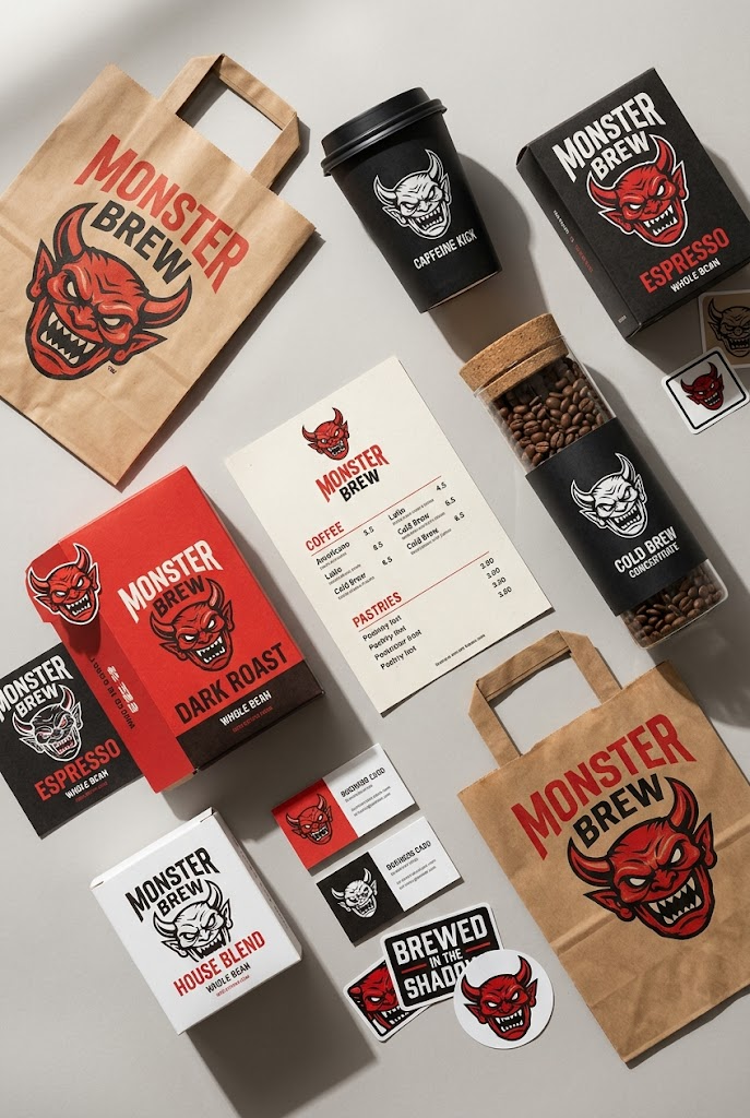
A clean studio flat lay showcasing a complete branded coffee packaging system ar
A clean studio flat lay showcasing a complete branded coffee packaging system arranged on a light neutral gray surfac...
- 分类
- 商品图
- 模型
- Nano Banana 2
- 来源作者
- xie underwood
- 原始语言
- en
- 来源 ID
- 1840
- 发布时间
- 2026年4月15日
完整提示词
A clean studio flat lay showcasing a complete branded coffee packaging system arranged on a light neutral gray surface. The composition includes paper shopping bags, a takeaway coffee cup with lid, coffee bean boxes, a cylindrical bottle container with cork lid, a printed menu sheet, business cards, stickers, and labels. All items share a bold visual identity using a limited red, white, and black color palette, featuring a sharp, stylized monster face logo with aggressive eyes and a snarling mouth.

The layout feels intentionally spaced with slight rotations and offsets, avoiding perfect symmetry while maintaining balance. Shot from a high overhead angle (around 75–85 degrees), capturing the full system in a medium-wide frame with deep focus—everything crisp and legible.

Lighting is strong and directional, coming from the upper left, casting hard, well-defined shadows stretching to the right, mimicking natural sunlight through a window. Surfaces show realistic matte paper textures and subtle print grain, avoiding overly polished or CGI-like perfection.

The atmosphere is modern, minimal, and design-forward, with a slightly rebellious, playful branding tone. It feels like a real product shoot—slightly imperfect, tactile, and grounded. The overall impression suggests a newly launched coffee brand confidently presenting its identity: bold, graphic, and unapologetically distinctive.
多语言1
A clean studio flat lay showcasing a complete branded coffee packaging system ar
enA clean studio flat lay showcasing a complete branded coffee packaging system arranged on a light neutral gray surface. The composition includes paper shopping bags, a takeaway coffee cup with lid, coffee bean boxes, a cylindrical bottle container with cork lid, a printed menu sheet, business cards, stickers, and labels. All items share a bold visual identity using a limited red, white, and black color palette, featuring a sharp, stylized monster face logo with aggressive eyes and a snarling mouth. The layout feels intentionally spaced with slight rotations and offsets, avoiding perfect symmetry while maintaining balance. Shot from a high overhead angle (around 75–85 degrees), capturing the full system in a medium-wide frame with deep focus—everything crisp and legible. Lighting is strong and directional, coming from the upper left, casting hard, well-defined shadows stretching to the right, mimicking natural sunlight through a window. Surfaces show realistic matte paper textures and subtle print grain, avoiding overly polished or CGI-like perfection. The atmosphere is modern, minimal, and design-forward, with a slightly rebellious, playful branding tone. It feels like a real product shoot—slightly imperfect, tactile, and grounded. The overall impression suggests a newly launched coffee brand confidently presenting its identity: bold, graphic, and unapologetically distinctive.
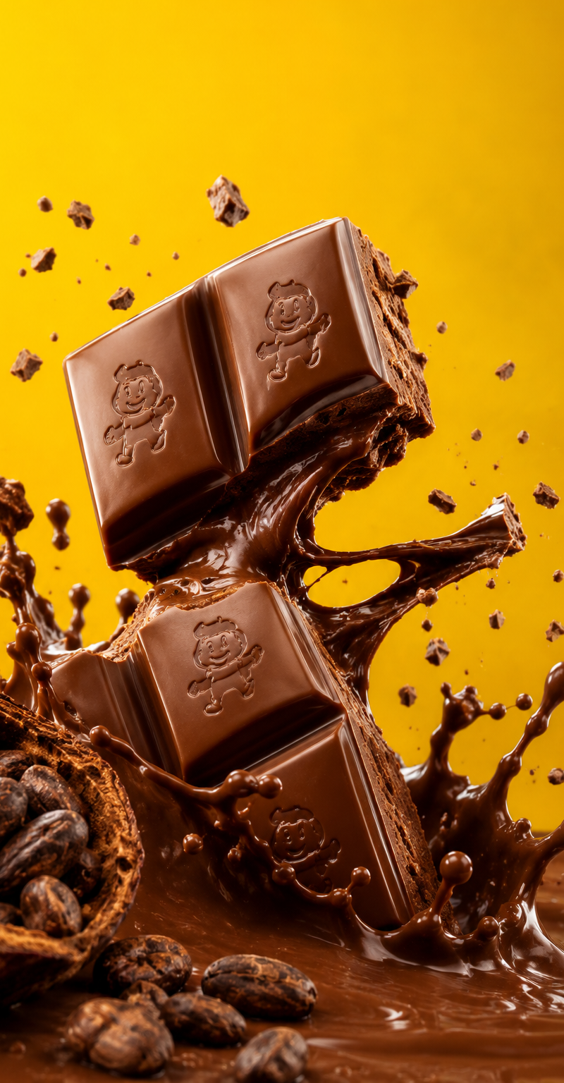
![Exploding [food item] with [filling], broken into two pieces with [filling actio](https://whqgdndlpxjbwosvipip.supabase.co/storage/v1/render/image/public/prompt-source-media/promptsref/work-2413/image-1-e26dc765f3c49579.png?width=800&quality=75)