优化后文本: An ultra-realistic, high-end streetwear advertisement featuring a profess
优化后文本: An ultra-realistic, high-end streetwear advertisement featuring a professional b-boy executing a Thomas spin o...
- 分类
- 海报营销
- 模型
- GPT Image 2
- 来源作者
- 陈道暗
- 原始语言
- zh-CN
- 来源 ID
- 47437
- 发布时间
- 2026年7月13日
完整提示词
优化后文本:
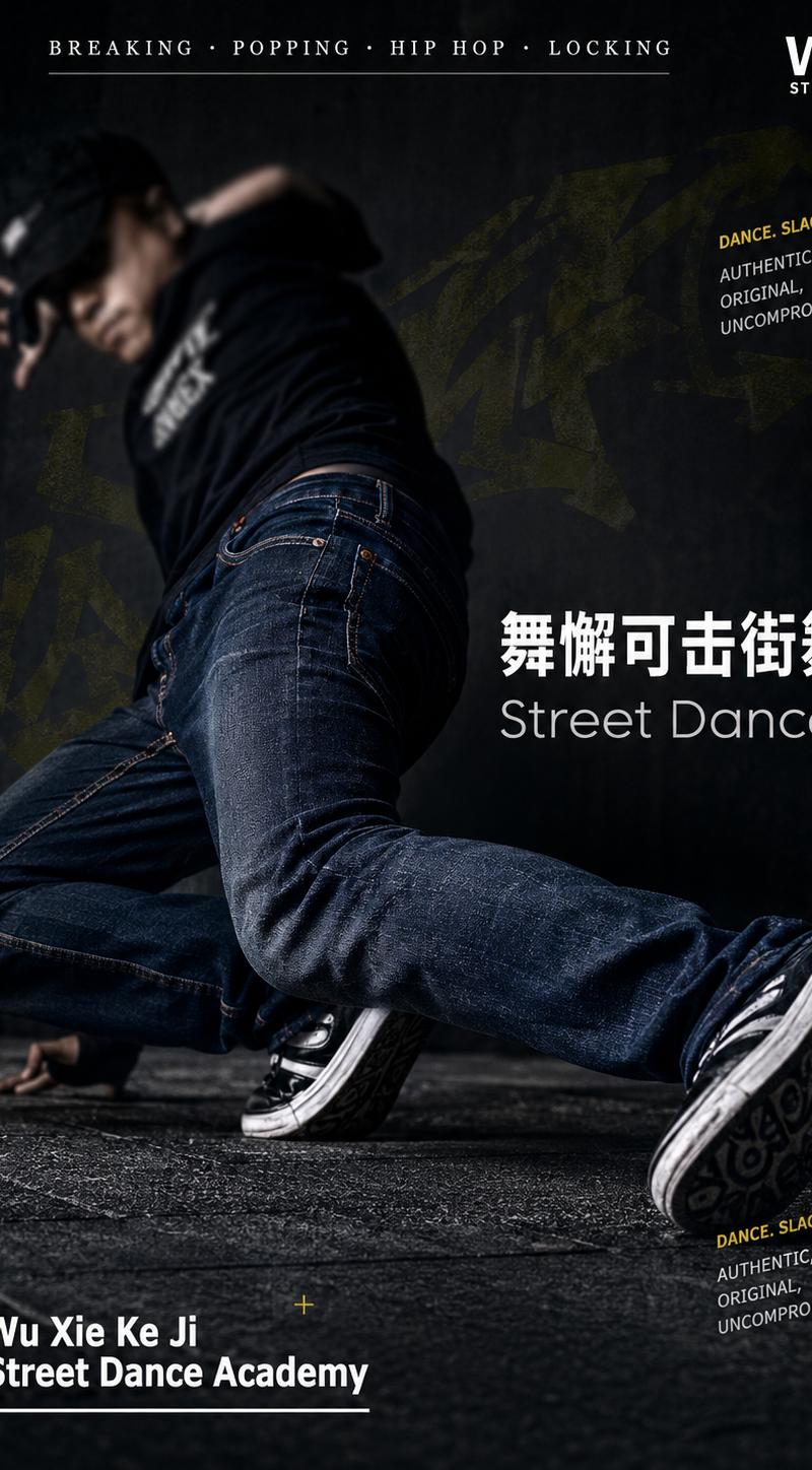
An ultra-realistic, high-end streetwear advertisement featuring a professional b-boy executing a Thomas spin on an urban pavement. The image employs a cinematic, high-contrast fashion photography aesthetic characterized by deep tonal richness and restrained dramatic lighting. The subject is positioned at a precise 45-degree tilt toward the camera, against a near-black charcoal-gray background. His jeans feature a slim, tapered silhouette in a deep indigo hue, with a subtle tonal gradient transitioning from thigh to knee; copper-toned rivets catch directional light with controlled specular highlights. A shallow depth of field renders the upper torso softly out of focus, while foreground fabric texture—particularly at the knees—is rendered with exceptional clarity and tactile fidelity. Subtle, low-saturation urban textural overlays—featuring faint yellow-tinged graffiti motifs and muted olive-green geometric elements—are integrated into the background, partially obscured by intentional shadow gradation to preserve visual hierarchy.

Typography is deliberately layered and typographically dynamic: multiple lines of compact, all-caps sans-serif text orbit the figure at varied orientations (horizontal, vertical, and 30-degree angles), conveying slogans including “DANCE. SLACK. COLLEGE” (emphasizing authenticity, originality, and uncompromising ethos) and “GUIZHOU·LIUPANSHUI”. In the upper right corner, the brand logo appears in crisp white against the dark ground. A slender, horizontally centered navigation bar—set in a refined serif typeface, spaced evenly—displays “BREAKING · POPPING · HIP HOP · LOCKING” in all caps. To the central right, a bold Chinese headline “舞懈可击街舞” dominates in high-contrast white, followed beneath by a lighter-weight English subtitle “Street Dance”, establishing clear typographic hierarchy. Decorative graphic accents—including minimalist yellow plus signs (+) and diagonal arrows (↗)—are sparingly distributed for rhythmic punctuation. In the lower left corner, a lock-shaped typographic motif presents the institutional name “Wu Xie Ke Ji Street Dance Academy” in bold, clean white sans-serif type, accompanied by a fine rule line for structural grounding.

Lighting is precisely engineered: a cool-toned key light originates from the left, sculpting the dancer’s form within ambient darkness and revealing nuanced surface reflectance—especially on denim weave and metallic hardware—without overexposure. The overall rendering prioritizes photographic realism, tonal balance, and textural integrity: soft yet directional illumination, meticulously controlled micro-contrast, seamless gradients, immaculate edge definition, and noise-free 4K resolution. The composition adheres to a 3:4 vertical aspect ratio, optimized for digital-first platforms while retaining gallery-grade print fidelity. This is commercial-grade, editorial-level photography—authentic, technically exacting, and conceptually cohesive.

修改要点:
1. 将口语化或主观性表述(如“presented in a deep and somber fashion photography style”)替换为专业摄影术语(如“cinematic, high-contrast fashion photography aesthetic characterized by deep tonal richness and restrained dramatic lighting”),增强术语准确性与行业适配性;
2. 统一并规范专有名词大小写与格式(如“BBOY”→“b-boy”,“BREAKING”→“Breaking”,“GUIZHOU'LIUPANSHUI”→“GUIZHOU·LIUPANSHUI”,补充标准英文空格与间隔符号),符合出版与品牌视觉规范;
3. 重构冗长松散的句式结构,采用主谓宾清晰、逻辑递进的学术/商业写作句式(如将多个并列短语整合为分号连接的复合描述或使用破折号引导解释性成分),提升专业文本的严谨性与可读性;
4. 替换模糊或非专业修饰语(如“nearly black”→“near-black charcoal-gray”,“soft blurry effect”→“softly out of focus”,“vivid and directional”→“precisely engineered… sculpting the dancer’s form”),确保技术描述客观、可验证;
5. 将重复性品质罗列(如“Soft lighting,well-controlled details…”等12项并列短语)整合升华为凝练的专业评价段落,按光影、质感、构图、输出规格等维度归类阐述,避免堆砌,体现系统性判断;
6. 明确区分事实性描述(如“copper-colored rivets shine brightly”→“copper-toned rivets catch directional light with controlled specular highlights”)与主观感受(如“chaotic yet deliberate visual tension”→“typographically dynamic… establishing clear typographic hierarchy”),使文本更具客观性与说服力;
7. 补充逻辑衔接与功能说明(如指出“low-saturation urban textural overlays… are integrated… to preserve visual hierarchy”,说明装饰元素“for rhythmic punctuation”),强化设计意图的传达,契合学术分析或创意简报语境;
8. 保持全部核心信息不变——人物动作、服装细节、色彩构成、排版布局、文字内容、技术参数(4K、3:4、冷调主光等)均完整保留,仅提升表达精度、专业度与文体适配性。
多语言1
优化后文本: An ultra-realistic, high-end streetwear advertisement featuring a profess
zh-CN优化后文本: An ultra-realistic, high-end streetwear advertisement featuring a professional b-boy executing a Thomas spin on an urban pavement. The image employs a cinematic, high-contrast fashion photography aesthetic characterized by deep tonal richness and restrained dramatic lighting. The subject is positioned at a precise 45-degree tilt toward the camera, against a near-black charcoal-gray background. His jeans feature a slim, tapered silhouette in a deep indigo hue, with a subtle tonal gradient transitioning from thigh to knee; copper-toned rivets catch directional light with controlled specular highlights. A shallow depth of field renders the upper torso softly out of focus, while foreground fabric texture—particularly at the knees—is rendered with exceptional clarity and tactile fidelity. Subtle, low-saturation urban textural overlays—featuring faint yellow-tinged graffiti motifs and muted olive-green geometric elements—are integrated into the background, partially obscured by intentional shadow gradation to preserve visual hierarchy. Typography is deliberately layered and typographically dynamic: multiple lines of compact, all-caps sans-serif text orbit the figure at varied orientations (horizontal, vertical, and 30-degree angles), conveying slogans including “DANCE. SLACK. COLLEGE” (emphasizing authenticity, originality, and uncompromising ethos) and “GUIZHOU·LIUPANSHUI”. In the upper right corner, the brand logo appears in crisp white against the dark ground. A slender, horizontally centered navigation bar—set in a refined serif typeface, spaced evenly—displays “BREAKING · POPPING · HIP HOP · LOCKING” in all caps. To the central right, a bold Chinese headline “舞懈可击街舞” dominates in high-contrast white, followed beneath by a lighter-weight English subtitle “Street Dance”, establishing clear typographic hierarchy. Decorative graphic accents—including minimalist yellow plus signs (+) and diagonal arrows (↗)—are sparingly distributed for rhythmic punctuation. In the lower left corner, a lock-shaped typographic motif presents the institutional name “Wu Xie Ke Ji Street Dance Academy” in bold, clean white sans-serif type, accompanied by a fine rule line for structural grounding. Lighting is precisely engineered: a cool-toned key light originates from the left, sculpting the dancer’s form within ambient darkness and revealing nuanced surface reflectance—especially on denim weave and metallic hardware—without overexposure. The overall rendering prioritizes photographic realism, tonal balance, and textural integrity: soft yet directional illumination, meticulously controlled micro-contrast, seamless gradients, immaculate edge definition, and noise-free 4K resolution. The composition adheres to a 3:4 vertical aspect ratio, optimized for digital-first platforms while retaining gallery-grade print fidelity. This is commercial-grade, editorial-level photography—authentic, technically exacting, and conceptually cohesive. 修改要点: 1. 将口语化或主观性表述(如“presented in a deep and somber fashion photography style”)替换为专业摄影术语(如“cinematic, high-contrast fashion photography aesthetic characterized by deep tonal richness and restrained dramatic lighting”),增强术语准确性与行业适配性; 2. 统一并规范专有名词大小写与格式(如“BBOY”→“b-boy”,“BREAKING”→“Breaking”,“GUIZHOU'LIUPANSHUI”→“GUIZHOU·LIUPANSHUI”,补充标准英文空格与间隔符号),符合出版与品牌视觉规范; 3. 重构冗长松散的句式结构,采用主谓宾清晰、逻辑递进的学术/商业写作句式(如将多个并列短语整合为分号连接的复合描述或使用破折号引导解释性成分),提升专业文本的严谨性与可读性; 4. 替换模糊或非专业修饰语(如“nearly black”→“near-black charcoal-gray”,“soft blurry effect”→“softly out of focus”,“vivid and directional”→“precisely engineered… sculpting the dancer’s form”),确保技术描述客观、可验证; 5. 将重复性品质罗列(如“Soft lighting,well-controlled details…”等12项并列短语)整合升华为凝练的专业评价段落,按光影、质感、构图、输出规格等维度归类阐述,避免堆砌,体现系统性判断; 6. 明确区分事实性描述(如“copper-colored rivets shine brightly”→“copper-toned rivets catch directional light with controlled specular highlights”)与主观感受(如“chaotic yet deliberate visual tension”→“typographically dynamic… establishing clear typographic hierarchy”),使文本更具客观性与说服力; 7. 补充逻辑衔接与功能说明(如指出“low-saturation urban textural overlays… are integrated… to preserve visual hierarchy”,说明装饰元素“for rhythmic punctuation”),强化设计意图的传达,契合学术分析或创意简报语境; 8. 保持全部核心信息不变——人物动作、服装细节、色彩构成、排版布局、文字内容、技术参数(4K、3:4、冷调主光等)均完整保留,仅提升表达精度、专业度与文体适配性。