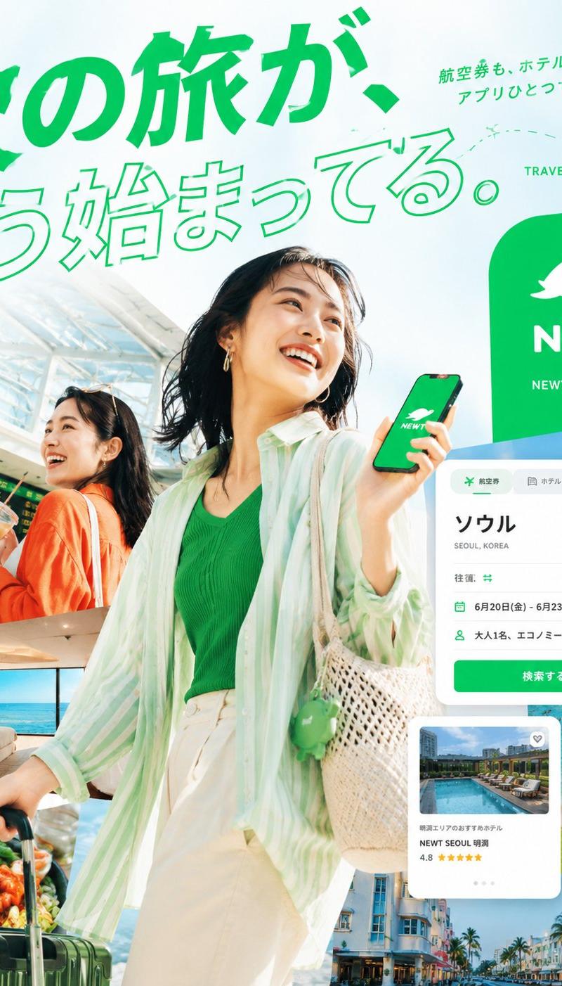
日本 NEWT 旅行 App 广告
生成一张明亮的日本旅行 App 发布广告拼贴画,包含面带微笑的旅客、热带目的地以及悬浮的预订 UI 卡片。
- 分类
- 图表信息图
- 模型
- GPT Image 2
- 来源作者
- Takaya Shinozuka / CEO of Reiwa Travel
- 原始语言
- en
- 来源 ID
- 27366
- 发布时间
- 2026年7月1日
完整提示词
目标:为 {argument name="brand name" default="NEWT"} 创建一个精致的日本旅行服务发布广告,将令人向往的机场摄影、热带度假胜地图像和 App UI 模型结合在明亮的编辑风格拼贴画中。

画布:方形 4:5 比例社交广告,768×960 视觉感,纵向构图,顶部留有充足的留白,采用鲜艳的祖母绿品牌色,简洁的现代日语排版,高端初创旅行活动美学。

布局:使用动态分层拼贴。主体是一位面带微笑的年轻东亚女性,位于中心前景,半身至膝盖处,左手拉着深绿色行李箱拉杆,右手拿着智能手机。她穿着绿色针织上衣、宽松白裤和透明淡薄荷色条纹衬衫,背着编织奶油色单肩包,配有绿色小饰品。她抬头看向右侧,充满愉悦的度假活力。在她左后方,放置另一位身穿橙色开衫、在机场航站楼手持饮料的年轻东亚女性,背景是机场的项目。标题横跨左上角和上方中心,醒目且充满活力。品牌板块置于右侧:一个圆角绿色矩形,内含白色海龟状 Logo、NEWT 字样以及一个小型行动呼吁按钮。在右中区域悬浮预订 UI 卡片,下方放置酒店卡片。

文本内容:日语主标题应为 {argument name="headline text" default="次の旅が、もう始まってる。"}。在右上角添加简短的日语副标题 {argument name="subcopy text" default="航空券も、ホテルも、アプリひとつで軽やかに。"}。在右上角附近添加简短的英文文案“TRAVEL FEELS NEW.”。在左侧添加一个小型垂直分类列表,包含 5 个项目:AIRPORT、HOTEL、CITY、BEACH、FOOD。绿色品牌板块应显示白色 Logo、“NEWT”以及“NEWTで旅をみる”。

可见拼贴元素:包含 7 个主要视觉模块:1 个手持手机和行李箱的中心旅客,1 个次要机场旅客,1 个机场项目区域,1 个左下角带海景的豪华酒店房间,1 个左下角虾和蔬菜的食物特写,1 个右侧绿松石色海滩航拍图,以及 1 个右下角粉彩度假城市街道。保持它们无缝重叠,边缘剪裁清晰,具有编辑深度。

App UI 细节:在右侧包含 2 个悬浮 App 卡片。卡片 1 是搜索表单,带有航班、酒店和套餐标签;目的地为“ソウル”,下方标注“SEOUL, KOREA”;日期范围为“6月20日(金) - 6月23日(月)”;旅客/舱位行显示“大人1名、エコノミー”;以及一个亮绿色按钮“検索する”。卡片 2 是酒店推荐卡片,包含度假泳池缩略图、小爱心图标、酒店名称“NEWT SEOUL 明洞”、评分“4.8”(带黄色星星)以及轮播点。

风格:高调日光,光泽感商业旅行摄影与简洁矢量 UI 相结合,饱和的祖母绿点缀,带有微妙蓝色渐变的通风白色背景,自然的肤色,乐观的夏季氛围,清晰的日语排版,第一句使用加粗填充的绿色字体,第二句使用绿色轮廓字体。在右上角附近添加俏皮的虚线飞行路径和微小的地图定位针。采用高端编辑布局,逼真的照片拼贴,焦点清晰,无污渍,无水印,除品牌外无额外 Logo。多语言2
日本 NEWT 旅行 App 广告
zh-CN目标:为 {argument name="brand name" default="NEWT"} 创建一个精致的日本旅行服务发布广告,将令人向往的机场摄影、热带度假胜地图像和 App UI 模型结合在明亮的编辑风格拼贴画中。 画布:方形 4:5 比例社交广告,768×960 视觉感,纵向构图,顶部留有充足的留白,采用鲜艳的祖母绿品牌色,简洁的现代日语排版,高端初创旅行活动美学。 布局:使用动态分层拼贴。主体是一位面带微笑的年轻东亚女性,位于中心前景,半身至膝盖处,左手拉着深绿色行李箱拉杆,右手拿着智能手机。她穿着绿色针织上衣、宽松白裤和透明淡薄荷色条纹衬衫,背着编织奶油色单肩包,配有绿色小饰品。她抬头看向右侧,充满愉悦的度假活力。在她左后方,放置另一位身穿橙色开衫、在机场航站楼手持饮料的年轻东亚女性,背景是机场的项目。标题横跨左上角和上方中心,醒目且充满活力。品牌板块置于右侧:一个圆角绿色矩形,内含白色海龟状 Logo、NEWT 字样以及一个小型行动呼吁按钮。在右中区域悬浮预订 UI 卡片,下方放置酒店卡片。 文本内容:日语主标题应为 {argument name="headline text" default="次の旅が、もう始まってる。"}。在右上角添加简短的日语副标题 {argument name="subcopy text" default="航空券も、ホテルも、アプリひとつで軽やかに。"}。在右上角附近添加简短的英文文案“TRAVEL FEELS NEW.”。在左侧添加一个小型垂直分类列表,包含 5 个项目:AIRPORT、HOTEL、CITY、BEACH、FOOD。绿色品牌板块应显示白色 Logo、“NEWT”以及“NEWTで旅をみる”。 可见拼贴元素:包含 7 个主要视觉模块:1 个手持手机和行李箱的中心旅客,1 个次要机场旅客,1 个机场项目区域,1 个左下角带海景的豪华酒店房间,1 个左下角虾和蔬菜的食物特写,1 个右侧绿松石色海滩航拍图,以及 1 个右下角粉彩度假城市街道。保持它们无缝重叠,边缘剪裁清晰,具有编辑深度。 App UI 细节:在右侧包含 2 个悬浮 App 卡片。卡片 1 是搜索表单,带有航班、酒店和套餐标签;目的地为“ソウル”,下方标注“SEOUL, KOREA”;日期范围为“6月20日(金) - 6月23日(月)”;旅客/舱位行显示“大人1名、エコノミー”;以及一个亮绿色按钮“検索する”。卡片 2 是酒店推荐卡片,包含度假泳池缩略图、小爱心图标、酒店名称“NEWT SEOUL 明洞”、评分“4.8”(带黄色星星)以及轮播点。 风格:高调日光,光泽感商业旅行摄影与简洁矢量 UI 相结合,饱和的祖母绿点缀,带有微妙蓝色渐变的通风白色背景,自然的肤色,乐观的夏季氛围,清晰的日语排版,第一句使用加粗填充的绿色字体,第二句使用绿色轮廓字体。在右上角附近添加俏皮的虚线飞行路径和微小的地图定位针。采用高端编辑布局,逼真的照片拼贴,焦点清晰,无污渍,无水印,除品牌外无额外 Logo。
日本 NEWT 旅行 App 广告
enGoal: Create a vibrant Japanese travel-app advertising poster for {argument name="brand name" default="NEWT"}, combining editorial travel photography, clean app UI mockups, and bold Japanese typography to promote the feeling that the next trip is already beginning. Canvas: Square 1:1 promotional graphic, bright white and mint-green background, high-key summer lighting, energetic composition, polished commercial ad quality. Layout: A large diagonal Japanese headline dominates the top-left and upper center. The main traveler stands large in the center foreground, smiling and looking up to the right while holding a smartphone showing the green brand screen. A second traveler appears behind her on the left inside an airport scene. Layer multiple travel photo cutouts around the lower half and right side, with floating app interface cards over them. Place a large green rounded brand block on the upper-right. Text content: Use exactly 5 main text groups: 1) huge headline text {argument name="headline text" default="次の旅が、もう始まってる。"} in vivid green, with the first line filled and the second line outlined; 2) small upper-right Japanese copy {argument name="subheadline text" default="航空券も、ホテルも、アプリひとつで軽やかに。"}; 3) English tagline “TRAVEL FEELS NEW.” near the top-right; 4) left-side vertical category list with exactly 5 items: “AIRPORT”, “HOTEL”, “CITY”, “BEACH”, “FOOD”; 5) brand block text with a white animal-like logo, the word “NEWT”, and the small Japanese call-to-action “NEWTで旅をみる” with a circular arrow icon. Subject details: Main subject is a cheerful young East Asian woman traveler, mid-20s, short dark bob hair moving naturally, gold hoop earrings, green ribbed top, loose translucent mint-and-white striped overshirt, cream high-waisted pants, woven straw shoulder bag with a small green charm, pulling a dark green rolling suitcase. She holds a phone with a green screen, white brand logo, and “NEWT” text. Secondary subject is a smiling young East Asian woman in an orange cardigan at an airport, holding a drink, with a departures board behind her. Travel image collage: Include exactly 5 travel photo cutouts: 1) bright airport terminal with departures board behind the secondary woman, 2) luxury hotel room with ocean view, 3) close-up seafood dish with shrimp and greens near the suitcase, 4) turquoise beach and ocean with swimmers on the right, 5) colorful resort city street with palm trees along the bottom-right. App UI cards: Include exactly 2 floating white app interface cards with rounded corners and soft shadows. Card 1 is a booking search card at mid-right with tabs for flight, hotel, and package; large destination text “ソウル”, small text “SEOUL, KOREA”, rows showing round trip, dates “6月20日(金) - 6月23日(月)”, passengers “大人1名、エコノミー”, and a green button labeled “検索する”. Card 2 is a hotel recommendation card lower-right with a pool thumbnail, small heart icon, hotel name “NEWT SEOUL 明洞”, rating “4.8”, and five yellow stars. Visual style: Premium Japanese startup travel campaign, fresh mint green brand color, crisp cutout collage, clean sans-serif typography, dynamic diagonal composition, airy negative space, glossy magazine-ad finish, realistic photography mixed with minimal vector UI. Add a dotted flight path with a location pin near the top-right. Constraints: Use no extra logos or watermarks beyond the specified brand. Keep all Japanese text legible and accurately placed. Maintain the strong green-and-white identity, optimistic summer travel mood, and layered depth.