Fauré 安魂曲光影海报
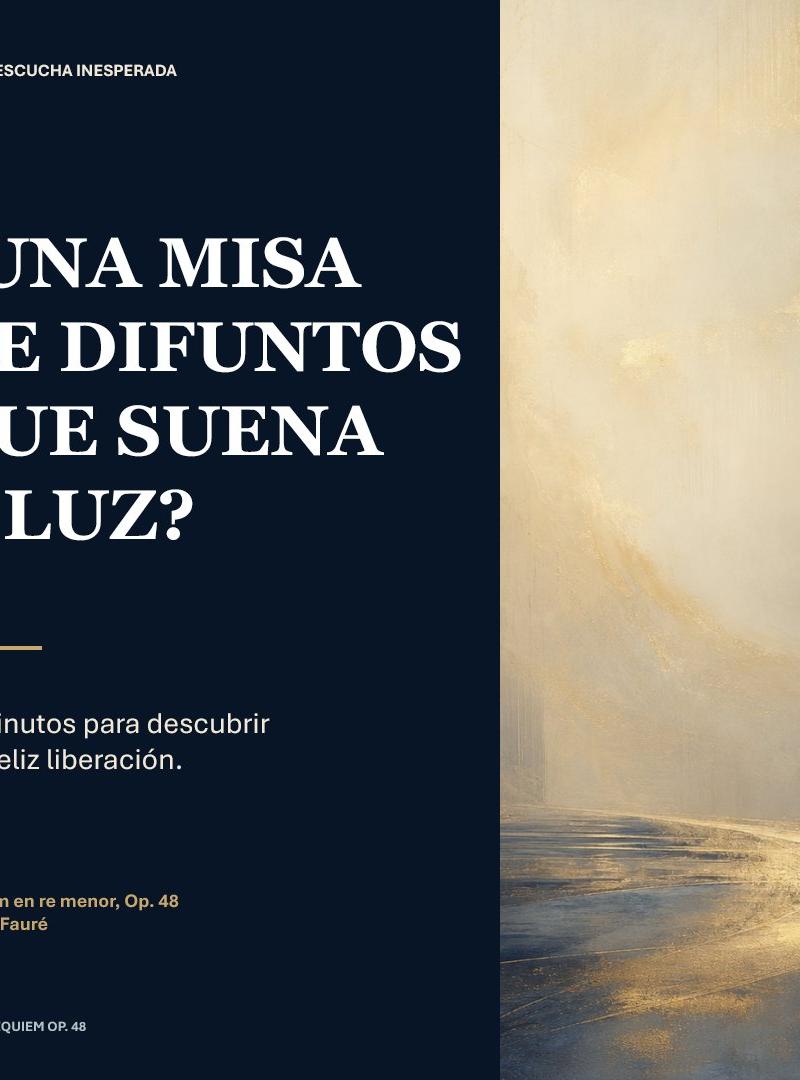
一款方形编辑风格社交媒体海报设计,旨在将 Fauré 的《安魂曲》呈现为一场宁静且充满光感的音乐探索。
- 分类
- 海报营销
- 模型
- GPT Image 2
- 来源作者
- Juan José Arango E.
- 原始语言
- en
- 来源 ID
- 28437
- 发布时间
- 2026年7月11日
完整提示词
目标:为 {argument name="musical work" default="D 小调安魂曲,作品 48 号"}(作者:{argument name="composer" default="Gabriel Fauré"})创作一张精致的方形社交媒体编辑海报,展现安魂曲平静、明亮的一面,而非沉重阴郁的风格。

画布:1:1 方形比例,768 x 768 px。将构图垂直分为两个板块:左侧为深海军蓝文字板块,占据约 59% 的宽度;右侧为氛围感抽象画板块,占据约 41% 的宽度。

布局:左侧板块采用宽裕的页边距和优雅的编辑排版。左上角有一个金色小方块,后跟一个小型大写字母版块标签。主标题位于中上方,醒目且占据主导地位,分为 4 行堆叠。下方是一条简短的水平金色分割线。分割线下方是 2 行副标题。左下角附近是 2 行金色的作品/作曲家署名。最底部是极小的页脚标签。整个海报的右下角有一个极小的页码。

文字内容:包含 7 个文字元素:1) 顶部标签:“UNA ESCUCHA INESPERADA”;2) 西班牙语主标题,全大写,带有倒问号:“¿UNA MISA / DE DIFUNTOS / QUE SUENA / A LUZ?”;3) 副标题:“40 minutos para descubrir / una feliz liberación.”;4) 作品署名:“Réquiem en re menor, Op. 48”;5) 作曲家署名:“Gabriel Fauré”;6) 页脚:“FAURÉ · RÉQUIEM OP. 48”;7) 页码:“01”。允许将标题自定义为 {argument name="headline text" default="¿UNA MISA DE DIFUNTOS QUE SUENA A LUZ?"},将副标题自定义为 {argument name="subtitle text" default="40 minutos para descubrir una feliz liberación."},同时保持相同的换行节奏。

排版:主标题采用粗体高对比度古典衬线字体,白色,全大写,具有戏剧性的粗细笔画对比。辅助文字采用简洁的现代无衬线字体,主要为白色;作品/作曲家署名使用柔和的金色。运用强烈的排版层级和精确的对齐方式。

视觉风格:极简、博物馆级质感,以文学和圣乐为主题。左侧背景为深午夜蓝,近乎黑色。强调色为温暖的古董金。右侧板块为柔和的抽象光影景观或教堂般的通道:奶油米色、淡金色、薄雾、细腻的笔触,底部有一条发光的弯曲光路,通向明亮朦胧的垂直空间。不包含人物、乐器或写实的教堂内部;保持空灵与宁静。

约束条件:严格保持 2 板块构图和列出的 7 个文字元素。除单个金色小方块和一条金色分割线外,不得添加额外的 Logo、水印、图标或装饰性元素。确保西班牙语标题清晰易读。多语言2
Fauré 安魂曲光影海报
zh-CN目标:为 {argument name="musical work" default="D 小调安魂曲,作品 48 号"}(作者:{argument name="composer" default="Gabriel Fauré"})创作一张精致的方形社交媒体编辑海报,展现安魂曲平静、明亮的一面,而非沉重阴郁的风格。 画布:1:1 方形比例,768 x 768 px。将构图垂直分为两个板块:左侧为深海军蓝文字板块,占据约 59% 的宽度;右侧为氛围感抽象画板块,占据约 41% 的宽度。 布局:左侧板块采用宽裕的页边距和优雅的编辑排版。左上角有一个金色小方块,后跟一个小型大写字母版块标签。主标题位于中上方,醒目且占据主导地位,分为 4 行堆叠。下方是一条简短的水平金色分割线。分割线下方是 2 行副标题。左下角附近是 2 行金色的作品/作曲家署名。最底部是极小的页脚标签。整个海报的右下角有一个极小的页码。 文字内容:包含 7 个文字元素:1) 顶部标签:“UNA ESCUCHA INESPERADA”;2) 西班牙语主标题,全大写,带有倒问号:“¿UNA MISA / DE DIFUNTOS / QUE SUENA / A LUZ?”;3) 副标题:“40 minutos para descubrir / una feliz liberación.”;4) 作品署名:“Réquiem en re menor, Op. 48”;5) 作曲家署名:“Gabriel Fauré”;6) 页脚:“FAURÉ · RÉQUIEM OP. 48”;7) 页码:“01”。允许将标题自定义为 {argument name="headline text" default="¿UNA MISA DE DIFUNTOS QUE SUENA A LUZ?"},将副标题自定义为 {argument name="subtitle text" default="40 minutos para descubrir una feliz liberación."},同时保持相同的换行节奏。 排版:主标题采用粗体高对比度古典衬线字体,白色,全大写,具有戏剧性的粗细笔画对比。辅助文字采用简洁的现代无衬线字体,主要为白色;作品/作曲家署名使用柔和的金色。运用强烈的排版层级和精确的对齐方式。 视觉风格:极简、博物馆级质感,以文学和圣乐为主题。左侧背景为深午夜蓝,近乎黑色。强调色为温暖的古董金。右侧板块为柔和的抽象光影景观或教堂般的通道:奶油米色、淡金色、薄雾、细腻的笔触,底部有一条发光的弯曲光路,通向明亮朦胧的垂直空间。不包含人物、乐器或写实的教堂内部;保持空灵与宁静。 约束条件:严格保持 2 板块构图和列出的 7 个文字元素。除单个金色小方块和一条金色分割线外,不得添加额外的 Logo、水印、图标或装饰性元素。确保西班牙语标题清晰易读。
Fauré 安魂曲光影海报
enGoal: Create a refined square social-media editorial poster about {argument name="musical work" default="Requiem in D minor, Op. 48"} by {argument name="composer" default="Gabriel Fauré"}, presenting a calm, luminous interpretation of a requiem rather than a dark one. Canvas: 1:1 square format, 768 x 768 px. Divide the composition vertically into 2 panels: a dark navy text panel on the left occupying about 59% of the width, and an atmospheric abstract painting panel on the right occupying about 41%. Layout: Left panel uses generous margins and elegant editorial spacing. Top-left has 1 small gold square bullet followed by a small uppercase section label. The main headline sits in the upper-middle, large and dominant, broken into 4 stacked lines. Below it is 1 short horizontal gold divider line. Under the divider is a 2-line subtitle. Near the lower-left is a small gold work/composer credit in 2 lines. At the very bottom-left is a tiny footer label. Bottom-right of the whole poster has a tiny page number. Text content: Include exactly 7 text elements: 1) top label: “UNA ESCUCHA INESPERADA”; 2) main headline in Spanish, all caps with inverted question mark: “¿UNA MISA / DE DIFUNTOS / QUE SUENA / A LUZ?”; 3) subtitle: “40 minutos para descubrir / una feliz liberación.”; 4) credit line: “Réquiem en re menor, Op. 48”; 5) composer line: “Gabriel Fauré”; 6) footer: “FAURÉ · RÉQUIEM OP. 48”; 7) page number: “01”. Allow the headline to be customized as {argument name="headline text" default="¿UNA MISA DE DIFUNTOS QUE SUENA A LUZ?"} and the subtitle as {argument name="subtitle text" default="40 minutos para descubrir una feliz liberación."} while preserving the same line-break rhythm. Typography: Main headline in a bold high-contrast classical serif, white, all caps, with dramatic thick-thin strokes. Supporting text in a clean modern sans serif, mostly white; the work/composer credit is muted gold. Use strong typographic hierarchy and precise alignment. Visual style: Minimal, museum-quality, literary and sacred-music themed. Left background is deep midnight navy, almost black. Accent color is warm antique gold. Right panel is a soft abstract luminous landscape or chapel-like passage: creamy beige, pale gold, mist, subtle brush texture, a glowing curved path of light near the bottom leading into a bright hazy vertical space. No figures, no instruments, no literal church interior; keep it ethereal and serene. Constraints: Keep exactly the 2-panel composition and exactly the 7 text elements listed. No extra logos, watermarks, icons, or decorative ornaments beyond the single gold square bullet and one gold divider line. Ensure the Spanish headline is crisp and legible.