五联版饮料营销活动
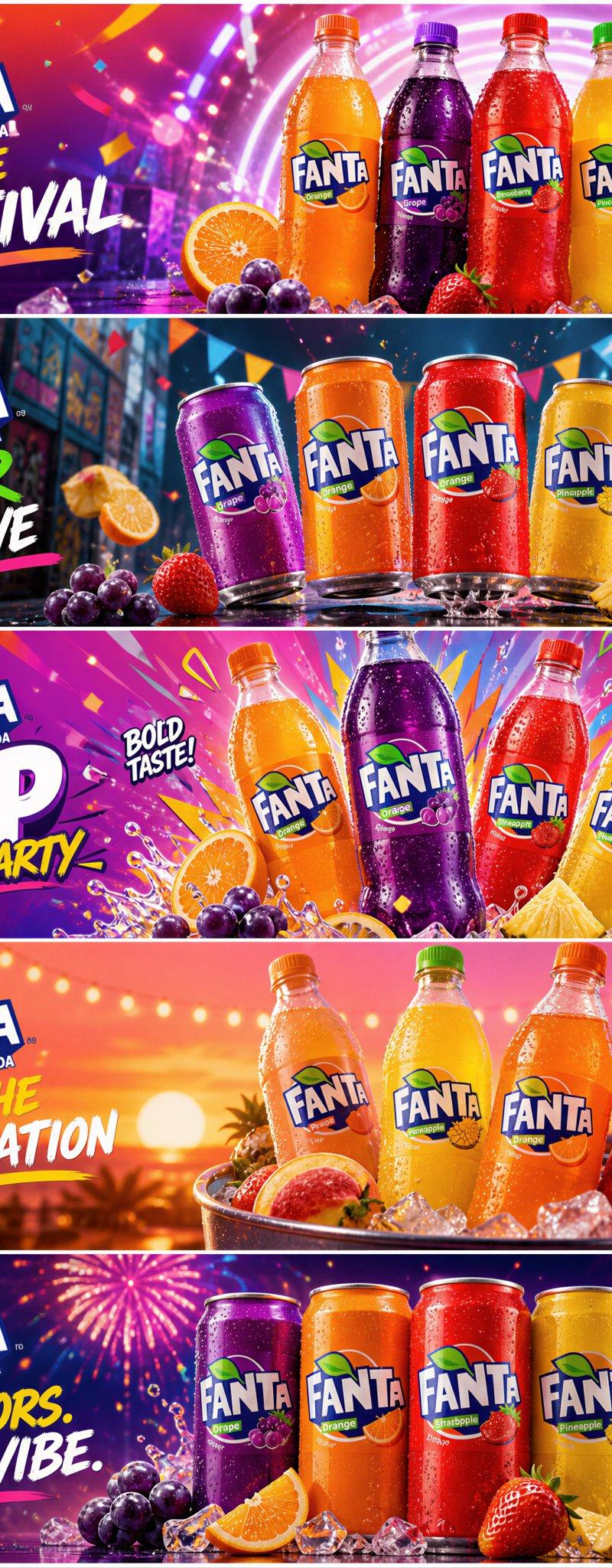
一个复杂的提示词,用于为饮料品牌生成一套统一的 5 联版营销横幅系统,并呈现不同的节日主题。
- 分类
- 海报营销
- 模型
- GPT Image 2
- 来源作者
- Loriel.AI
- 原始语言
- en
- 来源 ID
- 28496
- 发布时间
- 2026年7月12日
完整提示词
为 Fanta 水果味汽水创建一个超高端的横向 5 联版营销活动系统,将其重新构想为一系列充满活力、具有年轻视觉冲击力和高端商业质感的时尚节日促销海报。最终效果必须呈现出世界级的大型节日或青年庆典品牌活动感,包含五张独特的宽幅营销横幅,它们既属于同一个 Fanta 宇宙,又各自传达出独特的创意卖点。整体布局:创建 5 张横向横幅式面板,组成一个统一的活动系列。每个面板必须作为独立的广告视觉呈现,具备强大的产品层级、高可读性的品牌标识、精致的排版以及独特的节日概念场景。所有五张横幅必须通过统一的 Fanta 高端活动语言保持视觉连贯:明亮的色彩能量、纯净的产品写实感、大胆的商业构图、年轻的兴奋感以及精致的灯光。所有产品必须以绝对的写实感呈现:正宗的 Fanta 水果味汽水包装、准确的 Fanta 标志、逼真的瓶身或罐体比例、真实的液体颜色、干净的反射、高级的冷凝水珠、清晰的标签印刷以及鲜明的品牌特征。产品必须给人以冰凉、生动、清爽且高度写实的感觉。核心概念是五个独特的节日促销世界。不要在不同颜色中重复相同的设置。每个面板必须呈现出明显不同的节日或促销氛围,同时仍感觉属于同一个活动系列。面板 1:霓虹节日启动。一个大胆的启动面板,将多种 Fanta 口味以生动的构图排列在充满活力的现代庆典背景中。使用发光的渐变、五彩纸屑般的能量点缀、潮流图形形状和年轻的节日兴奋感。这应作为整个活动的首发主视觉。面板 2:街头嘉年华口味发布。一个更具都市感的节日场景,具有动态感、漂浮的水果、多彩的横幅、俏皮的阴影和街头派对的商业氛围。产品必须保持焦点,周围的世界暗示着当代青年庆典。面板 3:流行庆典爆发。一个明亮、图形化、适合社交媒体传播的促销图块,具有爆炸性但受控的色彩、以水果为主的装饰、大胆的节日排版和极具吸引力的产品展示。此面板应具有高度的促销感,并能瞬间抓住眼球。面板 4:日落派对口味场景。一个更温暖、更时尚的庆典面板,使用节日灯光、发光的氛围、粉橙色天空渐变和高昂的派对能量。产品应感觉清爽、令人向往,并专为时尚的节日活动而设计。面板 5:盛大终章促销横幅。一个标志性的最终面板,感觉像是活动的最高潮:将所有核心口味的能量提炼为一个干净但充满节日气氛的商业场景,具有最强的品牌存在感、最强的促销钩子和最令人难忘的季节性标识。在所有五个面板中,使用多种 Fanta 口味变体,例如:橙子、葡萄、草莓、菠萝、桃子、苹果或热带混合水果。产品应表现为一个协调的口味家族,但每个横幅可以根据创意概念强调不同的子集。辅助场景造型:使用节日和年轻的促销元素,例如:彩带、五彩纸屑形状、发光的灯光、水果切片、漂浮的冰块、节日丝带、图形爆发、日落渐变、都市庆典元素或派对般的动态点缀。然而,保持一切在商业控制范围内且高端。不要使构图杂乱。不要让道具喧宾夺主。灯光:在所有五个横幅中使用高端明亮的商业灯光。每个面板应包括:包装上的干净高光、美丽的液体光泽、微妙的水果质感、受控的冷凝水细节以及优雅的阴影塑造。灯光必须感觉令人兴奋、多彩、年轻且昂贵。所有阴影必须保持通透和干净,没有浑浊的黑色、脏斑或嘈杂的暗部污染。背景:每个横幅必须具有明显不同的节日环境和色彩氛围,同时作为同一个活动保持协调。可能的方向:电光橙与青柠、紫色夜派对光、节日红与黄、日落珊瑚与粉色、以及蓝紫色庆典对比。每个面板都应感觉独特,但整个系列必须被解读为一个协调的 Fanta 促销系统。排版:仅使用精致的英文品牌和促销文案。主要重复文本:“FANTA”“FRUIT FLAVORED SODA”。每个横幅还应带有不同的活动标语,例如:“OPEN THE FESTIVAL”“FLAVOR GOES LIVE”“POP THE PARTY”“TASTE THE CELEBRATION”“FIVE FLAVORS. ONE BIG VIBE.”排版必须感觉大胆、年轻、潮流且具有商业高端感,绝不廉价或过度拥挤。氛围:节日能量、年轻潮流文化、高端汽水营销、大胆的清爽感、社交媒体就绪的活动影响力、时尚庆典、生动的商业兴奋感。渲染风格:超写实饮料摄影、奢华商业横幅系统、五个独特的横向活动场景、正宗的多口味 Fanta 产品渲染、潮流节日世界构建、精致的促销排版、8k、世界级活动质量。负面提示:普通汽水广告、假 Fanta 标志、低细节产品、重复的横幅、在不同颜色中重复使用的相同场景、杂乱的道具、薄弱的产品层级、廉价超市传单美学、浑浊的阴影、黑色斑点、嘈杂的灯光、幼稚的低端设计、混乱的排版
多语言2
五联版饮料营销活动
zh-CN为 Fanta 水果味汽水创建一个超高端的横向 5 联版营销活动系统,将其重新构想为一系列充满活力、具有年轻视觉冲击力和高端商业质感的时尚节日促销海报。最终效果必须呈现出世界级的大型节日或青年庆典品牌活动感,包含五张独特的宽幅营销横幅,它们既属于同一个 Fanta 宇宙,又各自传达出独特的创意卖点。整体布局:创建 5 张横向横幅式面板,组成一个统一的活动系列。每个面板必须作为独立的广告视觉呈现,具备强大的产品层级、高可读性的品牌标识、精致的排版以及独特的节日概念场景。所有五张横幅必须通过统一的 Fanta 高端活动语言保持视觉连贯:明亮的色彩能量、纯净的产品写实感、大胆的商业构图、年轻的兴奋感以及精致的灯光。所有产品必须以绝对的写实感呈现:正宗的 Fanta 水果味汽水包装、准确的 Fanta 标志、逼真的瓶身或罐体比例、真实的液体颜色、干净的反射、高级的冷凝水珠、清晰的标签印刷以及鲜明的品牌特征。产品必须给人以冰凉、生动、清爽且高度写实的感觉。核心概念是五个独特的节日促销世界。不要在不同颜色中重复相同的设置。每个面板必须呈现出明显不同的节日或促销氛围,同时仍感觉属于同一个活动系列。面板 1:霓虹节日启动。一个大胆的启动面板,将多种 Fanta 口味以生动的构图排列在充满活力的现代庆典背景中。使用发光的渐变、五彩纸屑般的能量点缀、潮流图形形状和年轻的节日兴奋感。这应作为整个活动的首发主视觉。面板 2:街头嘉年华口味发布。一个更具都市感的节日场景,具有动态感、漂浮的水果、多彩的横幅、俏皮的阴影和街头派对的商业氛围。产品必须保持焦点,周围的世界暗示着当代青年庆典。面板 3:流行庆典爆发。一个明亮、图形化、适合社交媒体传播的促销图块,具有爆炸性但受控的色彩、以水果为主的装饰、大胆的节日排版和极具吸引力的产品展示。此面板应具有高度的促销感,并能瞬间抓住眼球。面板 4:日落派对口味场景。一个更温暖、更时尚的庆典面板,使用节日灯光、发光的氛围、粉橙色天空渐变和高昂的派对能量。产品应感觉清爽、令人向往,并专为时尚的节日活动而设计。面板 5:盛大终章促销横幅。一个标志性的最终面板,感觉像是活动的最高潮:将所有核心口味的能量提炼为一个干净但充满节日气氛的商业场景,具有最强的品牌存在感、最强的促销钩子和最令人难忘的季节性标识。在所有五个面板中,使用多种 Fanta 口味变体,例如:橙子、葡萄、草莓、菠萝、桃子、苹果或热带混合水果。产品应表现为一个协调的口味家族,但每个横幅可以根据创意概念强调不同的子集。辅助场景造型:使用节日和年轻的促销元素,例如:彩带、五彩纸屑形状、发光的灯光、水果切片、漂浮的冰块、节日丝带、图形爆发、日落渐变、都市庆典元素或派对般的动态点缀。然而,保持一切在商业控制范围内且高端。不要使构图杂乱。不要让道具喧宾夺主。灯光:在所有五个横幅中使用高端明亮的商业灯光。每个面板应包括:包装上的干净高光、美丽的液体光泽、微妙的水果质感、受控的冷凝水细节以及优雅的阴影塑造。灯光必须感觉令人兴奋、多彩、年轻且昂贵。所有阴影必须保持通透和干净,没有浑浊的黑色、脏斑或嘈杂的暗部污染。背景:每个横幅必须具有明显不同的节日环境和色彩氛围,同时作为同一个活动保持协调。可能的方向:电光橙与青柠、紫色夜派对光、节日红与黄、日落珊瑚与粉色、以及蓝紫色庆典对比。每个面板都应感觉独特,但整个系列必须被解读为一个协调的 Fanta 促销系统。排版:仅使用精致的英文品牌和促销文案。主要重复文本:“FANTA”“FRUIT FLAVORED SODA”。每个横幅还应带有不同的活动标语,例如:“OPEN THE FESTIVAL”“FLAVOR GOES LIVE”“POP THE PARTY”“TASTE THE CELEBRATION”“FIVE FLAVORS. ONE BIG VIBE.”排版必须感觉大胆、年轻、潮流且具有商业高端感,绝不廉价或过度拥挤。氛围:节日能量、年轻潮流文化、高端汽水营销、大胆的清爽感、社交媒体就绪的活动影响力、时尚庆典、生动的商业兴奋感。渲染风格:超写实饮料摄影、奢华商业横幅系统、五个独特的横向活动场景、正宗的多口味 Fanta 产品渲染、潮流节日世界构建、精致的促销排版、8k、世界级活动质量。负面提示:普通汽水广告、假 Fanta 标志、低细节产品、重复的横幅、在不同颜色中重复使用的相同场景、杂乱的道具、薄弱的产品层级、廉价超市传单美学、浑浊的阴影、黑色斑点、嘈杂的灯光、幼稚的低端设计、混乱的排版
五联版饮料营销活动
enCreate an ultra-premium horizontal 5-panel campaign system for Fanta Fruit Flavored Soda, reimagined as a trendy festive promotional series with bold energy, youthful visual impact, and premium commercial polish. The final result must feel like a world-class seasonal brand campaign for a major holiday or youth celebration, with five unique wide-format marketing banners that all belong to the same Fanta universe while each panel delivers a distinct creative selling point. Overall layout: create 5 horizontal banner-style panels arranged as a unified campaign series. Each panel must function as a complete advertising visual on its own, with strong product hierarchy, highly readable branding, refined typography, and a unique festive-concept scene. All five banners must remain visually connected through one premium Fanta campaign language: bright color energy, clean product realism, bold commercial composition, youthful excitement, and polished lighting. All products must be rendered with absolute realism: authentic Fanta Fruit Flavored Soda packaging, correct Fanta logo, realistic bottle or can proportions, true liquid color, clean reflections, premium condensation, sharp label printing, and unmistakable brand identity. The products must feel cold, vivid, refreshing, and highly photoreal. The key concept is five unique festive-promo worlds. Do not repeat the same setup in different colors. Each panel must present a clearly different festive or promotional mood, while still feeling part of the same campaign family. Panel 1: Neon Festival Kickoff A bold launch panel with multiple Fanta flavors arranged in a lively composition against a vibrant modern celebration backdrop. Use glowing gradients, confetti-like energy accents, trendy graphic shapes, and youthful festival excitement. This should feel like the opening hero of the full campaign. Panel 2: Street Carnival Flavor Drop A more urban festive scene with dynamic movement, floating fruit, colorful banners, playful shadows, and a street-party commercial vibe. The products must remain the focus, with the world around them suggesting contemporary youth celebration. Panel 3: Pop Celebration Burst A bright, graphic, social-media-friendly promotional tile with explosive but controlled color, fruit-led accents, bold festive typography, and irresistible product visibility. This panel should feel highly promotional and instantly eye-catching. Panel 4: Sunset Party Flavor Scene A warmer, more stylish celebration panel using festival lights, glowing atmosphere, pink-orange sky gradients, and elevated party energy. The products should feel refreshing, aspirational, and made for a trendy holiday event. Panel 5: Grand Finale Promo Banner A final signature panel that feels like the climax of the campaign: all key flavor energy distilled into one clean but festive commercial scene with strongest brand presence, strongest promotional hook, and most memorable seasonal identity. Across all five panels, use multiple Fanta flavor variants such as: orange, grape, strawberry, pineapple, peach, apple, or tropical mixed fruit. The products should appear as a coordinated flavor family, but each banner may emphasize different subsets depending on the creative concept. Supporting scene styling: use festive and youthful promotional elements such as: streamers, confetti-inspired shapes, glowing lights, fruit slices, floating ice, festival ribbons, graphic bursts, sunset gradients, urban celebration cues, or party-like motion accents. However, keep everything commercially controlled and premium. Do not clutter the composition. Do not let props overpower the products. Lighting: use premium bright commercial lighting across all five banners. Each panel should include: clean highlights on the packaging, beautiful liquid glow, subtle fruit sheen, controlled condensation detail, and elegant shadow shaping. The lighting must feel exciting, colorful, youthful, and expensive. All shadows must remain breathable and clean, with no muddy blacks, dirty blotches, or noisy dark contamination. Backgrounds: each banner must have a clearly different festive environment and color mood, while remaining cohesive as one campaign. Possible directions: electric orange and lime, purple night-party glow, festival red and yellow, sunset coral and pink, and blue-violet celebration contrast. Each panel should feel unique, but the full series must read as one coordinated Fanta promo system. Typography: use refined English branding and promotional copy only. Main recurring text: “FANTA” “FRUIT FLAVORED SODA” Each banner should also carry a different campaign line, such as: “OPEN THE FESTIVAL” “FLAVOR GOES LIVE” “POP THE PARTY” “TASTE THE CELEBRATION” “FIVE FLAVORS. ONE BIG VIBE.” Typography must feel bold, youthful, trendy, and commercially premium, never cheap or overcrowded. Mood: festival energy, youthful trend culture, premium soda marketing, bold refreshment, social-media-ready campaign impact, stylish celebration, vivid commercial excitement. Rendering style: hyper-real beverage photography, luxury commercial banner system, five unique horizontal campaign scenes, authentic multi-flavor Fanta product rendering, trendy festive worldbuilding, polished promotional typography, 8k, world-class campaign quality. Negative prompt: generic soda ad, fake Fanta logo, low-detail product, repetitive banners, same scene reused in different colors, cluttered props, weak product hierarchy, cheap supermarket flyer aesthetic, muddy shadows, black blotches, noisy lighting, childish low-end design, chaotic typography