复古做旧风格便利店招聘海报
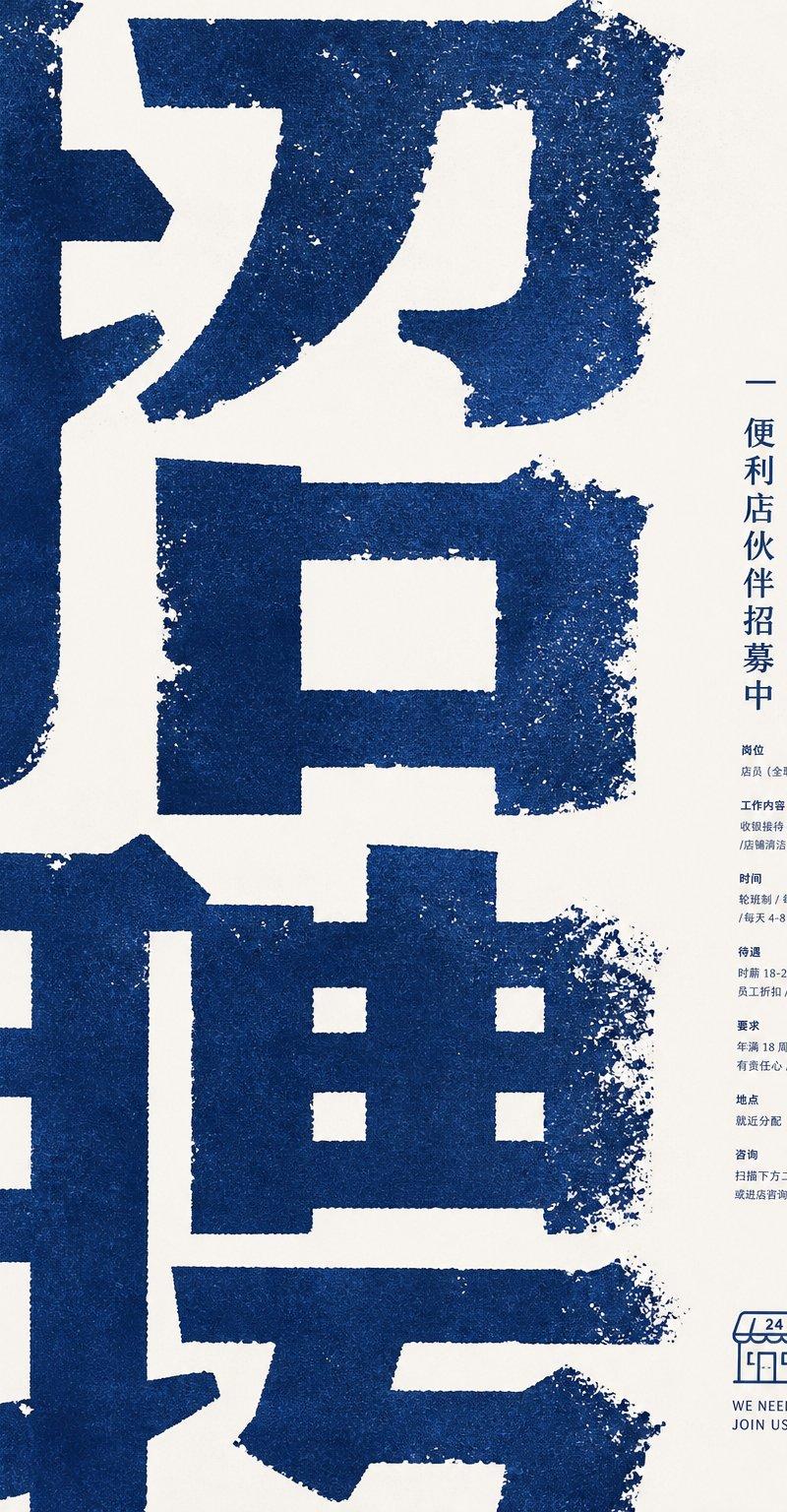
一款采用深蓝色与米色调的质感企业招聘海报排版,适用于便利店招聘或企业活动公告。
- 分类
- 海报营销
- 模型
- GPT Image 2
- 来源作者
- 小小东
- 原始语言
- en
- 来源 ID
- 28528
- 发布时间
- 2026年7月12日
完整提示词
目标:为便利店合作伙伴招聘活动创作一张极简主义企业招聘海报,采用醒目的东亚排版美学。

画布:竖向海报,2:3 比例,暖米色纸张背景,右侧留有大量负空间。

布局:海报左侧 75% 的区域填充巨大的深蓝色裁剪中文字符,呈现为醒目的招聘标题 {argument name="main headline" default="招聘"};字符尺寸极大,笔画延伸至海报边缘之外。在右侧边缘附近垂直居中放置一个狭窄的信息栏。右下角添加一个小型便利店线条图标及英文标语。

视觉风格:粗糙的孔版印刷 / 丝网印刷质感,米色纸张上的深海军蓝油墨,带有颗粒感的做旧边缘、斑驳的掉墨效果以及略显不均匀的盖章式排版。采用冷静的企业海报构图,现代且具有触感,无照片,无渐变,无额外色彩。

文本内容:海报包含 1 个巨大的裁剪标题区、1 行垂直标题、7 个小型信息板块以及 1 个底部 Logo/标语块。垂直标题行应为 {argument name="vertical title" default="便利店伙伴招募中"}。右侧栏的 7 个小板块为:1) 职位:店员,全职或兼职;2) 工作内容:收银操作、商品陈列、门店清洁;3) 时间:轮班制,每周 3–5 天,每天 4–8 小时;4) 福利:时薪 18–25 元,员工折扣,节假日福利;5) 要求:年龄 18 岁及以上,有责任心,勤奋踏实;6) 地点:就近分配;7) 联系方式:扫描下方二维码或到店咨询。正文请保持字号极小、紧凑,并使用海军蓝色。

底部板块:绘制 1 个简单的便利店轮廓图标,雨棚上标有“24”,下方放置两行简短的英文:{argument name="english slogan line one" default="WE NEED YOU"} 和 {argument name="english slogan line two" default="JOIN US"}。

约束:保持巨大的裁剪蓝色标题与微小的右侧栏细节之间的极端比例对比。所有排版和插图均使用相同的海军蓝油墨。避免使用写实人物、照片、除单个门店图标外的装饰性图标、二维码细节、阴影或光泽效果。多语言2
复古做旧风格便利店招聘海报
zh-CN目标:为便利店合作伙伴招聘活动创作一张极简主义企业招聘海报,采用醒目的东亚排版美学。 画布:竖向海报,2:3 比例,暖米色纸张背景,右侧留有大量负空间。 布局:海报左侧 75% 的区域填充巨大的深蓝色裁剪中文字符,呈现为醒目的招聘标题 {argument name="main headline" default="招聘"};字符尺寸极大,笔画延伸至海报边缘之外。在右侧边缘附近垂直居中放置一个狭窄的信息栏。右下角添加一个小型便利店线条图标及英文标语。 视觉风格:粗糙的孔版印刷 / 丝网印刷质感,米色纸张上的深海军蓝油墨,带有颗粒感的做旧边缘、斑驳的掉墨效果以及略显不均匀的盖章式排版。采用冷静的企业海报构图,现代且具有触感,无照片,无渐变,无额外色彩。 文本内容:海报包含 1 个巨大的裁剪标题区、1 行垂直标题、7 个小型信息板块以及 1 个底部 Logo/标语块。垂直标题行应为 {argument name="vertical title" default="便利店伙伴招募中"}。右侧栏的 7 个小板块为:1) 职位:店员,全职或兼职;2) 工作内容:收银操作、商品陈列、门店清洁;3) 时间:轮班制,每周 3–5 天,每天 4–8 小时;4) 福利:时薪 18–25 元,员工折扣,节假日福利;5) 要求:年龄 18 岁及以上,有责任心,勤奋踏实;6) 地点:就近分配;7) 联系方式:扫描下方二维码或到店咨询。正文请保持字号极小、紧凑,并使用海军蓝色。 底部板块:绘制 1 个简单的便利店轮廓图标,雨棚上标有“24”,下方放置两行简短的英文:{argument name="english slogan line one" default="WE NEED YOU"} 和 {argument name="english slogan line two" default="JOIN US"}。 约束:保持巨大的裁剪蓝色标题与微小的右侧栏细节之间的极端比例对比。所有排版和插图均使用相同的海军蓝油墨。避免使用写实人物、照片、除单个门店图标外的装饰性图标、二维码细节、阴影或光泽效果。
复古做旧风格便利店招聘海报
enGoal: Create a minimalist corporate recruitment poster for a convenience store partner hiring campaign, using a bold East Asian typographic aesthetic. Canvas: Vertical poster, 2:3 aspect ratio, warm off-white paper background with lots of negative space on the right. Layout: Fill the left 75% of the poster with enormous cropped dark-blue Chinese characters, reading like a giant recruitment headline {argument name="main headline" default="招聘"}; the characters are so large that their strokes extend beyond the poster edges. Place a narrow right-side information column centered vertically, aligned near the right margin. Add a small convenience-store line icon and English slogan at the lower right. Visual style: Rough risograph / screen-print texture, dark navy blue ink on cream paper, gritty distressed edges, speckled ink loss, slightly uneven stamped typography. Use a calm corporate poster composition, modern but tactile, no photos, no gradients, no extra colors. Text content: The poster contains exactly 1 giant cropped headline area, 1 vertical title line, 7 small information sections, and 1 bottom logo/slogan block. The vertical title line should read {argument name="vertical title" default="便利店伙伴招募中"}. The 7 small sections in the right column are: 1) position: store staff, full-time or part-time; 2) work content: cashier operation, product display, store cleaning; 3) schedule: shift system, 3–5 days per week, 4–8 hours per day; 4) benefits: hourly wage 18–25 yuan, employee discount, holiday benefits; 5) requirements: age 18 or above, responsible, hardworking; 6) location: assigned nearby; 7) contact: scan the QR code below or visit the store to ask. Keep this body text very small, compact, and navy blue. Bottom block: Draw exactly 1 simple outlined convenience-store icon with an awning marked “24”, and below it place two short English lines: {argument name="english slogan line one" default="WE NEED YOU"} and {argument name="english slogan line two" default="JOIN US"}. Constraints: Preserve the extreme scale contrast between the huge cropped blue headline and the tiny right-column details. Keep all typography and illustration in the same navy ink. Avoid realistic people, photos, decorative icons beyond the single store icon, QR code detail, shadows, or glossy effects.