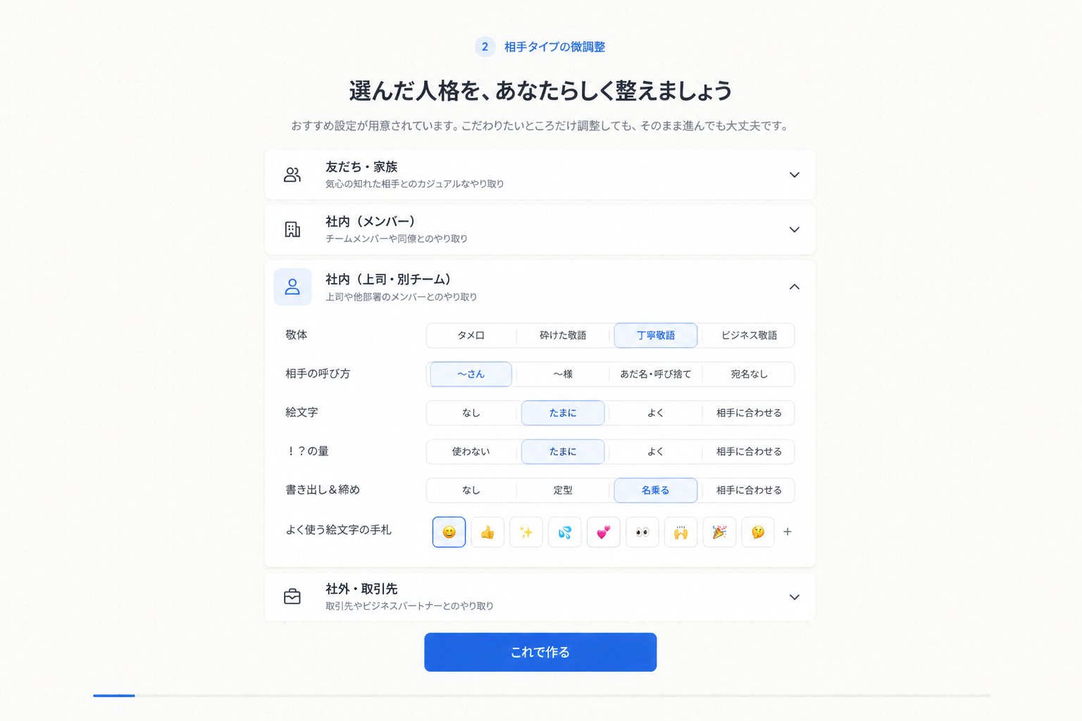
日语人格设置 UI
生成一个简洁的日语 SaaS 入门界面,用于自定义沟通语气和关系设置。
- Category
- UI & Interfaces
- Model
- GPT Image 2
- Creator
- yossy🐾
- Source language
- en
- Source ID
- 28036
- Published
- Jul 8, 2026
Full prompt
Goal: Create a clean Japanese web app onboarding/settings screen for step 2, showing fine-tuning of a selected communication personality or relationship type.

Canvas: 16:9 desktop screenshot, white to very pale gray background, centered content column about 720 px wide with generous margins, soft shadows, rounded cards, minimal SaaS UI style.

Header: At the top center, show a small blue circular badge with “2” followed by the label 「相手タイプの微調整」. Under it place a bold Japanese headline: 「選んだ人格を、あなたらしく整えましょう」. Under the headline add a smaller gray subtitle: 「おすすめ設定が用意されています。こだわりたいところだけ調整しても、そのまま進んでも大丈夫です。」

Main layout: Stack exactly 4 accordion cards vertically. Each card has a left line icon, a bold Japanese title, a smaller gray description, and a chevron on the right. The 4 cards are: 1) closed card with people icon, title 「友だち・家族」, description 「気心の知れた相手とのカジュアルなやり取り」, downward chevron; 2) closed card with building icon, title 「社内(メンバー)」, description 「チームメンバーや同僚とのやり取り」, downward chevron; 3) expanded selected card with blue-highlighted user icon, title 「社内(上司・別チーム)」, description 「上司や他部署のメンバーとのやり取り」, upward chevron; 4) closed card with briefcase icon, title 「社外・取引先」, description 「取引先やビジネスパートナーとのやり取り」, downward chevron.

Expanded card details: Inside the third card, create exactly 6 setting rows with Japanese labels on the left and segmented pill controls on the right. Row 1 label 「敬体」 has 4 options: 「タメ口」, 「砕けた敬語」, selected 「丁寧敬語」, 「ビジネス敬語」. Row 2 label 「相手の呼び方」 has 4 options: selected 「〜さん」, 「〜様」, 「あだ名・呼び捨て」, 「宛名なし」. Row 3 label 「絵文字」 has 4 options: 「なし」, selected 「たまに」, 「よく」, 「相手に合わせる」. Row 4 label 「!?の量」 has 4 options: 「使わない」, selected 「たまに」, 「よく」, 「相手に合わせる」. Row 5 label 「書き出し&締め」 has 4 options: 「なし」, 「定型」, selected 「名乗る」, 「相手に合わせる」. Row 6 label 「よく使う絵文字の手札」 shows exactly 9 small square emoji buttons followed by a plus sign: selected smiling face emoji, thumbs up, sparkles, sweat droplets, two hearts, eyes, raised hands, party popper, thinking face, then “+”.

Footer: Beneath the accordion stack, center a prominent rounded blue gradient primary button with white text 「これで作る」.

Visual style: Crisp modern Japanese product UI, thin light gray borders, subtle card shadows, blue accent color for selected controls and active icon backgrounds, black/dark navy headings, gray secondary text. Keep the composition symmetrical and spacious. No browser chrome, no watermark, no extra text. Use {argument name="accent color" default="bright blue"} as the active selection color and keep all visible UI text in Japanese.
Translations
日语人格设置 UI
enGoal: Create a clean Japanese web app onboarding/settings screen for step 2, showing fine-tuning of a selected communication personality or relationship type. Canvas: 16:9 desktop screenshot, white to very pale gray background, centered content column about 720 px wide with generous margins, soft shadows, rounded cards, minimal SaaS UI style. Header: At the top center, show a small blue circular badge with “2” followed by the label 「相手タイプの微調整」. Under it place a bold Japanese headline: 「選んだ人格を、あなたらしく整えましょう」. Under the headline add a smaller gray subtitle: 「おすすめ設定が用意されています。こだわりたいところだけ調整しても、そのまま進んでも大丈夫です。」 Main layout: Stack exactly 4 accordion cards vertically. Each card has a left line icon, a bold Japanese title, a smaller gray description, and a chevron on the right. The 4 cards are: 1) closed card with people icon, title 「友だち・家族」, description 「気心の知れた相手とのカジュアルなやり取り」, downward chevron; 2) closed card with building icon, title 「社内(メンバー)」, description 「チームメンバーや同僚とのやり取り」, downward chevron; 3) expanded selected card with blue-highlighted user icon, title 「社内(上司・別チーム)」, description 「上司や他部署のメンバーとのやり取り」, upward chevron; 4) closed card with briefcase icon, title 「社外・取引先」, description 「取引先やビジネスパートナーとのやり取り」, downward chevron. Expanded card details: Inside the third card, create exactly 6 setting rows with Japanese labels on the left and segmented pill controls on the right. Row 1 label 「敬体」 has 4 options: 「タメ口」, 「砕けた敬語」, selected 「丁寧敬語」, 「ビジネス敬語」. Row 2 label 「相手の呼び方」 has 4 options: selected 「〜さん」, 「〜様」, 「あだ名・呼び捨て」, 「宛名なし」. Row 3 label 「絵文字」 has 4 options: 「なし」, selected 「たまに」, 「よく」, 「相手に合わせる」. Row 4 label 「!?の量」 has 4 options: 「使わない」, selected 「たまに」, 「よく」, 「相手に合わせる」. Row 5 label 「書き出し&締め」 has 4 options: 「なし」, 「定型」, selected 「名乗る」, 「相手に合わせる」. Row 6 label 「よく使う絵文字の手札」 shows exactly 9 small square emoji buttons followed by a plus sign: selected smiling face emoji, thumbs up, sparkles, sweat droplets, two hearts, eyes, raised hands, party popper, thinking face, then “+”. Footer: Beneath the accordion stack, center a prominent rounded blue gradient primary button with white text 「これで作る」. Visual style: Crisp modern Japanese product UI, thin light gray borders, subtle card shadows, blue accent color for selected controls and active icon backgrounds, black/dark navy headings, gray secondary text. Keep the composition symmetrical and spacious. No browser chrome, no watermark, no extra text. Use {argument name="accent color" default="bright blue"} as the active selection color and keep all visible UI text in Japanese.
日语人格设置 UI
zh-CN目标:创建一个简洁的日语 Web 应用入门/设置界面(步骤 2),展示对所选沟通人格或关系类型的微调。 画布:16:9 桌面截图,白色至极浅灰色背景,居中内容列宽约 720 px,留白充裕,柔和阴影,圆角卡片,极简 SaaS UI 风格。 页眉:在顶部居中位置,显示一个蓝色小圆徽标,内含数字“2”,后接标签「相手タイプの微调整」。下方放置加粗的日语标题:「选んだ人格を、あなたらしく整えましょう」。标题下方添加较小的灰色副标题:「おすすめ设定が用意されています。こだわりたいところだけ调整しても、そのまま进んでも大丈夫です。」 主要布局:垂直堆叠 4 个手风琴卡片。每个卡片左侧带有图标、加粗的日语标题、较小的灰色描述,右侧带有箭头。4 个卡片分别为:1) 折叠状态,人物图标,标题「友だち・家族」,描述「気心の知れた相手とのカジュアルなやり取り」,向下箭头;2) 折叠状态,建筑图标,标题「社内(メンバー)」,描述「チームメンバーや同僚とのやり取り」,向下箭头;3) 展开状态(选中),蓝色高亮用户图标,标题「社内(上司・别チーム)」,描述「上司や他部署のメンバーとのやり取り」,向上箭头;4) 折叠状态,公文包图标,标题「社外・取引先」,描述「取引先やビジネスパートナーとのやり取り」,向下箭头。 展开卡片详情:在第三个卡片内,创建 6 行设置项,左侧为日语标签,右侧为分段式胶囊控件。第 1 行标签「敬体」,包含 4 个选项:「タメ口」、「砕けた敬语」、选中「丁寧敬语」、「ビジネス敬语」。第 2 行标签「相手の呼び方」,包含 4 个选项:选中「〜さん」、「〜様」、「あだ名・呼び捨て」、「宛名なし」。第 3 行标签「絵文字」,包含 4 个选项:「なし」、选中「たまに」、「よく」、「相手に合わせる」。第 4 行标签「!?の量」,包含 4 个选项:「使わない」、选中「たまに」、「よく」、「相手に合わせる」。第 5 行标签「書き出し&缔め」,包含 4 个选项:「なし」、「定型」、选中「名乗る」、「相手に合わせる」。第 6 行标签「よく使う絵文字の手札」,显示 9 个小方形表情符号按钮,后接一个加号:选中笑脸、点赞、闪光、汗滴、双心、眼睛、举手、礼花、思考表情,最后是“+”。 页脚:在手风琴堆叠下方,居中放置一个醒目的圆角蓝色渐变主按钮,文字为白色「これで作る」。 视觉风格:清爽的现代日语产品 UI,细浅灰色边框,微妙的卡片阴影,选中控件和激活图标背景使用蓝色强调色,黑色/深蓝色标题,灰色辅助文本。保持构图对称且宽敞。无浏览器边框,无水印,无额外文字。使用 {argument name="accent color" default="bright blue"} 作为激活选中颜色,并确保所有可见 UI 文本均为日语。