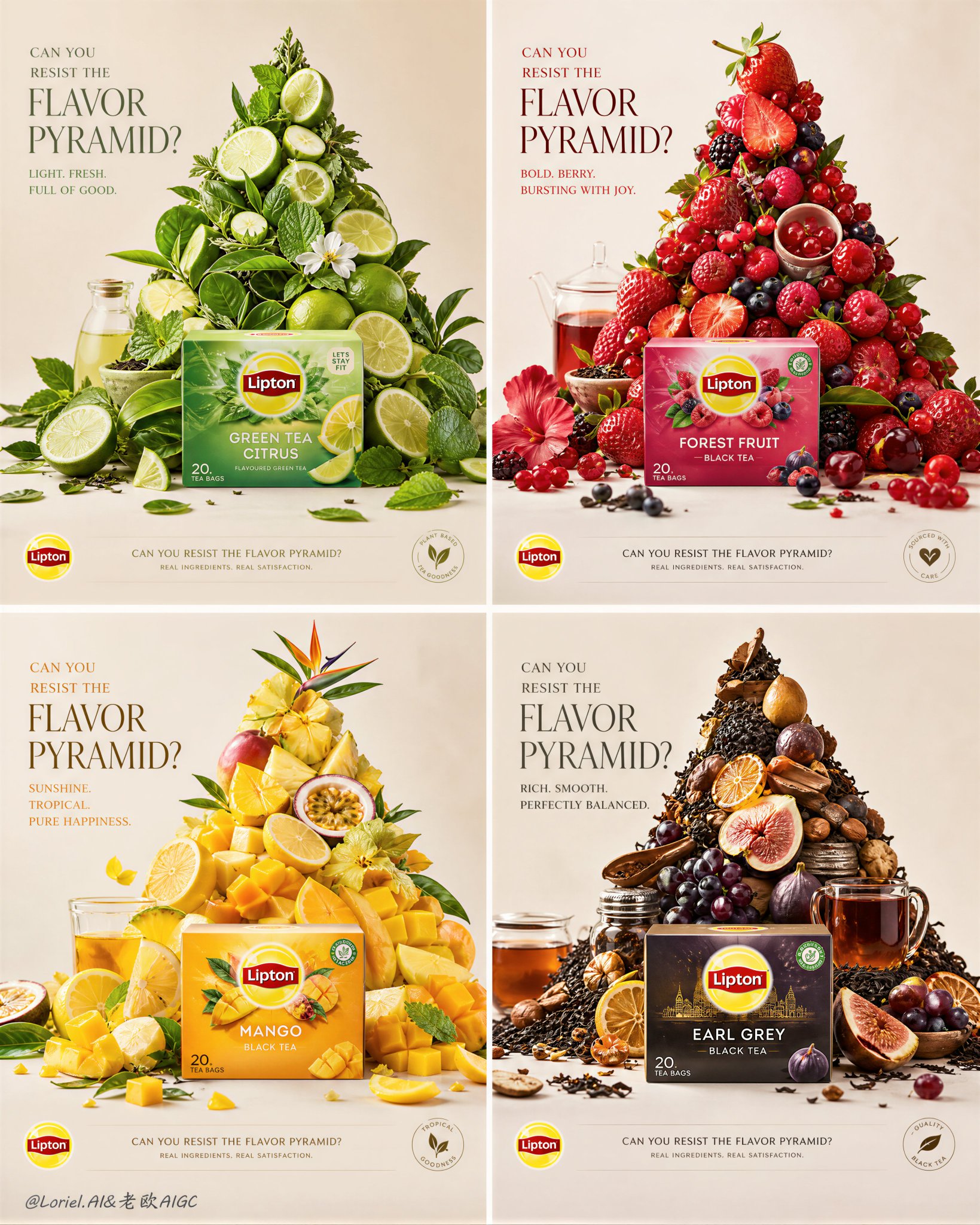
Break down taste into four pyramids, each representing a different pace...
Saved from X post by @ou_zhen599. Break down taste into four pyramids, each representing a different pace of life. Refreshing, rich and sweet, tropical, and mellow come together in a single romantic bite. 把味觉拆成四座金字
- Category
- 创意图片
- Model
- GPT Image 2
- Creator
- @ou_zhen599
- Source language
- zh-CN
- Source ID
- 2078481914575699998
- Published
- Jul 19, 2026
Full prompt
Break down taste into four pyramids, each representing a different pace of life. Refreshing, rich and sweet, tropical, and mellow come together in a single romantic bite. 把味觉拆成四座金字塔,都在讲不同的生活节奏。清爽、浓甜、热带、沉稳被排成一口浪漫。 GPT- image 2 prompt Create an ultra-premium four-panel campaign board for Lipton, developed as the “Ingredient Summit System” version, but avoid an overly perfect or machine-built arrangement. The entire board must still preserve the same multi-flavor 2x2 series logic, real front-facing Lipton products, and four different flavor worlds expressed through pyramid-like ingredient structures, but each pyramid must now feel hand-built, naturally assembled, and slightly imperfect. The final image must feel like a world-class global advertising campaign that combines premium still-life design with believable human touch: hyper-real, elegant, flavorful, refined, but not sterile. Core concept: Each Lipton flavor becomes a hand-built ingredient summit. A real front-facing Lipton product pack anchors the lower front area of each panel, while above it rises a pyramid-like flavor structure made from fruit, leaves, petals, tea ingredients, and lifestyle-related objects. However, the pyramid must not feel too mathematically clean or mechanically precise. It should feel like a beautifully art-directed manual arrangement: some ingredients slightly tilted, some pieces subtly slipping, some elements lightly scattered at the base, some gaps and irregular stacking preserved, as if expert hands assembled it with care but allowed natural imperfection and living realism to remain. The image must feel premium and controlled, yet still human and tactile. 4-panel structure: Use a clean 2x2 campaign board with four equal panels. Each panel must maintain the same layout logic: upper area with elegant English headline, center area dominated by a pyramid-like flavor summit, lower front area anchored by one real front-facing Lipton product pack, lower strip or lower zone with minimal official campaign information. All four panels must clearly belong to one same campaign family, but each one must express a different flavor identity through its own ingredients, color system, and summit personality. Imperfection logic: This version must specifically avoid overly neat symmetry. The ingredient pyramids should still read clearly as triangular or summit-like forms, but they must feel assembled by hand rather than manufactured by a machine. Preserve: slightly uneven stacking, small natural gaps, subtle leaning fruit or leaves, a few fallen or rolled pieces near the base, some scattered petals, peels, seeds, or tea fragments, tiny irregular overlaps, slight asymmetry in edges, small signs of gravity and real placement. The result should feel premium, intelligent, and believable, like a luxurious handmade ingredient installation. Panel 1, green citrus freshness: Place a real front-facing Lipton green or citrus-green flavor product at the lower front center. Above it, build a fresh green summit from lime slices, green tea leaves, mint-like leaves, pale citrus peel, light green fruit, and a few wellness-oriented mini objects. The structure should still feel upward and pyramid-like, but let some lime slices slip outward, a few leaves scatter at the base, and some pieces sit imperfectly instead of in strict rows. This panel should feel fresh, light, uplifting, and slightly breezy rather than rigid. Panel 2, red berry intensity: Place a real front-facing Lipton berry or red fruit flavor product at the lower front center. Build the summit from strawberries, raspberries, cherries, red currants, berry leaves, and glossy red lifestyle details. Let the red fruit pile feel richer and more abundant, with berries naturally spilling outward, small fruit rolling near the base, and some clusters stacked in a lively imperfect way. The shape should still read as a pyramid, but one made through generous layered hand placement rather than exact geometry. Panel 3, yellow tropical brightness: Place a real front-facing Lipton mango or tropical-yellow flavor product at the lower front center. Build a sunny summit from mango pieces, pineapple chunks, lemon wedges, golden fruit rounds, tropical leaves, and bright cheerful mini objects. Preserve the triangular silhouette, but allow some mango cubes and citrus wedges to break outward, a few petals and leaves to drift around the base, and slight variations in density between the left and right side. The structure should feel optimistic, abundant, and naturally arranged. Panel 4, dark tea richness: Place a real front-facing Lipton black tea or deeper rich flavor product at the lower front center. Build a more grounded summit from darker tea leaves, figs, grapes, plum-toned fruit, citrus peel, spice-like accents, amber tea details, and ritual breakfast elements. Keep the pyramid form readable, but make it feel more layered and human: tea leaves fallen around the base, one or two fruit pieces slightly displaced, richer shadows in the stacking, and small object clusters suggesting manual composition. This panel should feel more refined, mature, and tactile. Product realism: Render each Lipton product pack with absolute realism and premium packaging fidelity. Every pack must be front-facing, clearly readable, physically accurate, and beautifully lit, with crisp logo print, box edges, flavor coding, printed surface finish, and premium shelf realism. The product must remain clearly visible and commercially dominant in every panel, even while the summit above carries much of the visual drama. Ingredient realism: All fruit, leaves, petals, tea fragments, and supporting objects must be rendered with hyper-real still-life precision. Show skin texture, pulp translucency, seed detail, moisture, leaf veins, peel edges, and tiny imperfections. The ingredients must feel fresh, tactile, and physically placed, not flat graphics. Some pieces should appear slightly bruised by pressure, compressed by stacking, or angled naturally by weight, but still remain premium and beautiful. Supporting scatter: At the foot of every pyramid, include a tasteful amount of natural scatter and leftover evidence of assembly: a few loose fruit slices, leaves, petals, seeds, tea dust, dropped wedges, small utensil-like elements, or tiny supporting pieces. This scatter must feel deliberate but believable, as if the summit was carefully built by hand and some ingredients remained around the base. Avoid chaos; keep it elegant and art-directed. Backgrounds: Use a clean soft-neutral premium studio background in each panel, close to warm ivory, pale cream, or very light gray-beige, with subtle tonal variation only. The background must remain bright and quiet so the ingredient summits and product packs dominate clearly. Let the flavor identity come mainly from the ingredients and packaging, not from overly saturated background color. Typography: Use an elegant English-led typography system that follows a premium global campaign layout. Each panel can feature a refined flavor-question or short campaign line in the upper area, with a minimal official information strip near the bottom. Main campaign direction: “CAN YOU RESIST THE FLAVOR PYRAMID?” Panel-specific copy can vary slightly by flavor mood while staying minimal and premium. Use only very restrained official logo placement and supporting English text. Typography must feel airy, modern, balanced, and beautifully spaced, never crude or heavy. Lighting: Use extremely delicate high-end studio-commercial lighting with soft directional highlights and refined shadows. Each summit must feel dimensional, tactile, and fresh, with fruit skins, tea leaves, petals, packaging, and small objects all rendered with exquisite realism. The light should be soft enough to preserve elegance and cleanliness, but precise enough to reveal texture, stacking depth, and slight imperfections. Every panel should feel premium, bright, and globally polished. Color direction: Build four distinct but harmonious flavor palettes: green freshness, red berry intensity, yellow tropical brightness, dark tea richness. The campaign must feel colorful but controlled, bright but elegant, playful but premium. The slight asymmetry and scatter must make the series feel more alive and more human without losing brand polish. Mood: fresh, premium, organized but human, tactile, hyper-real, elegant, flavorful, handcrafted, modern, internationally refined, commercially iconic Rendering style: ultra-premium Lipton multi-flavor campaign board, 2x2 layout, real front-facing product packs, four hand-built ingredient pyramid structures, slight asymmetry and natural scatter, premium still-life architecture, elegant English typography, bright neutral backgrounds, hyper-real food and packaging detail, refined soft lighting, world-class advertising key visual, 8k, global campaign quality Negative prompt: overly perfect symmetry, machine-built arrangement, sterile geometry, messy chaos, weak product dominance, cartoon rendering, cluttered layout, ugly typography, low-detail packaging, muddy palette, cheap supermarket poster style, flat lighting, low-end still life
Translations
Break down taste into four pyramids, each representing a different pace...
zh-CNBreak down taste into four pyramids, each representing a different pace of life. Refreshing, rich and sweet, tropical, and mellow come together in a single romantic bite. 把味觉拆成四座金字塔,都在讲不同的生活节奏。清爽、浓甜、热带、沉稳被排成一口浪漫。 GPT- image 2 prompt Create an ultra-premium four-panel campaign board for Lipton, developed as the “Ingredient Summit System” version, but avoid an overly perfect or machine-built arrangement. The entire board must still preserve the same multi-flavor 2x2 series logic, real front-facing Lipton products, and four different flavor worlds expressed through pyramid-like ingredient structures, but each pyramid must now feel hand-built, naturally assembled, and slightly imperfect. The final image must feel like a world-class global advertising campaign that combines premium still-life design with believable human touch: hyper-real, elegant, flavorful, refined, but not sterile. Core concept: Each Lipton flavor becomes a hand-built ingredient summit. A real front-facing Lipton product pack anchors the lower front area of each panel, while above it rises a pyramid-like flavor structure made from fruit, leaves, petals, tea ingredients, and lifestyle-related objects. However, the pyramid must not feel too mathematically clean or mechanically precise. It should feel like a beautifully art-directed manual arrangement: some ingredients slightly tilted, some pieces subtly slipping, some elements lightly scattered at the base, some gaps and irregular stacking preserved, as if expert hands assembled it with care but allowed natural imperfection and living realism to remain. The image must feel premium and controlled, yet still human and tactile. 4-panel structure: Use a clean 2x2 campaign board with four equal panels. Each panel must maintain the same layout logic: upper area with elegant English headline, center area dominated by a pyramid-like flavor summit, lower front area anchored by one real front-facing Lipton product pack, lower strip or lower zone with minimal official campaign information. All four panels must clearly belong to one same campaign family, but each one must express a different flavor identity through its own ingredients, color system, and summit personality. Imperfection logic: This version must specifically avoid overly neat symmetry. The ingredient pyramids should still read clearly as triangular or summit-like forms, but they must feel assembled by hand rather than manufactured by a machine. Preserve: slightly uneven stacking, small natural gaps, subtle leaning fruit or leaves, a few fallen or rolled pieces near the base, some scattered petals, peels, seeds, or tea fragments, tiny irregular overlaps, slight asymmetry in edges, small signs of gravity and real placement. The result should feel premium, intelligent, and believable, like a luxurious handmade ingredient installation. Panel 1, green citrus freshness: Place a real front-facing Lipton green or citrus-green flavor product at the lower front center. Above it, build a fresh green summit from lime slices, green tea leaves, mint-like leaves, pale citrus peel, light green fruit, and a few wellness-oriented mini objects. The structure should still feel upward and pyramid-like, but let some lime slices slip outward, a few leaves scatter at the base, and some pieces sit imperfectly instead of in strict rows. This panel should feel fresh, light, uplifting, and slightly breezy rather than rigid. Panel 2, red berry intensity: Place a real front-facing Lipton berry or red fruit flavor product at the lower front center. Build the summit from strawberries, raspberries, cherries, red currants, berry leaves, and glossy red lifestyle details. Let the red fruit pile feel richer and more abundant, with berries naturally spilling outward, small fruit rolling near the base, and some clusters stacked in a lively imperfect way. The shape should still read as a pyramid, but one made through generous layered hand placement rather than exact geometry. Panel 3, yellow tropical brightness: Place a real front-facing Lipton mango or tropical-yellow flavor product at the lower front center. Build a sunny summit from mango pieces, pineapple chunks, lemon wedges, golden fruit rounds, tropical leaves, and bright cheerful mini objects. Preserve the triangular silhouette, but allow some mango cubes and citrus wedges to break outward, a few petals and leaves to drift around the base, and slight variations in density between the left and right side. The structure should feel optimistic, abundant, and naturally arranged. Panel 4, dark tea richness: Place a real front-facing Lipton black tea or deeper rich flavor product at the lower front center. Build a more grounded summit from darker tea leaves, figs, grapes, plum-toned fruit, citrus peel, spice-like accents, amber tea details, and ritual breakfast elements. Keep the pyramid form readable, but make it feel more layered and human: tea leaves fallen around the base, one or two fruit pieces slightly displaced, richer shadows in the stacking, and small object clusters suggesting manual composition. This panel should feel more refined, mature, and tactile. Product realism: Render each Lipton product pack with absolute realism and premium packaging fidelity. Every pack must be front-facing, clearly readable, physically accurate, and beautifully lit, with crisp logo print, box edges, flavor coding, printed surface finish, and premium shelf realism. The product must remain clearly visible and commercially dominant in every panel, even while the summit above carries much of the visual drama. Ingredient realism: All fruit, leaves, petals, tea fragments, and supporting objects must be rendered with hyper-real still-life precision. Show skin texture, pulp translucency, seed detail, moisture, leaf veins, peel edges, and tiny imperfections. The ingredients must feel fresh, tactile, and physically placed, not flat graphics. Some pieces should appear slightly bruised by pressure, compressed by stacking, or angled naturally by weight, but still remain premium and beautiful. Supporting scatter: At the foot of every pyramid, include a tasteful amount of natural scatter and leftover evidence of assembly: a few loose fruit slices, leaves, petals, seeds, tea dust, dropped wedges, small utensil-like elements, or tiny supporting pieces. This scatter must feel deliberate but believable, as if the summit was carefully built by hand and some ingredients remained around the base. Avoid chaos; keep it elegant and art-directed. Backgrounds: Use a clean soft-neutral premium studio background in each panel, close to warm ivory, pale cream, or very light gray-beige, with subtle tonal variation only. The background must remain bright and quiet so the ingredient summits and product packs dominate clearly. Let the flavor identity come mainly from the ingredients and packaging, not from overly saturated background color. Typography: Use an elegant English-led typography system that follows a premium global campaign layout. Each panel can feature a refined flavor-question or short campaign line in the upper area, with a minimal official information strip near the bottom. Main campaign direction: “CAN YOU RESIST THE FLAVOR PYRAMID?” Panel-specific copy can vary slightly by flavor mood while staying minimal and premium. Use only very restrained official logo placement and supporting English text. Typography must feel airy, modern, balanced, and beautifully spaced, never crude or heavy. Lighting: Use extremely delicate high-end studio-commercial lighting with soft directional highlights and refined shadows. Each summit must feel dimensional, tactile, and fresh, with fruit skins, tea leaves, petals, packaging, and small objects all rendered with exquisite realism. The light should be soft enough to preserve elegance and cleanliness, but precise enough to reveal texture, stacking depth, and slight imperfections. Every panel should feel premium, bright, and globally polished. Color direction: Build four distinct but harmonious flavor palettes: green freshness, red berry intensity, yellow tropical brightness, dark tea richness. The campaign must feel colorful but controlled, bright but elegant, playful but premium. The slight asymmetry and scatter must make the series feel more alive and more human without losing brand polish. Mood: fresh, premium, organized but human, tactile, hyper-real, elegant, flavorful, handcrafted, modern, internationally refined, commercially iconic Rendering style: ultra-premium Lipton multi-flavor campaign board, 2x2 layout, real front-facing product packs, four hand-built ingredient pyramid structures, slight asymmetry and natural scatter, premium still-life architecture, elegant English typography, bright neutral backgrounds, hyper-real food and packaging detail, refined soft lighting, world-class advertising key visual, 8k, global campaign quality Negative prompt: overly perfect symmetry, machine-built arrangement, sterile geometry, messy chaos, weak product dominance, cartoon rendering, cluttered layout, ugly typography, low-detail packaging, muddy palette, cheap supermarket poster style, flat lighting, low-end still life